
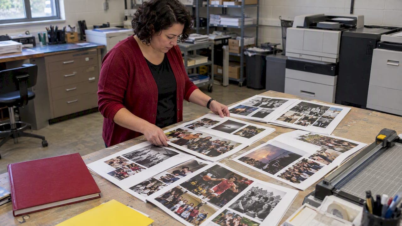
Use a few reusable spread templates and build each spread around one dominant photo to carry the story of the year. That single move fixes most of what makes a yearbook feel scattered: hold your grid consistent, limit yourself to two or three fonts, and write captions that add real detail instead of just naming names. Below are ten ready-to-use layout ideas, the design principles behind them, and a planning workflow to keep production on schedule.
TL;DR:
- Using a dominant full-page photo with supporting smaller images creates a clear visual hierarchy and engages readers immediately.
- Consistent grid layouts, limited fonts, and well-placed captions ensure a cohesive and readable yearbook design.
- Prioritize high-resolution images, accurate captions, and proper bleed margins to prevent common print issues and delays.
- Incorporate inclusive photography by covering diverse student groups and avoid captions that reduce students to stereotypes or single traits.
- Add multimedia links like QR codes carefully, ensuring they enhance the story without replacing strong photography or writing.
Table of Contents
- 1. Ten yearbook layout ideas worth copying
- Design principles that make yearbook layouts succeed
- Planning your ladder, templates, and production checks
- Common layout mistakes and quick fixes
- Resources and support for yearbook advisers
- Adding interactive elements and multimedia links
- Designing for diversity and inclusivity in photos and content
- Using color effectively to support your theme
- Balancing text and images on a page
- Accessibility considerations in yearbook design
- What I'd tell any adviser staring down a deadline
- Getting your yearbook designed and printed
- FAQ
- Sources
1. Ten yearbook layout ideas worth copying
These layouts cover most of what a yearbook needs to say, from big moments to quiet ones. Each works as a template you can reuse across sections once you adjust the photos and copy.
- Full-spread photo story: one powerful image stretches across both pages with a short headline and a few lines of body text. Use it for a homecoming game, a graduation moment, or anything with strong visual drama. Watch out for text getting lost in a busy background; drop a shaded panel behind it if needed.
- Clean modular grid for portraits: evenly sized boxes keep class or club portraits organized and easy to scan. Align every row and column precisely, and leave consistent gutters. Watch out for "postage stamp" syndrome, where photos shrink so much that faces become unrecognizable.
- Timeline spread: a horizontal or vertical line anchors photos and captions in chronological order, good for recapping a season or a semester of events. Use arrows or dots to mark dates clearly. Watch out for cramming too many events into one line; cut to the five or six that matter most.
- Quote or caption-forward page: a large pull quote from a student or teacher becomes the visual anchor, with supporting photos around it. Choose quotes with specific, surprising details rather than generic praise. Watch out for quotes that could belong to anyone; push students for a real memory, not a cliché.
- Modern minimalist spread with heavy white space: one or two photos sit inside generous margins, letting the images breathe. This works well for senior tributes or opening section pages. Watch out for empty space that reads as unfinished rather than intentional; anchor it with a clear headline or folio.
- Collage mosaic: a cluster of smaller photos fills the spread with energy, best for pep rallies, prom, or candid club life. Vary photo sizes so one or two still read as dominant. Watch out for a wall of same-size photos with no entry point for the eye.
- Infographic or season-stats page: scores, win-loss records, or participation numbers get translated into simple charts or icons next to photos. Use this for sports recaps or club achievement pages. Watch out for cramming raw data tables that nobody will actually read.
- Portrait-grid variations: staggered rows, circular crops, or diagonal accents break up a standard grid without sacrificing order. Use sparingly on one or two spreads so the effect still feels special. Watch out for inconsistent crop shapes that clash with the book's overall grid.
- Themed divider spreads: these mark the start of a new section (academics, sports, clubs) and echo the cover's color palette, typography, and theme concept. Keep the divider simple so it sets tone without overwhelming the section. Watch out for a divider so detailed it duplicates content from the section itself.
- Class memory or throwback spread: candid shots, nicknames, or "most likely to" style call-outs capture personality beyond posed portraits. Pair tight head shots with handwritten-style captions for warmth. Watch out for inside jokes that exclude readers who weren't there; add a line of context.
Design principles that make yearbook layouts succeed
Strong spreads follow a few consistent rules rather than chasing trends. NSPA Pacemaker judges note that the best books let design grow from strong photography and writing, not from forcing content into decoration.
- Anchor every spread with one large, dominant image, then support it with three to six smaller photos for context and movement.
- Treat facing pages as a single spread, not two separate pages, so the eye flows naturally across the gutter.
- Limit type to two or three families total, and never stack different typefaces on top of each other in the same block.
- Keep captions and body copy at a readable size. Judges consistently reward legible type over decorative fonts.
A workable default is one dominant photo supported by three to six smaller images per spread, a ratio that creates clear visual hierarchy without leaving any page feeling flat. Theme carries through the cover, endsheets, divider pages, and folios, a structure NHSPA's yearbook standards outline in detail, down to what belongs on the spine and title page. Our visual hierarchy guide walks through building this hierarchy spread by spread, and our grid system explainer covers how to set up a grid your whole staff can follow.
Planning your ladder, templates, and production checks
A ladder diagram, the master map of every spread in the book, is the single best defense against deadline panic. Build it before anyone opens a design program.
- Lay out every spread on the ladder first, reserving specific pages for big storytelling spreads and others for modular content like portraits or ads.
- Settle on a few reusable spread templates early, then only customize beyond them for signature moments like the cover story or a major event recap.
- Before sending anything to print, run a checklist: confirm bleed and trim, keep text inside the safe area, check image resolution, verify every caption and photo credit, and get sign-off from a final proof.
- Assign clear roles: section editors draft copy, photo editors select images, and an adviser or editor-in-chief does a final legibility pass before proofing.
Pro Tip: Lock your ladder before assigning a single spread so no section accidentally eats pages meant for another.
Our club section planning guide breaks this workflow down further for student staffs handling coverage assignments.
Common layout mistakes and quick fixes
Judges and advisers tend to flag the same handful of problems year after year.
- Design driving content: a flashy layout with nothing to say. Fix: start with the story, then choose a layout that fits the story.
- Tiny type: captions or body copy shrunk to fit space. Fix: increase size and leading before cutting words.
- Inconsistent grids: columns that shift from page to page. Fix: re-establish one grid system and stick to it across the book.
- Cluster captions: five names jammed into one caption block. Fix: write captions that add a detail readers cannot see in the photo itself.
- Low-resolution images and missing bleed: the most common print-rejection issues. Fix: check image resolution and bleed margins before final submission, not after.
Pro Tip: If a caption only names who's in the photo, it's not finished yet. Add what they're doing or why it mattered.
Resources and support for yearbook advisers
Building strong spreads gets easier with the right references on hand. NSPA's 2025 Yearbook Pacemaker winners are published for study, giving advisers real examples of award-level storytelling and layout. We support that same execution-first approach: fast 2 to 3 week turnaround times, free design assistance, and flexible design options using Canva, Adobe InDesign, or our own online creator. For more layout guidance, our module design breakdown and class-page fixes from our adviser playbook are written for the same staff this article is for.
Adding interactive elements and multimedia links
Printed yearbooks can still point readers toward video, audio, or extended photo galleries without needing a budget for an app. The most common method is a QR code printed small in a corner of a spread, linking to a game highlight reel, a music playlist built by the class, or raw footage from a theater production. Place the code near related content, not buried in a caption block, and always include a one-line label explaining what it leads to.
Keep the printed page the complete experience on its own. A QR code should add a bonus, not carry information a reader needs to understand the spread. This matters because yearbooks get pulled off shelves for decades, and dead links or discontinued hosting services will eventually break the multimedia layer while the printed page remains.
If your staff wants to go further, some yearbook programs now embed augmented-reality triggers that launch video when a smartphone camera is pointed at a photo. These require more setup and a stable third-party platform, so weigh the staff time against how many readers will actually use it. A simple QR code to a shared video folder achieves most of the same goal with far less technical risk.
Whatever format you choose, treat it as a layer on top of strong photography and writing, never a replacement for them. A spread with weak photo selection won't improve because it has a video link attached.

Designing for diversity and inclusivity in photos and content
A yearbook should look like the student body it represents, not just the students who show up most often to club meetings or sit closest to the camera. Build a shot list at the start of the year that deliberately covers different grade levels, programs, and student groups, including those who rarely appear in candids: students in special education programs, English language learners, and students involved in less visible clubs or activities.
Caption writing matters just as much as photo selection. Avoid captions that reduce a student to a single trait or treat a disability, accent, or background as the point of the photo. Ask students how they want to be described, and default to person-first language when it fits the situation.
Review spreads as a full staff before finalizing them, specifically checking whether certain students, teams, or programs are consistently underrepresented across the book, not just on one page. A staff member assigned to track photo coverage across sections catches this more reliably than hoping it balances out naturally.
Using color effectively to support your theme
Color should reinforce your theme and keep pages easy to read, not decorate for its own sake. Pick two or three core colors tied to your theme concept, then use tints and shades of those same colors for section dividers instead of introducing a new palette every few pages. This keeps the book feeling unified even across dozens of different spreads built by different student editors.
Contrast matters more than any single color choice. Light text on a light photo, or dark text on a dark background, disappears the moment the book goes to print, so test every color combination by printing a proof page rather than trusting a screen. Reserve your boldest color for the element that should draw the eye first, usually a headline or a dominant photo's border, and keep body text in black or a dark neutral for readability.
Balancing text and images on a page
Most yearbook spreads fail not because the design is wrong, but because text and images are fighting for the same space instead of working together. Start by deciding which element carries the story, usually the dominant photo, then size body text to support it rather than compete with it.
A good rule of thumb is to let images cover roughly half to two-thirds of a spread, with text blocks given enough width that lines aren't broken into awkward, one-word wraps. Group captions near the photos they describe instead of stacking them all in one block at the bottom of the page, which forces readers to hunt for which caption matches which image.

White space is part of the balance, not a wasted gap to be filled. A spread with nothing but photos and text, edge to edge, exhausts the eye before it can find an entry point. Our white space guide covers how much breathing room a typical spread needs to stay readable without feeling empty.
Accessibility considerations in yearbook design
A yearbook works best when every student can actually read it, not just the students with strong eyesight sitting under good lighting. Keep body copy at a legible point size, avoid thin or condensed fonts for long captions, and make sure text never sits directly on top of a busy photo background without a shaded panel or outline behind it.
Color contrast affects readers with color vision deficiencies as much as it affects general legibility. Avoid relying on color alone to separate sections; pair color choices with distinct typography or icons so the structure still reads in grayscale.
If your school produces a digital or PDF version of the yearbook alongside the print run, check that scanned text is searchable rather than locked inside flattened images, which matters for students using screen readers. These small checks cost little time during production and make the finished book usable for more of the students it's meant to represent.
What I'd tell any adviser staring down a deadline
When deadlines close in, protect the fundamentals first: a dominant photo, a clean grid, and captions that say something real. Everything else, from fonts to color accents, can wait or get simplified. Here's a six-step pass any staff can run this week.
- Confirm your three to five spread templates are locked and assigned.
- Pick the dominant photo for every spread still missing one.
- Rewrite any caption that only lists names, adding a detail instead.
- Check that every spread follows the same grid as its neighbors.
- Proof bleed, trim, and safe areas on anything headed to print.
- Do one final legibility pass, reading captions at actual print size.
Delegate steps two and three to section editors so the review falls to one person, not the whole staff scrambling at once.
— Jace
Getting your yearbook designed and printed
Once your spreads are built, we offer a direct path to print: choose Design Your Own Yearbook if your staff wants full creative control, or Yearbook Direct if you'd rather our team builds it for you. Either way, turnaround runs 2 to 3 weeks with no order deadlines and free design assistance included.

- Request a sample before committing to see print quality firsthand.
- View binding and cover options to finalize your specs.
- Reach our design support team with questions about templates or tools.
Ready to see your spreads in print? Request a sample and get instant, all-inclusive pricing with no sales pitch attached.
FAQ
What are some good ideas for a high school yearbook theme?
Strong themes usually tie a single concept, like a journey, a map, or a season, into the cover, endsheets, divider pages, and folios so it reads consistently throughout the book. Avoid themes so abstract that students can't connect them to actual school life; the best ones leave room for real photos and stories to fill them in.
What do you write in a yearbook?
Captions should add information a photo can't show on its own, like what happened right before or after the shot, rather than just naming who's in it. Headlines, pull quotes, and short recaps work best when they're specific to your school year rather than generic phrases that could apply to any class.
What to do in yearbook class?
Yearbook class typically splits work across photography, writing, layout design, and editing, with students rotating through sections based on interest and deadlines. Early in the year, most of the work is planning, building a ladder diagram and shot lists, before layout work ramps up closer to deadlines.
What are some creative ideas for including student life pages in a yearbook?
Student life pages work well as collage mosaics, timeline spreads, or throwback-style layouts that capture candid moments rather than posed shots. Mixing in a quote-forward page or two, built around a specific student's memory, adds personality that straight photo grids can't.
Sources
- NSPA — 54 yearbook Pacemaker finalists selected: read judges' comments
- NHSPA — Yearbook design standards and checklist (PDF)