
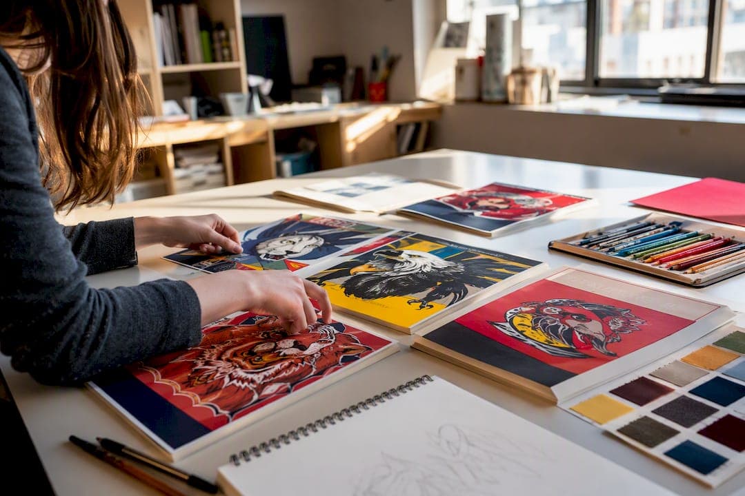
The best yearbook cover pairs a style that fits the grade level with a design that survives the press. Student art works for elementary, photo-driven or minimalist layouts suit middle school, and typography-led or premium-finish designs make high school covers feel like a keepsake. Pick your style first, then run it through a print checklist covering bleed, resolution, and spine width before anyone touches a file for final export.
TL;DR:
- Most cover styles look appealing on a screen but may not translate well to print, making resolution and color accuracy crucial.
- A minimalist design with high contrast or a single strong image reduces ink coverage and improves print quality across all grade levels.
- Proper file preparation involving bleed, safe zones, 300 DPI resolution, and CMYK color mode is essential to prevent blurry or misaligned covers.
- Budget-friendly options like minimalist designs, student-created art, or themed templates can produce professional-looking results without high costs.
- Pre-approval of proofs, especially for complex layouts like mosaics, helps avoid costly reprints or printing errors.
Table of Contents
- Six Yearbook Cover Ideas That Reliably Print Well
- 25+ Cover Concepts Organized by Style and Grade
- The Print Checklist Advisers Should Run Before Sending Files
- Choosing the Right Cover Style for Your School
- Running a Student Cover Contest Without the Chaos
- Design Mistakes That Wreck an Otherwise Great Cover
- What Successful Covers Look Like Across School Types
- Turning Your School's Theme Into an Actual Cover
- Getting a Premium Look Without a Premium Budget
- An Adviser's Honest Take on Cover Design
- Where TrailMark Fits Into Your Cover Project
- Sources
Six Yearbook Cover Ideas That Reliably Print Well
Some styles look great on a screen and fall apart at the printer. These six hold up, and each one carries its own production quirk worth knowing before students start designing.
- Minimalist. One strong image or shape, lots of white space. Fits any grade, ages well in a keepsake, and uses less ink coverage, which makes it more forgiving on press.
- Photo-driven. A single hero photo or curated collage built around the year's biggest moments. Works especially well for middle and high school. Needs high-resolution source images, since anything pixelated on a full-bleed cover shows immediately.
- Typography-led. Bold type carries the whole cover, often just a theme word or class year. Great for high school seniors. Requires embedded fonts so nothing shifts or substitutes at the print shop.
- Illustration. Custom or student-drawn art, mascots, or hand-lettered elements. A natural fit for elementary and middle school. Vector or high-res raster art holds detail better than a scanned sketch.
- Retro or vintage. Grain textures, muted palettes, throwback typefaces. Popular for reunion-style high school themes. Watch ink density; heavy texture overlays can print darker than they preview.
- Grid or mosaic. Rows of student portraits or icons tiled into a pattern. Works at any grade but shines in larger schools. Each small photo cell needs enough source resolution to stay recognizable once shrunk to size.
25+ Cover Concepts Organized by Style and Grade
Use these as starting points, not rigid templates. Swap colors, mascots, and copy to match your school's actual theme.
Minimalist
- A single school-color background with the mascot silhouette centered. Keep the silhouette in vector form so it scales cleanly at any trim size. Elementary through high school.
- One bold word ("Rise," "Onward") in a serif font over a solid color. Works best on casebound covers with foil stamping. Middle and high school.
- A thin gold-foil border framing empty space around a small icon. Foil adds cost but reads as premium on a tight design. High school.
- A single tree, star, or compass icon representing the year's theme. Simple enough for a student artist to render cleanly. Elementary.
Photo-driven
- A full-bleed action shot from the biggest sports win of the year. Crop tight and confirm the focal point survives trimming. Middle and high school.
- A collage of twelve candid photos in a loose grid with color-matched borders. Keep lighting and white balance consistent across shots. High school.
- A single senior class photo taken from above in a formation or shape. Needs a wide-angle, high-resolution capture. High school.
- A "day in the life" strip of five small photos across the bottom third. Leave the top two-thirds open for the title. Middle school.
Typography-led
- The theme phrase set in oversized type filling the entire cover. Great candidate for strong cover copy. High school.
- Class year numerals treated as the main graphic element, stacked or overlapping. Works well with spot UV on the numbers only. High school.
- Hand-lettered theme words scanned from student art, then vectorized. Keep the scan at 600 DPI minimum before tracing. Middle school.
- A short list of senior superlatives wrapped around a central mascot mark. Middle and high school.
Illustration
- A hand-drawn campus map with icons marking clubs and landmarks. Elementary and middle school.
- A mascot in an action pose, drawn by a student artist and inked digitally. Elementary through high school.
- A pattern of small icons representing every grade's activities, tiled like wallpaper. Elementary.
- A themed illustration built from a theme kit template to save design time for a small staff. Any grade.
Retro or vintage
- A faded film-strip border around a black-and-white hero photo. High school.
- A varsity-jacket color block with a large chenille-style patch graphic. Middle and high school.
- A distressed, sun-bleached texture behind bold retro type. High school.
- A rotary-phone or cassette-tape icon tied to a "Throwback" theme. Middle school.
Grid or mosaic
- Every student portrait tiled into the shape of the school's initial. High school.
- A checkerboard of class photos alternating with school-color squares. Middle school.
- A mosaic built entirely from mascot icons repeated at a small scale is a recognized cover style. Elementary.
- A grid of hobby and activity icons representing every homeroom. Elementary and middle school.
- A photo mosaic that forms the mascot when viewed from a distance. High school, with a strong design budget.
The Print Checklist Advisers Should Run Before Sending Files
Skip this and you risk a blurry cover, a shifted spine, or a rejected proof. None of it is complicated, but every item matters.
- Canvas size: build the full spread at trim size plus bleed (usually 0.125 inch on every edge), and calculate spine width from final page count and paper stock, not a guess.
- Safe zone: keep text and logos at least 0.25 inch inside the trim line so nothing gets cut during binding.
- Resolution and color: images need to sit at 300 DPI at final print size, and the whole file should convert to CMYK, not RGB, before export.
- Ink traps: avoid stacking multiple dark colors or heavy black fills near fine detail, since that's where reversed thin type tends to disappear on press.
- Finishes: foil stamping, spot UV, and embossing all read as premium, but each one adds cost and usually requires a casebound cover rather than a soft one.
- Proofing: request a hard proof any time the design uses heavy solids, specialty finishes, or reversed type, since a screen preview won't show ink coverage problems.
Pro Tip: A mosaic cover with hundreds of tiny portraits is the single hardest layout to proof on-screen. Always request a physical proof for it before locking the file.
Choosing the Right Cover Style for Your School
Run the decision through four filters before anyone opens a design program: who's the audience (parents, students, alumni), how long does this book need to last as a keepsake, what's the actual budget for finishes, and how much runway is left before the print deadline.
- Ask your printer directly: what file format do you need, do you offer a hard proof, what's the turnaround once files are approved, and who calculates spine width?
- Reject any workflow that skips a proofing step, can't confirm bleed specs, or won't put pricing in writing before you commit art time.
Pro Tip: If a vendor can't answer the spine-width question in one sentence, that's a sign they're not handling many of these covers.
Running a Student Cover Contest Without the Chaos
A student-designed cover builds buy-in fast, but it needs structure or you'll spend more time fixing files than judging art.
- Brief students clearly. Give them the trim size, theme, and two or three required elements up front.
- Collect submissions with a deadline and a simple naming convention so nothing gets lost.
- Judge against a short rubric focused on theme fit, originality, and print-readiness, not just popularity.
- Get permissions locked down. Any submission using another student's photo or likeness needs a signed release, following guidance from resources like Student Press and the Student Privacy Pledge.
- Move the winner into technical prep immediately, since student art rarely arrives print-ready on the first pass.
Design Mistakes That Wreck an Otherwise Great Cover
Most cover failures trace back to the same handful of habits.
- Reversed white text on dark backgrounds in a thin font, which can vanish once printed.
- Low-resolution images pulled from social media or phone screenshots instead of original files.
- Fonts that aren't embedded before export, causing substitutions at the print shop.
- Ignoring spine math until the last minute, leaving no room to adjust the layout.
- Skipping a flatten step on layered files, which can cause transparency errors on press.
Fix these early and you'll avoid the most common design errors advisers run into every spring.
What Successful Covers Look Like Across School Types
Elementary covers that work best usually lean on bright, illustrated mascots or a simple icon repeated across a bold color field. Kids respond to characters, not concepts, so a friendly mascot doing something active (running, cheering, waving) tends to outperform anything abstract.
Middle school covers tend to land best when they mix a strong photo with a short, punchy theme word. This is the age group most willing to embrace a bold color choice or an unconventional crop, since they're old enough to want individuality but young enough to still love a good mascot moment.
High school covers, especially senior editions, do best with restraint. A single striking image, a foil-stamped title, or a tight typography treatment reads as more mature than a busy collage. Reunion-driven retro themes also perform consistently well here, since alumni tend to keep these books for decades.
Design galleries and vendor cover libraries are useful for a reason: they show what's already been tested on a press. Browsing a cover library before committing to a concept can save a redesign later, especially if your school has never attempted a finish like foil or spot UV before.
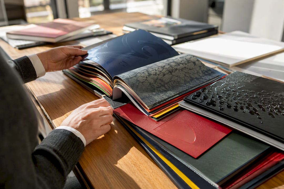
Sports-heavy schools sometimes lean into team-centric cover concepts built around a signature season. If athletics dominate your school's identity, ideas for showcasing team narratives from resources like this athlete exposure guide can translate directly into cover concepts.
Turning Your School's Theme Into an Actual Cover
A theme is a sentence. A cover is a single image, a color, and a typeface. The translation between the two is where most covers either click or feel disconnected from the rest of the book.
Start with the theme's core emotion, not its literal words. A theme like "Rooted" doesn't need a tree on the cover, but it does need imagery that feels grounded: earth tones, solid geometric shapes, a typeface with weight rather than a thin script. A theme like "Elevate" pushes the opposite direction: lighter palettes, upward diagonal lines, type that feels like it's lifting off the page.
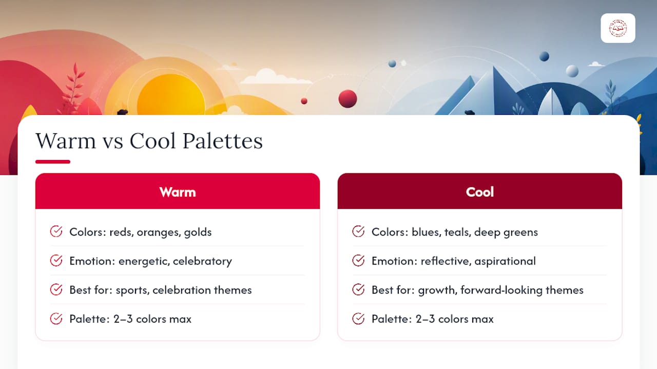
Color does most of the emotional work before a single graphic is drawn. Warm palettes (reds, oranges, golds) read as energetic and work well for sports-driven or celebratory themes. Cooler palettes (blues, teals, deep greens) read as reflective or aspirational, which fits themes about growth or looking forward. Stick to two or three colors maximum on the cover itself, and let the interior pages carry more variety.
Typography should match the theme's register. A playful, rounded theme name calls for a rounded sans-serif. A formal or nostalgic theme calls for a serif with real weight, especially for a graduating class's final book. Avoid mixing more than two typefaces on a cover regardless of theme, since a third almost always reads as cluttered rather than intentional.
Imagery follows last, and it should support the color and type choices already made rather than dictate them. If your theme kit includes matching backgrounds or icon sets, use them as a starting frame rather than a rulebook. Consistency between the cover and the interior pages matters more than any single striking image.
Getting a Premium Look Without a Premium Budget
The gap between an expensive-looking cover and a genuinely expensive one is smaller than most advisers assume. A single strong photo or illustration with generous white space almost always outperforms a busy layout, regardless of finish. Minimalist covers also happen to be the cheapest to produce well, since lower ink coverage is easier on press and forgiving of small proofing errors.
If the budget allows for exactly one upgrade, spend it on a single finish rather than spreading a small amount across several. A one-color foil stamp on a solid casebound cover reads as more premium than a full-color print with no finish at all, and it typically costs less than combining foil with spot UV or embossing.
Free or low-cost theme kits and templates close most of the remaining gap. They bundle matching layouts, icon sets, and backgrounds, which means a small staff can produce something visually consistent without hiring an outside designer. That consistency, more than any individual graphic, is what makes a budget cover look intentional instead of thrown together.
Student-created art is the other major lever. A well-briefed, well-judged student illustration or photo often reads as more original than a stock design, and it costs nothing beyond staff time to run the contest. Pair it with a simple typographic treatment for the title and class year, and the final result can sit comfortably next to a fully outsourced design.
An Adviser's Honest Take on Cover Design
Most cover disasters trace back to one decision made in week one: choosing a style before anyone thought about how it prints. A mosaic of five hundred tiny portraits looks stunning as a mockup and turns into mud once it's scaled down to an actual trim size. Advisers who ask about spine width and DPI before they fall in love with a concept save themselves a redesign in April.
The other pattern worth naming: schools that treat the cover as a separate project from the rest of the book almost always end up with a mismatch. The cover sets the visual promise; the interior pages have to keep it. A striking typography-led cover attached to a cluttered, inconsistent interior undercuts itself.
If your staff is small, lean on a theme kit and a clear student contest rather than trying to design from scratch. And when a finish or layout gives you any hesitation, ask for a physical proof. Screens lie about ink coverage more often than advisers expect, and a dedicated design resource can flag those issues before they become a reprint.
— Jace
Where TrailMark Fits Into Your Cover Project
TrailMark Yearbooks handles the production side so your staff can focus on the concept: fast 2 to 3 week turnaround, free design assistance, and flexible options whether your team works in Canva, Adobe InDesign, or our online creator. Every order comes with instant, all-inclusive pricing online, no sales calls required.
If you're testing a new finish or want to see paper stock and color reproduction before committing art time, request a sample directly from TrailMark. And if you're ready to compare full production options and turnaround details for your school, the production services overview walks through everything included in an all-inclusive order.
Sources
- Yearbook Cover Ideas That Actually Print Well (2026) - Capturely
- How to design an awesome yearbook cover - EDONext
- Student Press (Student Press Law Center / Student press resources)
- 13 Best Yearbook Cover Design Ideas - ManyPixels