
Common yearbook design errors are specific, preventable mistakes, including overcrowded layouts, low-resolution photos, and misspelled names, that directly degrade the quality and impact of a school yearbook. These errors fall under the broader discipline of print publication design, where visual hierarchy, image resolution, and copy accuracy are non-negotiable standards. Advisers who catch these mistakes early produce books that students and families keep for decades. Trailmarkyearbooks works with schools nationwide and consistently identifies the same recurring pitfalls across elementary, middle, and high school programs. This guide names each one and tells you exactly how to fix it.
1. Common yearbook design errors start with overcrowded layouts
Overcrowded pages are the single most frequent yearbook layout mistake. When every inch of a spread is filled with photos, text, and graphics, the reader's eye has nowhere to rest. The result is visual fatigue, and students stop engaging with the pages.
White space is not wasted space. It creates breathing room, separates elements, and guides the reader's eye from one section to the next. Effective layouts use clear visual hierarchy so the most important element, whether a headline photo or a section title, reads first.
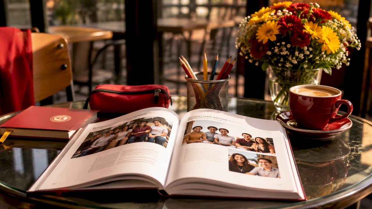
The fix is content curation. Not every photo from an event needs to appear on one spread. Choose the three or four strongest images, give them room, and let the story breathe. Spreading content logically across multiple pages produces a more professional result than cramming it onto one.
| Overcrowded page | Well-balanced page |
|---|---|
| No white space between elements | Consistent margins and padding |
| Six or more small photos competing for attention | Two to four anchor photos with clear sizing hierarchy |
| Multiple font styles and colors clashing | Two font families with consistent sizing |
| Captions overlapping images | Captions placed in dedicated text zones |
| No clear focal point | One dominant image per spread |
Pro Tip: Use layout templates that build white space in from the start. Trailmarkyearbooks offers free design assistance that includes pre-built templates with proper breathing room already factored in.
For a deeper look at layout best practices, the 2026 elementary planning guide covers visual hierarchy strategies that apply across all grade levels.
2. Low-resolution photos ruin print quality
Poor photo quality is among the top causes of print dissatisfaction in school yearbooks. Low-resolution images, screenshots taken from social media, and photos shot in poor lighting all look acceptable on a phone screen. They look blurry and pixelated in print.
Print requires a minimum of 300 DPI (dots per inch). Most smartphone photos taken at full resolution meet this standard. The problem is that images downloaded from Instagram, Facebook, or group chats are compressed and often fall well below 300 DPI. Advisers who skip the verification step discover the problem only after books are printed.
Build a photo collection process that filters out low-quality submissions before they reach the layout stage. Ask photographers and students to submit original files, not screenshots or forwarded images. Use a shared folder, such as Google Drive or Dropbox, where students upload full-resolution originals directly.
Photo sourcing best practices for print-ready yearbooks:
- Collect original camera or smartphone files, not compressed copies
- Reject any image smaller than 1,500 pixels on its shortest side
- Avoid screenshots from any social media platform
- Check lighting before accepting event photos; dark or blurry images do not improve in print
- Label every submitted photo with the event name and date at the time of submission
Pro Tip: Vet every photo before placing it in a layout. A quick resolution check takes seconds and prevents a costly reprint. The yearbook photography checklist from Trailmarkyearbooks walks coordinators through this process step by step.
3. Accuracy errors embarrass schools and hurt students
Misspelled names and wrong event details are the most common preventable yearbook mistakes. A student whose name is misspelled in their senior portrait caption will remember that error for years. Wrong scores, incorrect dates, and misidentified faces carry the same weight.
The recommended standard is a triple-proof process: three independent reviewers check every spread before it locks. Each reviewer brings fresh eyes and catches errors the previous reader missed. One person reviewing their own work is not sufficient.
Proofreading steps that reduce accuracy errors:
- Cross-check every name against the official school roster
- Verify every event date against the school calendar
- Confirm sports scores and team records with coaches directly
- Read captions aloud to catch awkward phrasing and missing words
- Have a reviewer who was not involved in layout check the spread cold
- Lock the page only after all names and captions are confirmed
Placeholder text is a separate but related trap. Captions marked "TBD" or left with question marks during the design phase regularly reach final print when teams rush to meet deadlines. Experienced teams lock pages only after every caption contains a confirmed name, or they remove the placeholder entirely rather than risk it printing.
4. Typography mistakes that reduce readability
Typography errors rank among the most visible common graphic design errors in yearbooks. Using too many font families, insufficient contrast between text and background, and improper font sizes all degrade readability and make a book look amateurish.
Best practice limits a yearbook to 2–3 font families total. One font for headlines, one for body copy, and one optional accent font for pull quotes or section labels. More than three creates visual noise that competes with photos and content.
Font size and contrast matter as much as font choice. Body copy set below 9 points becomes difficult to read in print. Decorative or script fonts used for body text slow readers down and cause fatigue. Reserve decorative fonts for headlines only, and always check that text color contrasts clearly against its background.
Typography best practices for yearbook advisers:
- Limit the yearbook to 2–3 font families throughout
- Set body copy at 9–11 points minimum for print legibility
- Use decorative fonts only in headlines, never in captions or body text
- Check text-to-background contrast before finalizing any spread
- Apply consistent font sizes across all similar elements, such as all captions at the same size
Pro Tip: Create a style guide at the start of the project and enforce it with master pages in your design software. Consistent formatting is the fastest way to make a yearbook look professionally produced.
5. Ignoring margins and gutter zones cuts off content
Ignoring margins and gutter zones causes images and text to be physically cut off during binding or trimming. This is one of the most frustrating yearbook layout issues because it is entirely avoidable and only becomes visible after printing.
The gutter is the inner margin where two pages meet at the binding. Any content placed too close to the gutter disappears into the spine. Trim zones on the outer edges of a page can also clip content if designs extend too close to the edge without accounting for production tolerances.
Designs must respect safe zones and maintain consistent margins on all four sides of every spread. Most professional design programs, including Adobe InDesign and Canva, allow advisers to set margin guides that make safe zones visible during layout. Use them on every page, not just the first few.
The school yearbook policy guide from Trailmarkyearbooks covers margin and safe zone standards that align with standard print production requirements.
6. Budget and procurement mistakes that affect print quality
Common yearbook budget mistakes often start with assumptions about print quality that turn out to be wrong. Sample promotional prints frequently use different paper stocks and finishes than schools' standard orders. An adviser who approves a vendor based on a promotional sample may receive a final book that looks and feels noticeably different.
Procurement teams should request samples from the actual production run or equipment planned for their order. This is the only reliable way to assess true print quality before committing to a full order. A well-organized procurement process also verifies paper weight, binding strength, print consistency, and vendor communication before signing any agreement.
Over-ordering is another common yearbook procurement mistake. Ordering significantly more books than the school needs ties up budget that could fund better paper stock or additional pages. Accurate pre-sales data, collected before the order is placed, prevents this.
| Print factor | What to verify |
|---|---|
| Paper stock | Confirm GSM weight matches the sample you approved |
| Binding type | Verify binding strength holds for the page count ordered |
| Color accuracy | Request a color proof before the full run begins |
| Turnaround time | Confirm production timeline in writing, not verbally |
Clear vendor communication prevents the most costly surprises. Put every specification in writing, including paper type, cover finish, page count, and delivery date. Verbal agreements in print procurement regularly lead to disputes and delays.
For detailed planning guidance, the yearbook budget planning guide covers how to structure procurement decisions from the first quote through final delivery.
Key Takeaways
Avoiding common yearbook design errors requires consistent processes across layout, photo quality, proofreading, typography, and procurement before a single page goes to print.
| Point | Details |
|---|---|
| Overcrowding is the top layout error | Use white space and limit photos per spread to create visual hierarchy. |
| 300 DPI is the print minimum | Collect original files and reject compressed or screenshot images before layout. |
| Triple-proof every spread | Three independent reviewers catch accuracy errors that one person misses. |
| Limit fonts to 2–3 families | Consistent typography makes a yearbook look professionally produced. |
| Request production-run samples | Promotional samples use different stock; verify quality from the actual print run. |
What I've learned from watching the same mistakes repeat every year
After working with schools on yearbook production for years, the pattern is clear. The advisers who produce the best books are not the ones with the biggest budgets or the most design experience. They are the ones who build structured processes and stick to them, even when the deadline pressure builds.
The most damaging mistakes I see are not creative failures. They are process failures. A team that never establishes a photo resolution standard will always end up with blurry images. A team that skips the second and third proof will always find a misspelled name after the books arrive. These are not bad luck. They are predictable outcomes of skipping steps.
The other pattern worth naming is the tendency to over-fill pages. Advisers often feel pressure to include every photo from every event, as if leaving something out is a failure. The opposite is true. A spread with four strong, well-sized photos tells a better story than a spread with twelve tiny ones. Curation is a skill, and it produces a better book.
My honest advice is to start earlier than you think you need to, assign specific roles to specific people, and never let a page lock without a fresh set of eyes on it. The yearbook is a permanent record. The time you invest in getting it right is worth every hour.
— Jace
Trailmarkyearbooks: built for error-free yearbook production
Trailmarkyearbooks gives advisers the tools and support to avoid the mistakes covered in this guide. With free design assistance, flexible design options using Canva, InDesign, or the Trailmarkyearbooks online creator, and a team backed by 50+ years of combined experience, the production process is designed to catch errors before they reach print.
Advisers who want to verify print quality before committing to a full order can request a physical sample directly from Trailmarkyearbooks. The sample reflects actual production quality, not a promotional version. For schools ready to move forward, the full range of yearbook production services includes all-inclusive pricing with no hidden fees, no order deadlines, and shipping included. Fast 2–3 week turnaround times mean advisers are not forced into rushed decisions that lead to procurement mistakes.
FAQ
What is the most common yearbook design error?
Overcrowding is the most frequent yearbook layout error. Pages with no white space cause visual fatigue and reduce reader engagement.
What resolution do yearbook photos need to be?
Yearbook photos must meet a minimum of 300 DPI for print. Images downloaded from social media are typically compressed below this threshold and will appear pixelated in the final book.
How many times should a yearbook spread be proofed?
A triple-proof process using three independent reviewers is the recommended standard. Each reviewer catches errors the previous one missed.
How many fonts should a yearbook use?
Best practice limits a yearbook to 2–3 font families total. More than three creates visual noise that competes with photos and reduces readability.
How do I avoid common yearbook procurement mistakes?
Request print samples from the actual production run, not promotional samples, and confirm all specifications in writing before placing your order.