
Elementary school yearbook planning is the process of organizing, designing, and producing a memory book built specifically for young students' developmental levels, visual learning styles, and community-centered school experiences. Done well, it results in a keepsake families hold onto for decades. Done poorly, it becomes a rushed, text-heavy document that misses the point entirely. This guide gives elementary school yearbook coordinators and teachers a practical, step-by-step framework covering tools, design principles, photo strategy, timelines, and personalization, all grounded in what actually works for K through 5 students.
What are the essential tools for elementary yearbook planning?
The right software is the single biggest factor separating a polished yearbook from a frustrating production cycle. For elementary schools, the best yearbook creator tools combine drag-and-drop simplicity with pre-built templates sized for varying class rosters. Platforms like Canva, Adobe InDesign, and dedicated yearbook online creator tools each serve different skill levels and budget ranges. Canva works well for coordinators with no design background, while InDesign gives experienced designers precise control over layout and typography.
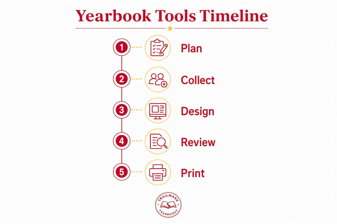
Beyond design software, you need organizational infrastructure. A shared Google Drive or Dropbox folder for photo collection, a Google Sheet for tracking submissions by classroom, and a printed or digital checklist for milestone deadlines form the backbone of any well-run project. Deadline management is where most elementary yearbook projects fall apart, so building your checklist before the school year starts is non-negotiable.
Pre-calculated smart templates tailored to class sizes avoid common layout headaches and help maintain a professional look throughout the yearbook. This matters more at the elementary level than anywhere else, because class sizes fluctuate between grades and even between sections of the same grade.
| Tool | Best for | Key feature |
|---|---|---|
| Canva | Beginners and volunteers | Drag-and-drop templates, free tier available |
| Adobe InDesign | Experienced designers | Precise layout control, professional output |
| TrailMark online creator | School coordinators | Built-in templates, adviser support included |
| Google Workspace | Organization and collaboration | Shared folders, real-time editing, free |
Pro Tip: Set up your photo submission folder structure by classroom before you send a single request to teachers. Folders labeled by grade and teacher name cut sorting time by more than half.
How to develop an age-appropriate yearbook design and theme
The most effective elementary yearbook design principle is a 90% photo to 10% text ratio to match developmental reading levels. Young students do not read their yearbooks the way middle schoolers do. They flip through pages looking for their own face and the faces of their friends. Dense text blocks go unread and waste valuable page real estate.

Choosing the right theme sets the visual and emotional tone for the entire book. Elementary yearbook themes focusing on growth and learning metaphors resonate best, with examples like "Growing and Glowing" or "Read, Learn, Shine" landing well with both students and families. These themes feel timeless rather than tied to a specific pop culture moment, which means the book holds its meaning years after graduation. Themes built around community, discovery, or the school's own mascot also perform consistently well.
Color and font choices should reflect the school's existing identity. Using the school's official colors as your primary palette creates instant recognition and cohesion. Stick to two fonts maximum: one display font for headings and one clean sans-serif for any body text. Comic Sans is the obvious trap to avoid. Fonts like Nunito, Poppins, or Fredoka One strike the right balance between playful and readable.
One design decision that trips up many coordinators is the superlative section. Elementary schools should avoid superlative sections like "Best Dressed" to prevent hurt feelings and promote inclusivity. At this age, singling out individual students for comparative rankings creates social friction that parents and principals notice immediately. Replace superlatives with group-focused features like "Our Favorite Books This Year" or classroom-wide memory prompts.
Pro Tip: Pull your school's hex color codes from the official website or ask the front office. Using exact brand colors rather than approximate matches makes the finished book look intentional and professional.
What are the best photo strategies for elementary yearbooks?
Photo size recommendations follow a clear logic tied to class roster size and student age. For Kindergarten through 2nd grade, layouts with photos about 1.93 inches high ensure high visibility, while 3rd through 5th grade layouts optimize photos at about 1.63 inches for larger rosters. Smaller photos in the lower grades make faces harder to identify, which defeats the purpose for five-year-olds who are still learning their classmates' names.
Using a uniform photo size layout based on the largest class grade for the entire book creates a cohesive visual look and reduces last-minute formatting headaches. This is a counterintuitive but proven approach. Rather than customizing each grade's layout to its exact roster size, pick the layout that fits your biggest class and apply it consistently. Smaller classes simply have more white space, which actually reads as clean and intentional.
Prioritize candid group photos of 3 to 5 students over solo portraits to represent friendship and community in elementary yearbooks. Solo portrait grids feel clinical at this age. A photo of four kids laughing at lunch or working together on a science project tells a richer story and captures the actual texture of elementary school life. Aim for a mix of classroom shots, recess moments, special events, and field trips.
| Grade range | Recommended photo height | Roster consideration |
|---|---|---|
| Kindergarten to 2nd grade | ~1.93 inches | Smaller rosters, larger faces needed |
| 3rd to 5th grade | ~1.63 inches | Larger rosters, more photos per page |
| All grades (uniform approach) | Largest class standard | Consistent look, simplifies layout work |
Pro Tip: Ask each classroom teacher to submit at least 20 candid photos from their own phone or camera throughout the year. Teachers capture moments that a designated photographer misses entirely, and the images feel authentic rather than staged.
How to organize the yearbook planning timeline and roles
Scheduling with clear milestone deadlines from the start of the school year helps coordinators meet production and distribution goals effectively. The most successful coordinators map the entire year in August, working backward from the desired distribution date in May or June. That reverse-engineering approach reveals exactly when photo collection, layout drafts, and proofing rounds need to happen.
A practical timeline for a May distribution looks like this:
- August to September: Finalize theme, set up photo submission system, assign roles, and confirm software and printing vendor.
- October to November: Collect fall event photos, begin layout templates, and send first photo request to teachers.
- December to January: Complete class photo pages, collect winter event photos, and run a mid-year check on photo gaps.
- February to March: Finalize all layouts, complete personalization pages, and submit for first proof review.
- April: Approve final proof, confirm print order, and prepare distribution logistics.
- May to June: Distribute yearbooks and collect feedback for next year's planning cycle.
Role clarity is what separates a smooth production from a chaotic one. Assign one lead coordinator, one photo manager, one layout designer, and at least two teacher liaisons who are responsible for gathering classroom submissions. Recruiting and involving student helpers requires clear role definitions and age-appropriate tasks to keep the process efficient and inclusive. At the elementary level, student involvement works best in the personalization phase rather than the layout phase. Fifth graders can write memory prompts, vote on themes, and help sort photos without needing design software access.
Review your yearbook adviser responsibilities at the start of each year to make sure every task has an owner. Unassigned tasks are the primary cause of missed deadlines.
How to personalize elementary yearbooks for lasting student engagement
"About Me" pages with student-filled prompts placed at the book's front or back enhance personalization and engagement significantly. These pages give every student a dedicated space that belongs entirely to them, which is the single most powerful driver of yearbook excitement at the elementary level. Prompts should be simple and open-ended: "My favorite thing about school this year," "When I grow up I want to," or "My best memory from 3rd grade."
Placing the interactive "About Me" section in immediately visible locations increases student engagement upon receiving their yearbooks. The first and last pages of a book are the ones students open first. Burying personalization content in the middle means many students never find it.
Effective personalization strategies for elementary yearbooks include:
- Handwritten signature pages with designated space for classmates to sign, using simple prompts like "Write something nice about me."
- Classroom memory spreads built from teacher-submitted candid photos and a single group quote chosen by the class.
- Student-drawn artwork incorporated as section dividers or border elements, which adds an authentically elementary feel that no stock graphic can replicate.
- Grade-level memory prompts printed directly on the page, so students fill them in at distribution rather than needing to remember to do it later.
Pro Tip: Send "About Me" prompt sheets home with students two weeks before your layout deadline. Collect completed sheets, scan them, and place the scanned handwritten versions directly into the layout. Handwriting beats typed text every time for this age group.
Key takeaways
Effective elementary school yearbook planning requires a photo-first design approach, a structured timeline with assigned roles, and personalization features that give every student a visible stake in the finished book.
| Point | Details |
|---|---|
| Photo-first design | Use a 90% photo to 10% text ratio to match how young students actually engage with their yearbooks. |
| Uniform layout strategy | Base your photo size on the largest class roster and apply it consistently across all grades. |
| Theme selection | Choose growth and learning themes like "Growing and Glowing" that stay meaningful for families long after the school year ends. |
| Timeline structure | Map your full production calendar in August, working backward from your May or June distribution date. |
| Personalization placement | Put "About Me" pages and signature sections at the front or back of the book where students find them immediately. |
Why photo-first design is the decision that changes everything
I have reviewed a lot of elementary yearbooks over the years, and the ones that fall flat share one consistent flaw: too much text. Coordinators add captions, bios, quotes, and section introductions because it feels like more content equals more value. It does not. A first grader does not read a paragraph about the school's mission statement. They point at a photo and say "that's me."
The 90/10 photo-to-text rule is not a suggestion. It is the structural reality of how young children interact with printed material. When you commit to it fully, every layout decision becomes easier. You stop debating whether to include a teacher quote and start asking which photo tells the better story.
The other thing I would push back on is the instinct to make every grade's layout unique. Consistency across grades is not laziness. It is professionalism. Families with kids in multiple grades notice when the kindergarten spread looks completely different from the fourth-grade spread. A unified visual system signals that someone was in charge and had a plan.
Inclusivity through group photos rather than superlatives is not just a feel-good choice. It is the right editorial decision for this age group. The yearbook should reflect the community, not rank it. Every student should be able to open the book and find themselves in a moment that looks joyful, not competitive.
Student participation in the personalization phase is where the magic actually happens. When kids fill in their own "About Me" prompts and sign each other's pages, the yearbook becomes an artifact of their relationships, not just a school document. That is what families keep.
— Jace
How Trailmarkyearbooks supports your elementary yearbook project
Trailmarkyearbooks builds yearbook solutions specifically designed to reduce the stress that coordinators and teachers feel every spring. With flexible design options using Canva, InDesign, or the TrailMark online creator, you can work in whatever environment fits your skill level and schedule. There are no hidden fees, no order deadlines, and shipping is included in every package. Trailmarkyearbooks also offers free design assistance for schools that need support getting layouts right the first time.
Start by downloading the adviser planning resources to get step-by-step checklists built for elementary school timelines. When you are ready to evaluate print quality and design options in person, request a sample to see exactly what your finished yearbook will look and feel like before you commit.
FAQ
What is an elementary school yearbook?
An elementary school yearbook is a printed memory book documenting a school year for K through 5 students, featuring class photos, candid shots, and personalization pages designed for young readers. Unlike high school yearbooks, elementary versions prioritize photos over text to match developmental reading levels.
What yearbook design ideas work best for young students?
Themes centered on growth and learning, such as "Growing and Glowing" or "Read, Learn, Shine," resonate most with elementary students and their families. Pair the theme with the school's official colors and a maximum of two readable fonts for a cohesive result.
What photo sizes should I use for elementary yearbook layouts?
Kindergarten through 2nd grade photos work best at approximately 1.93 inches high, while 3rd through 5th grade photos optimize at about 1.63 inches to accommodate larger rosters. Using the largest class size as your uniform standard across all grades simplifies the layout process significantly.
How early should elementary yearbook planning start?
Planning should begin at the start of the school year, ideally in August or September, with a full production calendar mapped backward from your May or June distribution date. Early planning gives you time to collect photos from every classroom without a last-minute scramble.
Should elementary yearbooks include superlative sections?
Elementary yearbooks should not include superlative sections like "Best Dressed" or "Most Likely To," as these create social comparisons that are developmentally inappropriate for young students. Group-focused features and classroom memory spreads are a more inclusive and effective alternative.