

The fastest, most reliable way to build yearbook class pages is a mix of portrait grids and one or two feature spreads, sized to your enrollment and locked to your printer's trim and bleed specs before anyone touches a template. Get the sizing right first. Everything else, from photo collection to caption style, builds on that one decision. Yearbook providers often work with schools on this kind of page planning.
TL;DR:
- Choose a grid size that matches your student enrollment, with larger portraits for smaller groups and split spreads for over 60 students to maintain clarity.
- Lock your page template's margins, color schemes, and placement rules early to ensure consistency across all sections and avoid rework.
- Build your yearbook files with proper bleed, gutter space, and a CMYK color profile, and run a thorough preflight checklist before printing.
- Initiate photo collection and layout planning at least three months before printing, using streamlined forms and assigning staff to minimize delays.
- Utilize professional support from TrailMark Yearbooks to verify design sizing, get sample proofs, and avoid common pitfalls caused by mismatched grids and enrollment numbers.
Table of Contents
- What Are the Best Yearbook Class Page Types and Ideas?
- Portrait Grid Templates: What Column Count Works for Your Enrollment?
- Print and Layout Rules: Bleed, Trim, and Gutters
- Building a Yearbook Timeline That Actually Works
- Keeping Class Pages Consistent While Still Making Seniors Feel Special
- How TrailMark Yearbooks Supports Class Page Production
- Where Advisers Get Class Pages Wrong
- Getting Started: Request a Sample or Instant Pricing
- Sources
What Are the Best Yearbook Class Page Types and Ideas?
Most yearbooks lean on four page types, and picking the right mix matters more than picking the trendiest one.
- Portrait grids by class or grade — the backbone of any yearbook, organized by teacher, homeroom, or grade level.
- Feature spreads for milestones like homecoming, prom, or a championship season, with fewer photos shown larger.
- Themed collages built around a class motto, a color scheme, or a shared activity.
- Q&A or student-submitted pages, where kids answer a prompt ("best memory this year") next to their portrait.
Portrait grids are non-negotiable. Every student expects to find their face somewhere. Feature spreads and collages are where you earn engagement, because they showcase personality instead of rows of headshots.
For schools with thin staff bandwidth, three shortcuts speed things up without sacrificing quality:
- Assign one student per homeroom to collect quotes or Q&A answers, so the adviser isn't chasing 30 kids individually.
- Reuse a single collage template across grade levels, swapping only the color accent and one graphic cell per section.
- Cap feature spreads at two or three per class section. More than that and staff time balloons.
Prioritize feature spreads over denser portrait grids when a class had a genuinely unusual year. A quiet homeroom probably just needs a clean grid.
Portrait Grid Templates: What Column Count Works for Your Enrollment?
Portrait size and grid density should scale with how many students you're fitting on a spread. Cram 60 kids into a grid built for 20, and you get thumbnail-sized faces nobody can identify. Template guidance from yearbook editors breaks this down by enrollment band, which is the fastest way to pick a starting layout.
| Students per spread | Suggested grid | Approx. portrait size | Notes |
|---|---|---|---|
| Up to 20 | 4 columns x 6 rows | Larger crop, room for names below each photo | Good candidate for a themed border or accent |
| 21–40 | 5 columns x 8 rows | Medium crop | Standard grade-level grid |
| 41–60 | 6 columns x 10 rows | Smaller, tighter crop | Keep name lines short (first name + last initial if space is tight) |
| More than 60 | Split across two spreads | Standard crop maintained | Split by homeroom or alphabetically rather than shrinking portraits further |
Name lines belong directly under each portrait, never overlapping the image, and section identifiers (teacher name, grade, homeroom number) should sit in a consistent header position on every spread so students can find their class fast.
Pro Tip: If your grid math pushes portraits below roughly one inch tall, stop and split the section into two spreads instead. A portrait too small to recognize defeats the entire purpose of the page.
Print and Layout Rules: Bleed, Trim, and Gutters
Printers cut physical pages to an exact trim size, and any design element that isn't set up with bleed risks getting sliced off or leaving an unintended white sliver at the edge. Files need to be built larger than the finished page. For an 8.5x11 book, Memento's export specs call for an 8.75" x 11.25" file at 300 dpi, with a 0.125-inch bleed trimmed off after printing.
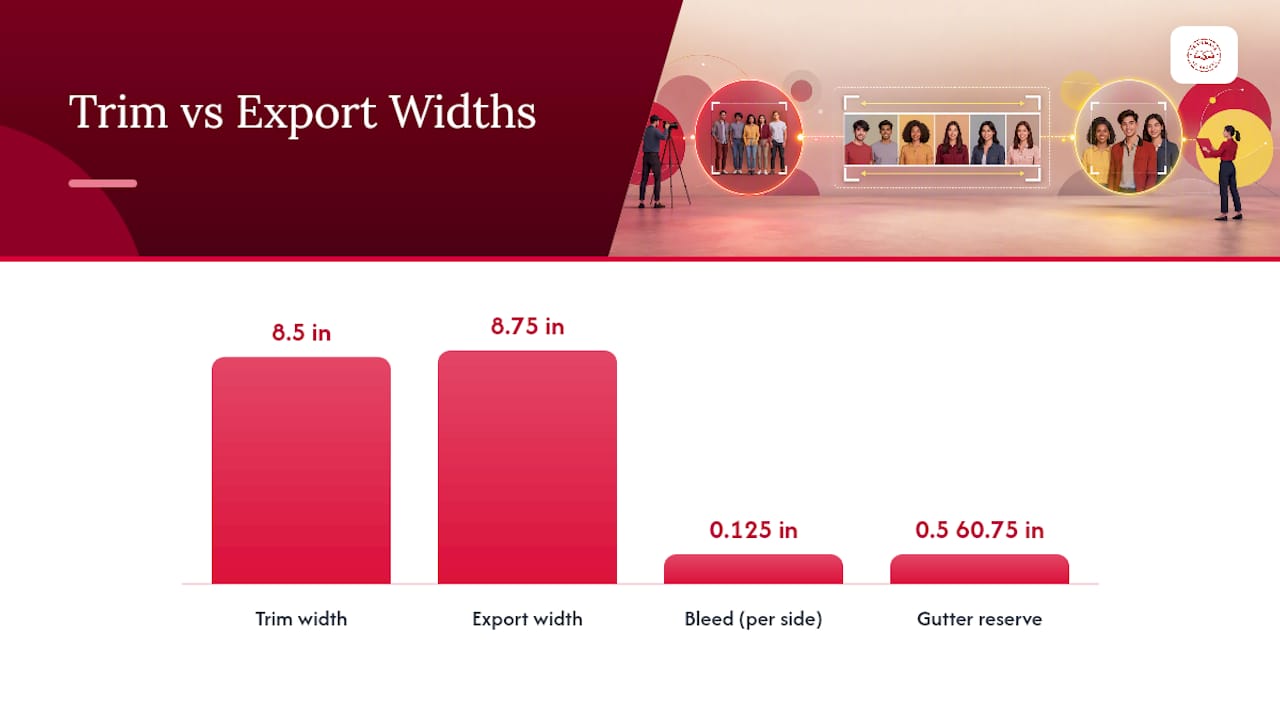
Gutters matter just as much on portrait spreads. Reserve 0.5 to 0.75 inches of gutter space near the spine, and never let a portrait cell or name line cross into that zone. A face lost in the binding is the single most common complaint advisers hear from parents.
Before sending files, run through this checklist:
- File named by page number and section (avoids print-order mistakes)
- CMYK color profile, not RGB
- Fonts embedded or outlined
- Images at 300 dpi minimum, no upscaled low-res portraits
- Bleed and trim marks match your printer's exact size, whether that's 8.5x11 or 9x12
Building a Yearbook Timeline That Actually Works
A workable class page timeline starts months before your print deadline, not weeks.
- 10-12 weeks out: schedule portrait retakes and photo day, and open a submission window for candid photos from students and staff.
- 8-10 weeks out: collect quotes, Q&A answers, and captions using a shared form or template so nothing arrives in a dozen different formats.
- 6-8 weeks out: build first-draft grids and spreads; confirm which sections need feature treatment versus a straight portrait grid.
- 3-4 weeks out: proofread every caption and name spelling, then run the preflight checklist above.
- 1-2 weeks out: submit for printing with buffer time for a proof review.
For caption collection, a simple script works better than an open-ended form: "Name (as it should appear in print), grade, one sentence about your year." That structure alone eliminates most of the back-and-forth editing.
Pro Tip: Assign a backup proofreader who didn't write the captions. A second set of eyes catches misspelled names faster than the person who typed them.
Keeping Class Pages Consistent While Still Making Seniors Feel Special
Consistency is what makes a 150-page yearbook feel like one book instead of 40 disconnected projects. Lock a few decisions early and apply them everywhere:
- One margin measurement and one type scale for all body text and captions.
- A single accent color system tied to each grade level or section.
- Name-line placement that never varies from spread to spread.
- Locked templates for feature spreads and portrait grids, so late edits don't cause unexpected reflow.
Senior sections earn a little extra: larger portraits, a personal quote line, or a "senior stats" callout are the standard upgrades. Just keep the underlying grid and type rules identical to the rest of the book. Check legibility in both the print proof and any digital version, since small caption text that reads fine on screen can disappear at trim size.
How TrailMark Yearbooks Supports Class Page Production
Advisers don't have to build every grid from scratch. TrailMark Yearbooks offers free design assistance alongside flexible tools, whether your staff prefers Canva, Adobe InDesign, or TrailMark's own online creator. That flexibility matters when your yearbook team has three different comfort levels with design software.
Production support includes preflight checks before printing and sample proofs, so sizing errors get caught before the whole print run is committed. For the mechanics of grid setup, TrailMark's grid system guide and visual hierarchy guide walk through the same template logic covered above.
Where Advisers Get Class Pages Wrong
Most class page failures aren't creative problems. They're sizing problems dressed up as design problems. An adviser picks a beautiful Pinterest layout, drops it into a 60-student homeroom, and only discovers at proof stage that portraits shrank to postage-stamp size. Idea boards are genuinely useful for inspiration, but they're built for inspiration, not for your specific enrollment number, and that gap is where most rework happens.
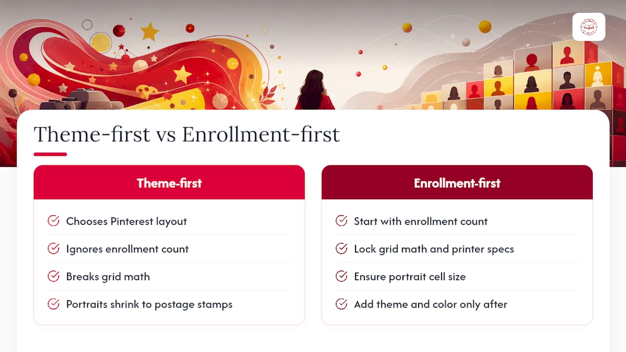
The conventional advice tells advisers to "start with a theme." That's backwards. Start with your enrollment count and printer specs, lock the grid math, and only then layer in theme and color. A gorgeous collage that pushes a portrait cell into the gutter isn't a design win. It's a reprint request waiting to happen.
If there's one thing I'd tell every new adviser: don't let the most enthusiastic student on staff talk you into a layout that ignores the column math in the table above. Enthusiasm doesn't scale portraits. Grids do. Spend your creative energy on the feature spreads and Q&A pages, where personality actually shows up, and keep the portrait grids boring and correct.
— Jace
Getting Started: Request a Sample or Instant Pricing
TrailMark Yearbooks gives schools instant, all-inclusive pricing online, no sales call required, so you can see real numbers before committing staff time to a layout. If you want to check print quality and template fit before placing a full order, request a sample yearbook and have your enrollment count and preferred book size (8.5x11 or 9x12) ready when you do.
Turnaround runs 2 to 3 weeks once files are submitted, with no order deadlines forcing you into a rushed schedule. Free design assistance is included, so if your grids need a second look before printing, TrailMark's team can help catch sizing issues before they become reprint costs. Shipping is included in the quoted price, with no hidden fees added later. When your class pages are built and proofed, you can move straight to ordering production with the same transparent pricing you saw upfront.
Sources
- Yearbook Page Layouts: Template Guide for Editors Designing Every Section
- Yearbook Size - Dimension, Inches, mm, cms, Pixel