

Yearbook visual hierarchy is defined as the deliberate arrangement of design elements so readers process content in order of priority, from the most important to the least. This principle sits at the core of every effective yearbook layout. Without it, spreads feel random, readers lose their place, and key moments get buried. With it, every page tells a clear story. Understanding visual hierarchy in yearbooks means knowing how size, color, placement, and spacing work together to guide the eye and create layouts that students actually want to read.
What is yearbook visual hierarchy and why does it matter?
Visual hierarchy in yearbooks is the system that tells readers where to look first, second, and third on any given spread. Professional yearbook design organizes page content into three distinct roles: dominant, secondary, and tertiary. The dominant element commands the most attention, usually a large anchor photo. Secondary elements, such as supporting photos and headlines, provide context. Tertiary elements, including captions and small graphic accents, fill in the details.
Successful layouts create clear entry points that guide readers logically through the spread rather than dumping all content at equal weight. That logical sequence is what separates a yearbook that feels polished from one that feels like a collage. When advisers apply visual hierarchy consistently, students can find their photos faster, stories read more clearly, and the book holds up as a document worth keeping for decades.

The importance of visual hierarchy goes beyond aesthetics. It directly affects how well students and families connect with the content. A spread with no clear focal point forces the reader's brain to work harder. Most readers simply move on.
Core principles of visual hierarchy in yearbook design
Four foundational principles drive visual hierarchy in yearbooks: size and scale, color contrast, alignment, and repetition. Each one shapes how a reader's eye moves across the page.
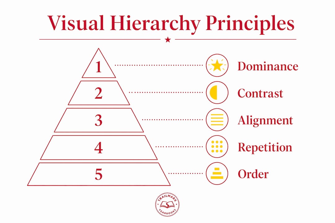
Size and scale are the most direct tools. A photo that fills half a spread signals dominance immediately. Smaller photos read as supporting evidence. The size relationship between elements tells readers what matters most before they read a single word.
Color contrast controls readability and visual interest. Bright contrasting colors for headers or text boxes enhance page appeal even in minimalist designs. A dark headline on a light background reads faster than a gray headline on a white background. Contrast is not decoration. It is a functional tool.
Alignment creates the sense of order that readers feel even when they cannot name it. When text blocks, captions, and photos share a common edge or baseline, the spread feels intentional. When they do not, the page feels accidental.
Repetition ties the spread together. Repeating a font size for all captions, a consistent color for pull quotes, or a standard photo border across a section trains the reader's eye to recognize patterns. That recognition speeds up comprehension.
Key elements that carry hierarchy in a yearbook spread include:
- Dominant anchor photo (largest image, clearest subject)
- Section headline (largest text element, typically at the top or left entry point)
- Secondary photos (supporting the main story, proportionally smaller)
- Captions (smallest text, aligned to their corresponding photo)
- Graphic accents (theme elements that add personality without competing for attention)
Pro Tip: Run a squint test on every spread before submitting. Blur your vision slightly and look at the page. The dominant element should still be obvious. If nothing stands out, the hierarchy is too flat.
How do grids and baseline systems establish visual hierarchy?
Grid systems are the structural backbone of yearbook page composition. A 4-column or 6-column grid creates flexible zones that define where dominant, secondary, and tertiary content lives. A 4-column grid works well for simpler layouts with one or two strong focal points. A 6-column grid gives more flexibility for complex spreads with multiple photos and text blocks.
Grids do more than organize photos. They define the relationships between elements. When a dominant photo spans four columns and a secondary photo spans two, the size ratio communicates priority without any additional design work. Consistent grid application prevents layouts from feeling random or cluttered, which is the most common complaint readers have about poorly designed yearbooks.
Margins and gutters are equally important. Professional standards recommend at least 0.125-inch margins for bleed images to maintain print integrity. Gutters, the spaces between columns, keep elements from crowding each other and give the eye room to rest between content zones.
The baseline grid is the element most advisers overlook entirely. It governs the invisible horizontal lines that keep text blocks, captions, and headlines aligned across the spread. Most advisers overlook baseline grids, yet they are the difference between a spread that feels organized and one that feels slightly off even when you cannot identify why. When a caption drops two pixels below the baseline, readers do not consciously notice. But they feel it as disorder.
| Grid element | Function | Common mistake |
|---|---|---|
| Columns (4 or 6) | Define dominant and secondary content zones | Using too few columns, limiting layout flexibility |
| Margins | Protect content from print bleed | Setting margins too narrow for bleed images |
| Gutters | Separate content zones for visual breathing room | Eliminating gutters to fit more content |
| Baseline grid | Align all text elements horizontally | Ignoring baseline alignment for captions |
Pro Tip: Turn on your baseline grid in whatever design tool you use, whether that is Canva, Adobe InDesign, or an online creator. Snap all text elements to it before finalizing any spread. This single habit eliminates most of the "something feels off" feedback you get during reviews.
Practical layout strategies for dominant elements and supporting content
The single most common layout mistake in yearbooks is treating every photo as equal priority. Treating all photos as equal priority dilutes hierarchy and muddles the visual story. One photo must be clearly larger than the rest. That dominant image anchors reader attention and makes every other element on the page easier to process.
A reliable approach to photo sizing follows a simple ratio. The dominant photo should occupy roughly twice the space of the next largest photo. Secondary photos should be noticeably smaller but still large enough to read clearly. Tertiary photos, if used, serve as texture rather than focal points.
White space is a tool, not wasted space. White space prevents clutter, improves readability, and directs attention to the elements that matter. Advisers who fill every inch of a spread with content actually reduce the impact of their best photos. Empty space around a dominant image makes it feel more important, not less.
A practical sequence for building a spread with strong hierarchy:
- Place the dominant photo first. Size it to occupy the largest zone on the grid.
- Write and place the section headline. Position it at the natural entry point, typically the top left or directly adjacent to the dominant photo.
- Add secondary photos in proportionally smaller grid zones. Keep at least one gutter of white space between each element.
- Place captions directly below or beside their corresponding photo. Align them to the baseline grid.
- Add graphic accents last. Graphic accents should enhance but not overwhelm the overall hierarchy. Scale them to tertiary status.
Pro Tip: Build your spread in layers. Lock the dominant photo and headline in place before adding anything else. This forces you to commit to the hierarchy before filling in details, which is where most layout decisions go wrong.
Placement zones matter as much as sizing. Readers in Western cultures enter a page from the top left. Placing the dominant photo or headline in that zone captures attention immediately. Captions placed far from their photos break the visual connection and slow comprehension.
How does visual hierarchy improve storytelling and student engagement?
Strong hierarchy increases emotional connection and reader engagement with yearbook content. That is not a design theory. It is a practical outcome. When a reader's eye moves naturally from a dominant game-winning photo to a supporting headline to a caption with the player's name, the story lands. When those same elements compete for attention at equal size, the story dissolves into noise.
Visual hierarchy supports memory recall. Readers remember pages with clear focal points more vividly than pages with scattered content. For a yearbook, which exists specifically to preserve memories, that is a critical function.
Hierarchy also creates narrative flow across an entire spread. A well-designed two-page spread reads like a short story: the dominant image sets the scene, secondary photos develop the narrative, and captions provide the specific details. Advisers who teach their staff to think in these terms produce books that feel cohesive rather than assembled.
Benefits of strong visual hierarchy for student engagement include:
- Faster recognition of personal photos and names, which drives purchase interest
- Clearer storytelling that makes events feel significant rather than routine
- Consistent page structure that helps readers navigate the book without confusion
- Higher perceived quality, which reflects well on the school and the yearbook staff
- Greater pride among student designers who see their work read as professional
Teaching these principles to student staff is one of the highest-value investments a yearbook adviser can make. Students who understand yearbook design principles produce better work faster and require fewer revisions. They also carry those skills into every design project they touch after graduation.
Key Takeaways
Visual hierarchy is the single most important design principle in yearbook layout because it determines whether readers engage with the content or skip past it.
| Point | Details |
|---|---|
| Define content roles clearly | Every spread needs a dominant, secondary, and tertiary element to guide the reader's eye. |
| Use grids consistently | A 4-column or 6-column grid creates structure that prevents random, cluttered layouts. |
| Size photos with intention | The dominant photo should be roughly twice the size of the next largest image on the spread. |
| Activate white space | Empty space around key elements increases their visual weight and improves readability. |
| Teach hierarchy to student staff | Students who understand these principles produce better layouts and need fewer corrections. |
What I've learned from watching advisers struggle with hierarchy
The most common pattern I see is advisers who understand hierarchy conceptually but hand off layout decisions to students without teaching the underlying logic. The student opens a design tool, drops in photos, and sizes them based on what fits rather than what matters. The result is a spread where the candid shot of two students laughing is the same size as the team's championship moment. Both are good photos. Neither reads as important.
The fix is not more rules. It is a different conversation. Ask your staff: "What is the one thing someone should remember from this spread?" Whatever the answer is, that element gets the dominant position. Every other decision flows from that choice. Once students internalize that question, their layouts improve faster than any template or checklist can produce.
Baseline grids are the other consistent gap. I have reviewed spreads that looked almost right but felt slightly uncomfortable to read. Nine times out of ten, the captions were floating off the baseline. Turning on the baseline grid and snapping everything to it takes five minutes and eliminates that problem entirely. If you want to avoid the most common yearbook design errors, start there.
The last thing I would say is this: hierarchy is not a cage. The rules exist to create clarity, not to eliminate personality. Once your staff understands the dominant, secondary, tertiary structure, they can break it intentionally for effect. A full-bleed photo with no white space can be a powerful choice when used once in a book. It reads as a statement precisely because the surrounding spreads follow the rules. Teach the structure first. Creative flexibility comes after.
— Jace
How Trailmarkyearbooks helps advisers apply these principles
Trailmarkyearbooks builds its templates around the grid and hierarchy principles covered in this article. Every template includes defined column structures, margin guides, and baseline-aligned text zones so advisers do not have to build that structure from scratch.

Trailmarkyearbooks supports flexible design through Canva, Adobe InDesign, and its own online creator, all with free design assistance from a team with over 50 years of combined experience. If you want to see how these layout principles translate into a finished book, request a sample and evaluate the print quality and template structure firsthand. No signup, no sales pitch, and no hidden fees.
FAQ
What is visual hierarchy in a yearbook?
Visual hierarchy in a yearbook is the deliberate arrangement of photos, headlines, and captions so readers process content from most to least important. It uses size, placement, color, and spacing to guide the eye through each spread.
Why does the dominant photo matter so much?
A spread without a clearly dominant image reads as indecisive. The largest photo provides the visual anchor that makes all other elements easier to process and gives the spread a clear focal point.
How does a grid system support visual hierarchy?
A 4-column or 6-column grid defines zones for dominant, secondary, and tertiary content. Consistent grid use prevents layouts from feeling random and helps readers understand content order across every page.
What is a baseline grid and should advisers use it?
A baseline grid is an invisible set of horizontal lines that aligns all text elements, including captions, headlines, and body copy, across a spread. Most advisers skip it, but it is one of the fastest ways to make a layout feel organized and professional.
How can advisers teach visual hierarchy to student staff?
Start with one question for every spread: "What is the single most important moment on this page?" The answer becomes the dominant element. Build every other layout decision around that choice, and students develop strong hierarchy instincts quickly.