
A yearbook background design element is the visual layer placed behind photos and text on yearbook pages to establish tone, reinforce theme, and create consistency across the entire book. These elements range from solid colors and geometric patterns to tinted overlays, paper-grain textures, and subtle school mascot imagery. Most yearbook creators treat backgrounds as decoration, but they are actually the structural foundation of every spread. Get them right, and the whole book feels intentional. Get them wrong, and even strong photography looks disorganized.
Tools like Adobe InDesign, Mixbook, and Canva each offer distinct approaches to building and managing background elements for yearbooks. Understanding how to use them well is the difference between a yearbook that looks professionally designed and one that looks assembled.
What is a yearbook background design element?
A yearbook background design element is any visual component that occupies the base layer of a page, sitting beneath photos, text blocks, and graphic accents. According to Mixbook's design guidance, backgrounds are not one-off art pieces. They are a repeated design system that defines page look and maintains consistency across the book. That distinction matters. A background is not a statement piece. It is a supporting player that makes every other element on the page look better.
Backgrounds serve three functions simultaneously. They establish the visual identity of the yearbook by carrying the school's color palette or theme. They create breathing room so photos and headlines have space to register clearly. They also signal section changes, such as shifting from academics to athletics, through subtle color or texture shifts. When those three functions work together, the yearbook reads as a single cohesive publication rather than a collection of individual pages.
What types of background design elements are used in yearbooks?
Yearbook background types fall into five broad categories, each with a different visual weight and use case.
Solid color backgrounds are the most common starting point. A flat field of the school's primary color creates a clean, readable surface that works behind almost any content. Solid backgrounds are especially effective for portrait sections where consistency matters most.
Patterned backgrounds introduce visual energy through stripes, polka dots, chevrons, or thematic motifs tied to the year's theme. A senior class that chose "Roots and Routes" as its theme, for example, might use a subtle map-grid pattern at low opacity across spreads. Patterns add personality but require careful opacity control to avoid competing with photos.
Tinted overlays are semi-transparent color washes applied over a white or light base. They soften the page without adding texture, making them ideal for spreads with heavy photo grids where a busy background would create visual noise.
Texture backgrounds include halftone dots, paper grain, linen weaves, and concrete effects. These add tactile depth to a digital layout and work particularly well in feature spreads or division pages where the design can be more expressive.
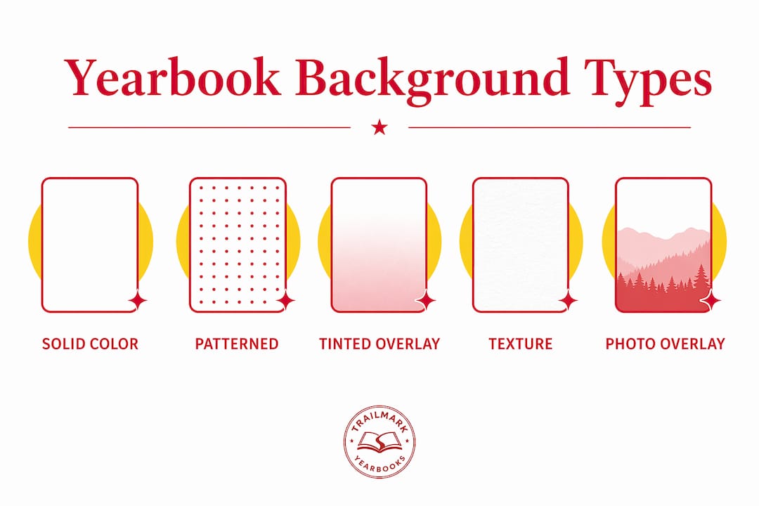
Photo and mascot overlays place a school image, logo, or mascot graphic at very low opacity in the background. This technique connects every page to the school's identity without overwhelming the content sitting on top.
Here is a quick comparison of background types by visual weight and best use:
| Background type | Visual weight | Best use case |
|---|---|---|
| Solid color | Low | Portrait sections, consistent spreads |
| Tinted overlay | Low to medium | Photo-heavy grids, activity pages |
| Pattern | Medium | Theme spreads, division pages |
| Texture | Medium to high | Feature spreads, opening/closing sections |
| Photo or mascot overlay | Low (at correct opacity) | Any spread needing school identity |
How do background elements affect readability and visual hierarchy?
Backgrounds directly control how easy it is to read a yearbook page. A background that is too dark, too saturated, or too busy forces the eye to compete between the content and the base layer. Touch Archive's design guidance is clear: backgrounds should use subtle colors and tints that enhance readability rather than interfere with it. Walsworth, one of the largest yearbook printers in the country, specifically warns that light text on dark backgrounds can be hard to read and should be used sparingly.
Visual hierarchy depends on contrast. Headlines need the strongest contrast on the page. Photos need clean separation from the background. Body copy needs a neutral, low-distraction surface. The background's job is to sit at the bottom of that contrast stack without pulling attention upward. Think of it as the floor of a room. You notice it when it's wrong, but when it's right, you look past it at everything else.
A few principles that hold across every yearbook layout style:
- Keep background opacity below 50% for textures and patterns behind text blocks.
- Use darker backgrounds only on division pages or spreads with no body copy.
- Test every background behind a sample text block before committing to a spread.
- Avoid backgrounds with strong directional lines near headline text, since the lines compete with the type.
- Prioritize contrast ratios that meet basic accessibility standards, particularly for captions and body copy.
Pro Tip: Run a grayscale proof of any spread before finalizing. If the text disappears or becomes hard to track in grayscale, the background contrast is insufficient for print.
What are the best practices for controlling background variation?
Background variation is one of the most common sources of visual chaos in student-produced yearbooks. Mixbook recommends alternating between roughly 3 to 5 different background options across the entire book. More than that, and the yearbook starts to feel like a collection of unrelated projects rather than a single publication. This is a concrete, enforceable rule that yearbook advisers can hand directly to student staff.
Here is a practical process for controlling background variation from the start of production:
- Define your palette before any spreads are built. Choose 3 to 5 approved backgrounds tied to the year's theme and school colors. Document each one with exact color values or file names.
- Assign backgrounds to sections, not individual pages. Athletics gets one background treatment. Academics gets another. Clubs and organizations get a third. Consistency within sections creates rhythm across the book.
- Build a style guide or template set. Every staff member works from the same approved InDesign or Canva templates. This removes the temptation to introduce a new background mid-production.
- Control variation at the spread level. Both pages of a spread should share the same background treatment. Switching backgrounds between the left and right page of a single spread creates visual whiplash.
- Review backgrounds as a group before finalizing sections. Print or display all spreads in a section side by side. Inconsistencies that are invisible page-by-page become obvious when you see the whole section at once.
Yearbook module design principles reinforce this approach: treating backgrounds as a design system rather than individual choices produces a more polished and unified result. Effective yearbook staffs use style guides with a limited palette reused spread by spread to maintain readability and design harmony throughout the book.
How can yearbook creators implement background elements in design tools?
Adobe InDesign remains the most powerful tool for implementing layered background elements. The Envato Tuts+ InDesign tutorial demonstrates a specific layering approach: place a halftone texture at 40% opacity as the base layer, then add a mascot graphic at 7% opacity above it. This creates depth and school identity without pushing the background into visual competition with photos or headlines. The opacity numbers are not arbitrary. They represent the threshold where most readers perceive texture and identity without consciously registering the background as a separate element.
In InDesign, backgrounds live on a dedicated locked layer at the bottom of the layer stack. This prevents accidental edits during production and makes it easy to swap backgrounds across spreads by unlocking and replacing a single layer. For schools using Canva or an online yearbook creator, the same principle applies: build background elements as reusable components that can be dropped into any spread without rebuilding from scratch.
Pro Tip: When uploading a school logo or mascot as a background element, convert it to grayscale first, then apply your school color as a tint overlay. This creates a cohesive, on-brand background without the color clash that often occurs when a full-color logo sits behind full-color photos.
Practical steps for any design tool:
- Upload approved background files to a shared folder accessible to all staff members.
- Lock background layers before distributing templates to prevent accidental edits.
- Test each background behind a text block and a photo at the actual print size, not just on screen.
- Save background configurations as named styles or templates so they can be applied consistently across sections.
The yearbook photography checklist from Trailmarkyearbooks also notes that photographic consistency and background coherence work together. Photos shot against varied or cluttered real-world backgrounds benefit most from clean, low-contrast page backgrounds that provide visual separation.
Key takeaways
Yearbook background design elements are a functional design system, not decoration, and limiting them to 3 to 5 approved styles across the book is the single most effective way to achieve visual cohesion.
| Point | Details |
|---|---|
| Definition of background elements | Visual layers behind photos and text that establish tone, theme, and consistency across every spread. |
| Limit variation to 3 to 5 styles | More than 5 background types creates visual chaos; assign backgrounds by section, not by page. |
| Opacity controls readability | Textures work at 40% opacity; mascot overlays work at 7%; anything higher competes with content. |
| Build a style guide first | Document approved backgrounds with exact color values before any spreads are built. |
| Test before committing | Always proof backgrounds behind actual text and photos at print size before finalizing a spread. |
Why backgrounds are the most underestimated decision in yearbook design
Most yearbook teams spend the majority of their design energy on covers, opening spreads, and senior portraits. Backgrounds get treated as an afterthought, something to fill in once the "real" design decisions are made. That's the wrong order of operations, and I've seen it produce the same result every time: a yearbook that looks like it was designed by five different people in five different years.
The background palette is the single decision that most affects whether a yearbook reads as one book or a collection of pages. When I look at yearbooks that consistently win recognition from organizations like NSPA (National Scholastic Press Association) or JEA (Journalism Education Association), the backgrounds are almost always the quietest thing on the page. They're present, they're intentional, and they're invisible in the best possible way.
My advice to any yearbook team starting production: lock your background palette before you touch a single spread. Choose three backgrounds. Maybe four. Give each one a name tied to a section. Then don't deviate. The creative energy you save by not relitigating background choices on every spread goes directly into better photo selection, stronger captions, and tighter copy. Those are the things readers actually remember.
The yearbook cover customization guide makes a related point about how background choices on the cover set expectations for the interior. Readers form an impression of the whole book from the first page. If the cover background is bold and thematic, the interior backgrounds need to echo that without repeating it exactly. That's a design conversation worth having early, not after 40 spreads are already built.
— Jace
How Trailmarkyearbooks supports your background design process

Trailmarkyearbooks works with elementary, middle, and high schools nationwide to make yearbook design less stressful and more consistent. Their team offers free design assistance backed by 50+ years of combined experience, which includes guidance on background palettes, template setup, and spread-level consistency. Whether your staff uses Canva, InDesign, or Trailmarkyearbooks' own online creator, their support team can help you build a background system that holds together across every section of the book. Request a sample to see their design quality firsthand, or connect with a rep for personalized advice on your school's specific layout and theme.
FAQ
What is a yearbook background design element?
A yearbook background design element is the visual layer placed behind photos and text on a yearbook page, including solid colors, patterns, textures, tinted overlays, and mascot imagery. Its primary function is to establish visual tone and consistency across the book without interfering with readability.
How many background styles should a yearbook use?
Mixbook recommends limiting backgrounds to 3 to 5 variations across the entire yearbook. Using more than 5 distinct background styles creates a visually chaotic result that undermines the book's cohesion.
What opacity should background textures be set to?
The Envato Tuts+ InDesign guidance recommends placing halftone textures at approximately 40% opacity and mascot overlays at around 7% opacity. These settings keep backgrounds supportive without overpowering photos or text.
Can dark backgrounds be used in yearbooks?
Dark backgrounds work well on division pages and feature spreads with minimal body copy, but Walsworth warns that light text on dark backgrounds is consistently harder to read in print. Reserve dark backgrounds for pages where large display type or full-bleed photos carry the spread.
How do background elements support yearbook storytelling?
Backgrounds reinforce thematic cohesion by carrying the year's visual identity across every spread. When backgrounds are treated as a consistent design system rather than individual decorative choices, they connect every section of the book to a single, recognizable visual story.