

A yearbook grid system is an invisible framework of columns, gutters, margins, and modules that organizes every page and spread so photos, captions, and headlines align consistently across the entire book. Without one, even talented student designers produce pages that look assembled rather than designed.
Three things to know right away:
- Grids improve readability and alignment. Columns and grids are networks of vertical and horizontal guides you toggle on in software to align text, images, and other elements — they never print, but they hold everything in place.
- Grids speed production and collaboration. When every staff member works from the same column structure, proofing a spread takes minutes instead of an hour of hunting misaligned photos.
- Intentional grid breaks create emphasis. The best spreads in any yearbook break the grid on purpose — a dominant photo crossing two columns, a headline bleeding to the edge — while the underlying structure keeps the rest of the page coherent.
Adobe InDesign, Canva, and Yearbook 360 all support column grids natively. Trailmarkyearbooks provides templates preset to common grid configurations, so advisers do not have to build from scratch.
Table of Contents
- What does a yearbook grid system mean? Core terms defined
- Which grid type fits your content?
- Starter templates and a pre-print checklist
- How Trailmarkyearbooks supports grid-based design
- Key Takeaways
- Useful sources and resources
- The part most grid advice gets wrong
What does a yearbook grid system mean? Core terms defined
Before you set a single guide in your software, you need the vocabulary. These are the terms you will see in templates, adviser guides, and printer specs.
- Module: A rectangular content block formed by combining columns and a consistent row height. Modular design converts a column grid into repeatable story containers for coverage pages.
- Eyeline: A horizontal guide that links the two facing pages of a spread, giving the reader's eye a consistent resting point. According to the Jostens Yearbook Adviser Guide, the eyeline is one of the core repeatable elements advisers should define once and reuse throughout the book.
Measurement units in U.S. yearbook production
Yearbook templates and printer specs in the United States use picas and points) rather than inches. One pica equals 1/6 of an inch; one point equals 1/72 of an inch. There are 12 points in a pica.
| Measurement | Picas | Points | Inches |
|---|---|---|---|
| 1 pica | 1p0 | 12 pt | 1/6 in |
| 3 picas | 3p0 | 36 pt | 1/2 in |
| 6 picas | 6p0 | 72 pt | 1 in |
| Typical gutter | 1p0 | 12 pt | 1/6 in |
| Typical margin | 3p0–4p0 | 36–48 pt | 1/2 in–2/3 in |
Which grid type fits your content?
Most successful yearbooks use 3-, 4-, or 5-column grids, chosen based on what the page needs to hold. The right column count depends on flexibility versus precise photo sizing.
| Grid type | Best for | Strengths | Watch out for |
|---|---|---|---|
| 3-column | Feature spreads, opening sections | Maximum flexibility, easy dominant photo | Fewer portrait slots per page |
| 4-column | Mixed candid/copy pages | Balanced photo and text ratio | Even number can feel symmetrical and static |
| 5-column | Portrait sections, dense photo pages | Precise sizing, fits more photos | Narrow columns make body text tight |
| Modular | Coverage pages, themed sections | Repeatable story blocks, scalable | Requires consistent row heights to work |
A modular grid takes the column structure one step further. Instead of placing content freely within columns, you define a row height and lock content into rectangular modules — say, a 2-column-wide by 3-row-tall block for a story package. This is the approach that makes coverage pages feel organized rather than scattered. The step-by-step design training from MooreSchools puts it plainly: all content elements fall within the column grid, and nothing stops mid-column.
Software quick tips
Adobe InDesign: Go to Layout > Margins and Columns to set columns and gutters. Use View > Grids & Guides > Show Document Grid to toggle guides. Master pages are your best friend — any change to a master propagates to every page using it.
Canva: Canva does not have a native column grid tool, but you can add ruler guides manually under File > View Settings > Rulers and Guides. Place vertical guides at your column edges and save the blank page as a template before adding content.
Yearbook 360: Column grids are built into the template system. Select a template with your preferred column count from the template library, then customize margins and gutter widths in the page settings panel.
Pro Tip: Save your portrait grid, your feature spread grid, and your candid page grid as three separate master templates before students touch a single page. Sharing those masters at the start of the year eliminates the most common source of inconsistency.
Starter templates and a pre-print checklist
Template presets
| Template | Columns | Gutter | Top margin | Notes |
|---|---|---|---|---|
| Portrait grid | 5 | 1p0 | 3p0 | Fixed name frame 1p6 below photo |
| Candid/photo page | 4 | 1p0 | 3p0 | Eyeline at 18p0 from top |
| Feature spread | 3 | 1p6 | 3p0 | Dominant photo spans 2 columns |
10-point pre-print checklist
- Margins match printer spec on all four sides
- Bleed extends 0.125 in beyond trim on all live edges
- Eyeline guide is consistent across every spread
- Type size is no smaller than 7 pt for captions
- All captions align to the bottom of their photo
- Folio tab is present and correctly placed on every page
- All images are 300 dpi or higher at final print size
- Color mode is CMYK (not RGB) for all placed images
- Export settings match the printer's PDF/X spec
- Portrait name placement is identical on every portrait page
For elementary-level books with smaller staffs, a simplified grid approach using 3 columns and a single modular template often works better than a full 5-column system. Trailmarkyearbooks advisers can request editable templates directly through the support team.
How Trailmarkyearbooks supports grid-based design
Trailmarkyearbooks is built around the reality that most yearbook advisers are teachers first and designers second. The support structure reflects that.
- Flexible templates — are available for Canva, Adobe InDesign, and the Trailmarkyearbooks online creator, each preset to common column grids so advisers do not start from a blank page.
To get started, request a sample to evaluate print quality and template fit before committing. Before contacting support, have your ladder, preferred column count, and portrait photo dimensions ready — that information lets the team match you to the right template immediately. For a full look at production options, the products page covers turnaround tiers, pricing, and full-service design options.

For advisers who want to go deeper on flexible design tools across Canva, InDesign, and the online creator, Trailmarkyearbooks maintains a password-protected resource hub with tutorials, template files, and adviser guides.
Key Takeaways
A yearbook grid system is the invisible column-and-module framework that keeps every spread aligned, readable, and consistent from the first portrait page to the closing spread.
| Point | Details |
|---|---|
| Core definition | A grid system uses columns, gutters, margins, and modules to organize every page. |
| Start with picas | Set gutters at 1p0 and margins at 3p0–4p0 using pica measurements for printer accuracy. |
| Match grid to content | Use 5 columns for portraits, 4 for mixed pages, and 3 for feature spreads. |
| Break intentionally | Cross columns only for dominant photos, full-spread headlines, or bleed imagery — never by accident. |
| Lock templates first | Save portrait, candid, and feature spread masters before students begin layout. |
Useful sources and resources
| Resource | What it covers |
|---|---|
| Pica unit reference | Measurement definitions and pica/point/inch conversions |
| Columns and Grids — Yearbook Groupie | Columns vs. grids explained with software context |
| Yearbook Design — Made Good Designs | Ladder planning and portrait grid discipline |
| Yearbook layout ideas — Touch Archive | Grid types and intentional grid breaks |
| Jostens Adviser Guide p. 75 | Eyeline, folio, modular design glossary |
| MooreSchools eBook Design Guide | Grid discipline and intentional breaks |
| MooreSchools Step-by-Step Design | Column grid setup as invisible framework |
| Digital Yearbook spread ideas | Grid breaks, workflow, and team collaboration |
| Request a Sample — Trailmarkyearbooks | Evaluate templates and print quality before ordering |
| Trailmarkyearbooks Products | Production options, turnaround, and full-service design |
The part most grid advice gets wrong
Most grid tutorials for yearbook advisers spend 80% of their time on the definition and almost none on the decision that actually matters: which grid to lock in before students open the software.
Here is the thing advisers underestimate. The portrait grid is not a design choice — it is an infrastructure decision. Get it wrong and you spend the last two weeks of production manually fixing name placement on 400 photos. Get it right and portrait sections practically build themselves. That single decision, made before anyone touches a page, saves more time than any other design choice in the book.
The conventional advice says "pick a grid that fits your content." That is true but incomplete. The better frame is: pick the fewest grids you can get away with. One portrait grid. One feature spread grid. One candid page grid. Three masters, applied consistently, produce a more professional book than a team that uses eight different column configurations because each section editor had a preference.
Breaking the grid gets romanticized in design education. Students hear "break the grid for emphasis" and interpret it as permission to ignore alignment whenever a photo looks better slightly off. The actual rule is simpler: if you cannot explain why an element crosses a column boundary, it does not cross one. Intentional breaks require a reason. A dominant homecoming photo spanning three columns is a reason. A caption that drifted 4 pixels to the left is not.
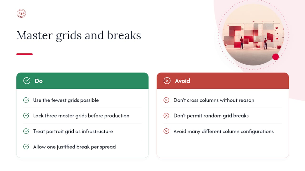
Set your three masters. Lock them. Then give your team permission to break the grid exactly once per spread, with a clear visual justification. That constraint produces better design than total freedom every time.