Middle school yearbook structure is the systematic arrangement of pages and content sections designed to showcase student portraits, school events, clubs, and candid moments with clarity and visual appeal. Understanding what is middle school yearbook structure means knowing how to divide your book into purposeful sections, apply consistent grid systems, and assign clear roles to your team. Tools like Canva, Adobe InDesign, and Mixbook all support this process, but the structure itself comes first. Get the framework right, and the creative work becomes far easier for every student editor and adviser on your staff.
What are the essential sections in a middle school yearbook?
Middle school yearbooks typically feature student portraits, faculty and staff pages, clubs and sports sections, event coverage, and autograph pages as their core content. Optional pages like messages from the principal and special collages add depth and personality. Every section serves a specific purpose, so knowing what belongs where prevents gaps and last-minute scrambling.
Here are the sections that belong in nearly every middle school yearbook:
- Opening pages: Title spread, table of contents, and a message from the principal or editor-in-chief
- Student portraits: Organized by grade, with name captions and optional quotes
- Faculty and staff: Individual or group portraits with name and title labels
- Clubs and organizations: Group photos, brief descriptions, and event highlights
- Sports teams: Team photos, individual action shots, and season results
- School events: Dances, assemblies, spirit weeks, field trips, and community service
- Candid photo spreads: Informal moments that capture daily school life
- Special features: Senior spotlights, superlatives, or themed collage pages
- Autograph pages: Blank or lightly designed pages for student signatures and messages
This list is your content map. Build your page budget around it before you design a single spread.
How do grid systems and templates shape yearbook page layouts?
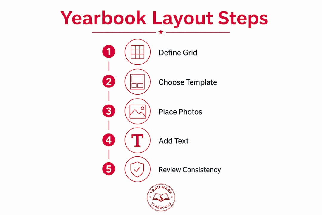
Effective yearbook page design relies on a grid system, typically 2–6 columns, to maintain visual consistency from the first page to the last. A grid tells every element on the page where to sit. Without one, layouts look accidental rather than intentional.
Experts recommend margins between 0.375 and 0.5 inches and gutters between 0.125 and 0.25 inches to produce a professional, organized look. Those measurements prevent photos and text from crowding the page edges or colliding with each other.
Here is how the most common grid choices perform in practice:
- Six-column grids: The most flexible option. A six-column grid allows two-column photo blocks, three-column arrays, full-width dominant images, and narrow copy columns without switching templates.
- Four-column grids: Better suited for formal sections like faculty portraits or academic awards where symmetry matters more than variety.
- Two-column grids: Simple and clean, useful for opening spreads or feature stories with large photos.
Templates resolve fundamental design questions about photo placement, font styles, and color usage so your staff can focus on storytelling instead of rebuilding layouts from scratch on every page. That shift in focus is where student creativity actually shows up.
Pro Tip: Lock your grid choice before your first layout session. Changing column counts mid-project forces you to reformat every completed page.
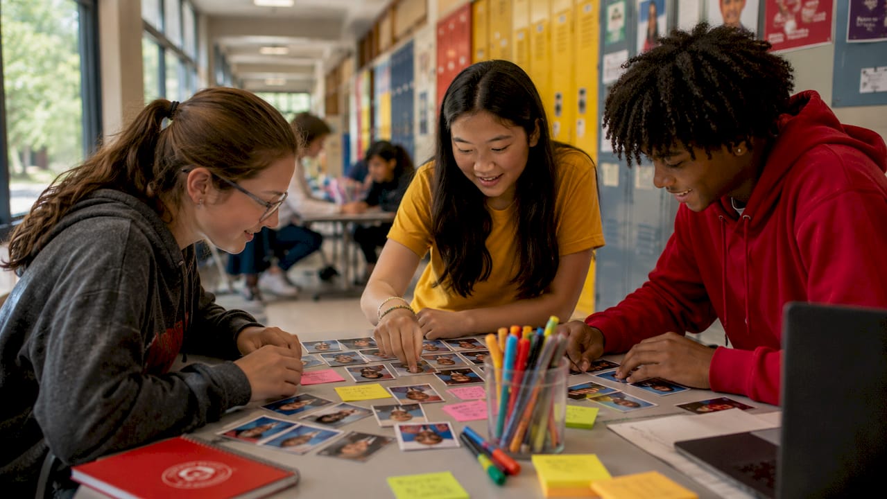
How do you organize student portraits and manage page budgets?
Portrait layout choices impact page count and budget more than any other single decision in yearbook content layout. A 72-roster layout fits 250 students into 8 pages, while a 40-portrait layout requires 14 pages for the same group. That six-page difference can mean the difference between staying on budget and cutting other sections entirely.
The two main portrait styles each serve a different school situation:
| Layout Style | Photos Per Page | Pages for 250 Students | Best For |
|---|---|---|---|
| Flow (classic) | ~40 | 14 pages | Higher page budgets, VIP feel |
| Roster (dense) | ~72 | 8 pages | Large schools, tighter budgets |
Portrait photo layouts categorized as Flow style emphasize larger photos and a more premium presentation. Roster style maximizes density with smaller images and compact text blocks. Flow suits schools with room in the budget; Roster suits large schools that need to fit every student without blowing the page count.
Readability matters even in dense layouts. Keep name captions in a consistent font size, align text blocks to the grid, and leave at least one gutter of breathing room between portrait rows. Consistency across all portrait pages signals professionalism to every reader who flips through the book.
Pro Tip: Decide on your portrait layout style before you collect photos. Changing from Flow to Roster after photos are submitted means resizing and repositioning every single image.
How should yearbook staff divide roles and coordinate workflow?
Yearbook teams function best with clearly defined editorial roles, and defined roles improve workflow, accountability, and coverage across every section. A team without role clarity tends to double up on some sections and completely miss others.
Here is a practical role structure for a middle school yearbook staff:
- Editor-in-chief: Oversees the full book, approves layouts, and manages the production timeline
- Section editors: Assign one editor each to student life, academics, sports, clubs, and special features
- Photographers: Dedicated team members covering events, portraits, and candid moments throughout the year
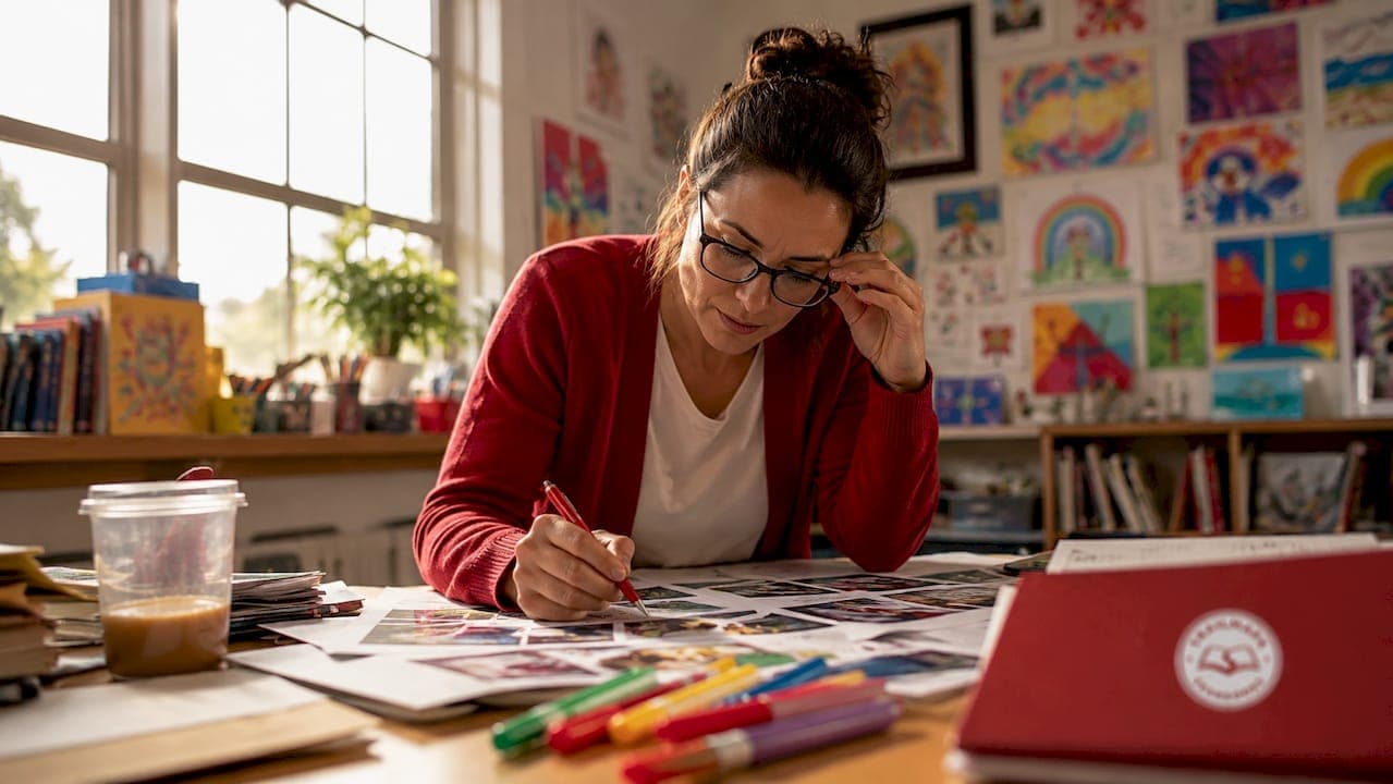
- Layout designers: Students responsible for building pages in Canva, Adobe InDesign, or your chosen platform
- Writers and copy editors: Handle captions, headlines, feature copy, and proofreading
- Business manager: Tracks the budget, manages sales, and coordinates with your printing partner
Coordinating content deadlines with your production timeline is the adviser's most critical job. Use a deadline management checklist to map every section deadline backward from your print date. When editors know exactly when their pages are due, the whole book moves forward on schedule.
Communication between section editors and layout designers keeps the visual style unified. Hold a brief weekly check-in to catch inconsistencies in fonts, color use, or photo quality before they spread across multiple spreads.
What design best practices make a middle school yearbook readable and engaging?
Visual hierarchy is what elevates yearbooks beyond a photo scrapbook, guiding readers naturally through the story the book tells. Every spread needs one dominant element, whether a large photo, a bold headline, or a striking graphic, to anchor the reader's eye. Secondary elements like smaller photos, captions, and pull quotes follow that anchor without competing with it.
Here are the design principles that separate polished yearbooks from cluttered ones:
- Establish visual hierarchy first: Place one dominant photo or headline per spread before adding anything else
- Use white space intentionally: White space prevents reader overwhelm and makes key elements stand out rather than disappear into a crowded page
- Keep margins and gutters consistent: Uniform spacing across every page creates a professional rhythm that readers feel even if they cannot name it
- Balance image sizes: Mix large, medium, and small photos on the same spread to create visual movement
- Apply school branding: Use your school's colors, fonts, and logo consistently to tie the book to its community
- Write captions that tell stories: A caption that names who is in the photo and what they are doing adds far more value than a generic label
- Avoid overcrowding: One extra photo is never worth sacrificing readability. Cut rather than cram.
School branding deserves special attention in middle school yearbook design. Students respond to seeing their school colors and mascot woven through the book. It signals that this yearbook belongs to them specifically, not to a generic template. For guidance on yearbook copy writing that pairs with strong design, your captions and headlines carry as much weight as your photos.
Pro Tip: Before finalizing any spread, step back and identify the first thing your eye lands on. If you cannot name a clear dominant element within two seconds, the layout needs a revision.
Key takeaways
A strong middle school yearbook structure depends on a grid-based layout system, clearly defined content sections, and role-specific team assignments working together from the first planning session to the final print file.
| Point | Details |
|---|---|
| Define sections early | Map all content sections before designing a single page to prevent gaps and budget overruns. |
| Choose your grid and stick to it | A six-column grid offers the most flexibility for mixing photo sizes and text across all section types. |
| Pick portrait layout before collecting photos | The difference between Flow and Roster styles can mean six or more pages, directly affecting your budget. |
| Assign roles with clear accountability | Defined editorial and support roles keep every section on schedule and prevent coverage gaps. |
| Lead every spread with a dominant element | Visual hierarchy turns a collection of photos into a story readers want to follow from cover to cover. |
Structure is the permission slip for creativity
I have worked with enough yearbook staffs to know that the teams who struggle most are not the ones with the least creative talent. They are the ones who skipped the structure conversation and jumped straight into designing pages. By week six, they have three different font styles across five sections, portrait pages that do not match, and a page count that does not add up.
The grid is not a cage. It is the thing that frees your designers to actually be creative. When a layout designer does not have to figure out where the margins go or how many columns to use, they spend that mental energy on photo selection, caption writing, and making the spread actually feel like your school. That is where the real work happens.
I also think middle school yearbooks have a unique challenge that high school books do not face in the same way. The student staff is younger, the adviser is often juggling multiple responsibilities, and the timeline feels impossibly short. The answer is not to simplify the book. The answer is to build a structure so clear that any student can pick up their section and know exactly what to do. Role clarity and template consistency are not just design choices. They are how you get a finished book.
Start your planning session with the yearbook policy best practices that set expectations for your whole team. Then build your grid, assign your sections, and trust the structure to carry the creative work forward.
— Jace
How Trailmarkyearbooks helps middle school staffs build better yearbooks
Trailmarkyearbooks was built for exactly the kind of project you are managing. The team behind it brings over 50 years of combined experience supporting school yearbook programs, and the entire service is designed to remove the production stress so your staff can focus on the content.

Trailmarkyearbooks offers professionally designed templates built for middle school layouts, free design assistance, and flexible tools including Canva, Adobe InDesign, and an online creator. Turnaround runs 2–3 weeks with no hidden fees and shipping included. Download the adviser resource PDFs to get planning checklists and timeline guides, or request a sample to see exactly how your yearbook could look before you commit to anything.
FAQ
What is middle school yearbook structure?
Middle school yearbook structure is the organized arrangement of content sections, including student portraits, faculty pages, clubs, sports, events, and autograph pages, built on a consistent grid system and template framework. It gives the entire book a logical flow and professional appearance.
How many sections does a typical middle school yearbook have?
Most middle school yearbooks include 8–10 core sections, covering portraits, faculty, clubs, sports, events, candid spreads, special features, and autograph pages. The exact count depends on school size and page budget.
What grid system works best for yearbook page layouts?
A six-column grid offers the most flexibility for middle school yearbook design because it supports multiple photo sizes, text blocks, and layout combinations without requiring a new template for each section.
How do portrait layout choices affect the yearbook budget?
A 72-roster layout fits 250 students into 8 pages, while a 40-portrait layout needs 14 pages for the same group. Choosing your portrait style early is the single most effective way to control your page count and printing costs.
What roles should a middle school yearbook staff include?
A well-structured staff includes an editor-in-chief, section editors for student life and sports and clubs, photographers, layout designers, copy editors, and a business manager. Clear role assignments keep every section on schedule and prevent coverage gaps.