

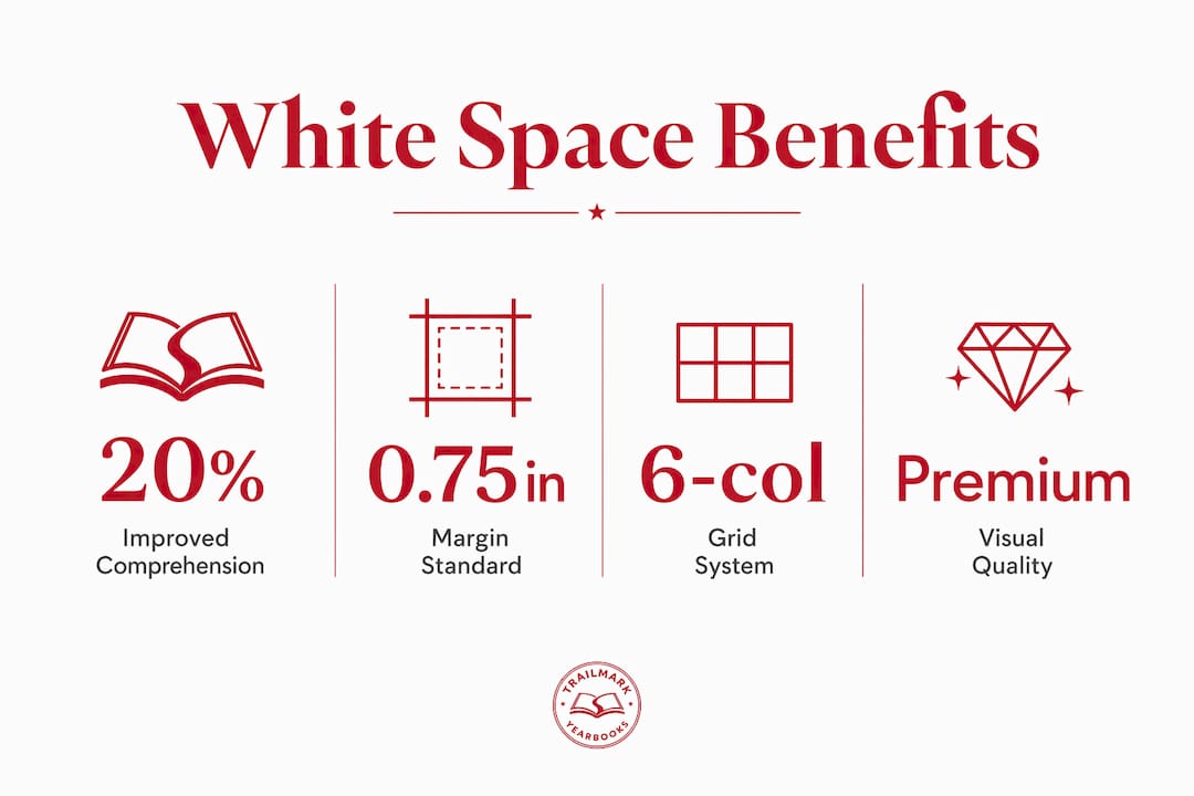
White space in yearbook design is defined as the deliberate empty space around text, photos, and graphic elements that improves readability, establishes visual hierarchy, and signals professional quality. It is not wasted space. It is the design decision that separates a polished, memorable yearbook from a cluttered one that readers flip past. Research shows that adequate white space improves reading comprehension by up to 20%. The role of white space in yearbook layouts is to give every element room to breathe, guide the reader's eye, and make the page feel intentional rather than rushed.
How does white space improve readability in yearbooks?
White space directly reduces cognitive load, making text and photos easier to process. When lines of text sit too close together, or when photos crowd captions, the brain works harder to separate one element from another. That extra effort adds up across a full yearbook, and readers disengage faster than you might expect.
"White space is not merely empty space. It is the deliberate decision directing attention and establishing page hierarchy."
The W3C Web Accessibility Initiative identifies white space as vital for cognitive accessibility, helping readers with cognitive disabilities process content more easily. That standard applies directly to yearbook design. A page with generous line spacing and clear margins works for every reader, not just those with strong reading skills.
The contrast between poor and effective white space shows up most clearly in text blocks. A senior quote section crammed into a narrow column with tight leading looks like a legal disclaimer. The same content with 1.5x line spacing and a clear margin reads like something worth stopping to enjoy. The content did not change. The spacing did.
Pro Tip: Increase leading (line spacing) by at least 20% above your default setting for any text block longer than three lines. The page will feel less dense without losing any content.
Generous white space also signals premium quality and improves perceived credibility, according to research from Nielsen Norman Group and A List Apart. Readers associate open layouts with trustworthiness. That perception matters when a yearbook represents an entire school year.
What are the technical requirements for white space in yearbook printing?
Technical printing standards set the floor for white space decisions. Ignoring them means content disappears into the binding or bleeds off the edge with a white sliver. Both outcomes undermine the design work done before the file ever goes to print.
The inside margin standard for yearbooks over 200 pages requires at least 0.75 inches to prevent content loss in the binding gutter. Perfect-bound books hide more of the inner page than saddle-stitched books, so the margin must compensate. Designers who set inside margins at 0.5 inches on a thick yearbook will find photos and text swallowed by the spine.
Bleed images require a different calculation. Any photo or graphic that runs to the edge of the page must extend 0.125 inches beyond the trim line. Without that buffer, the trimming process leaves a thin white edge that looks like a printing error.
| Area | Minimum requirement | Why it matters |
|---|---|---|
| Inside margin (200+ pages) | 0.75 inches | Prevents content loss in binding gutter |
| Outside margin | 0.5 inches | Frames the page and protects edge content |
| Bleed extension | 0.125 inches beyond trim | Eliminates white edges on full-bleed photos |
| Top and bottom margin | 0.5 inches minimum | Keeps headers and captions readable after trimming |
Photo spreads and text pages have different margin needs. A full-bleed photo spread can push margins to zero on the outer edges, provided the bleed standard is met. A text-heavy page like an index or a faculty section needs wider margins to keep the content readable. Binding thickness also affects white space allocation. As page count rises, the gutter eats more of the inner margin, and the inside margin must grow to match.
How do grid systems manage white space in yearbook layouts?
A grid system is the underlying structure that keeps white space consistent across every page of a yearbook. Without a grid, spacing decisions become arbitrary, and the book looks uneven even when individual pages look fine in isolation.

Yearbook designers recommend 6-column grid systems for organizing content and maintaining white space consistently. A 6-column grid gives advisers and students the flexibility to place a single wide photo across four columns, a caption in one column, and leave one column as intentional white space. That flexibility is what makes the grid worth learning.
Applying a grid to yearbook module design means every spread follows the same spatial logic. Photos align to column edges. Text blocks sit within defined gutters. White space appears in predictable places, which trains the reader's eye to move through the page naturally.
The most common mistake with grids is treating every column as a container that must be filled. Spreads that fill every pixel with content feel frantic and cause visual fatigue. Purposeful white space creates resting points and guides the reader's eye from one element to the next.
- Use a 6-column grid as the base structure for all spreads.
- Leave at least one full column of white space on complex photo pages.
- Align all text blocks and photo edges to grid lines, never between them.
- Use consistent gutter widths between columns throughout the entire book.
- Avoid placing text in the gutter between facing pages.
Pro Tip: Build your grid template before placing a single photo or caption. Changing the grid after content is placed forces you to reposition everything, and most teams skip that step, producing inconsistent spacing.
Resources like the middle school yearbook structure guide show how grid-based layouts apply across different school levels, with spacing adjusted for the volume of content each section requires.
What are macro and micro white space, and why do both matter?
White space operates at two distinct scales in yearbook design, and both must be managed deliberately. Confusing the two, or neglecting one while focusing on the other, produces pages that feel off without an obvious reason why.
Macro white space refers to the large-scale empty areas: page margins, the gap between a headline and the first photo, the space separating one section from another. Micro white space refers to the small-scale spacing: the gap between lines of text (leading), the padding between a photo and its caption, and the space between individual letters in a display font.
- Set macro white space first by defining margins and section breaks before placing any content.
- Set micro white space second by adjusting leading, caption padding, and letter spacing within each content block.
- Check both scales together by printing a proof page and reviewing it at arm's length, then up close.
Balancing macro and micro white space is what separates layouts that look polished from those that look cheap. A page with generous margins but tight leading still reads as cramped. A page with comfortable leading but no section breaks reads as a wall of content. Both scales must work together.
White space at the macro level also builds hierarchy. A large gap above a section headline tells the reader that something new is starting. A smaller gap between a photo and its caption tells the reader those two elements belong together. That visual logic works without any words explaining it.
Pro Tip: Print a single spread at full size and hold it at normal reading distance. If your eye does not know where to land first, the macro white space is not doing its job. Adjust section gaps before touching any micro spacing.
The importance of white space in establishing hierarchy applies equally to educational documents and yearbook pages. Both formats rely on spatial cues to guide the reader through content in the intended order.
What practical tips protect white space in yearbook design?
The biggest threat to white space is not bad design instinct. It is the pressure to include more content. Every adviser knows the moment when a coach asks for one more team photo, or a sponsor wants a larger logo, and the temptation is to shrink everything else to make room.
Shrinking text to fit more content is the wrong solution. Reducing font size below 10pt to preserve space for an extra photo creates a page that is harder to read and looks less professional. The better decision is to cut content, not compress it. Defending white space against stakeholder pressure is a key design challenge, and space communicates clarity and hierarchy in ways that extra content never can.
- Reduce content before reducing font size or margins.
- Prioritize the most important elements and give them generous space.
- Remove secondary content rather than shrinking primary content to accommodate it.
- Test layouts both on screen and in print before finalizing spacing decisions.
- Set a minimum font size rule (10pt for body text) and enforce it across the entire team.
Reviewing common yearbook design errors shows that improper spacing and clutter are among the most frequent problems advisers face. Catching those errors early, during the layout phase rather than after printing, saves time and money.
Using grids, spacing consistently, and prioritizing key elements helps balance white space and content effectively. That balance is a discipline, not a one-time decision. It requires checking every spread against the same standard before the file goes to print.
Key Takeaways
White space in yearbook design is a deliberate structural tool that improves comprehension, signals quality, and guides the reader's eye through every page.
| Point | Details |
|---|---|
| White space boosts comprehension | Adequate spacing improves reading comprehension by up to 20%, making content easier to absorb. |
| Technical standards are non-negotiable | Inside margins must reach 0.75 inches for books over 200 pages; bleed must extend 0.125 inches beyond trim. |
| Grid systems create consistency | A 6-column grid keeps white space predictable and prevents uneven spacing across spreads. |
| Macro and micro spacing both matter | Margins and section gaps set hierarchy; leading and caption padding determine readability within each block. |
| Defend space against content pressure | Cutting content is always better than shrinking text or margins to fit more onto a page. |
Why white space is the hardest design decision to defend
I have reviewed a lot of yearbook spreads over the years, and the pages that look the most dated share one trait: they are full. Every corner has something in it. The team clearly worked hard. But the result feels exhausting to look at, and nobody can tell you why.
The counterintuitive truth is that adding white space feels like doing less. Students and advisers who are proud of their content want to show all of it. Cutting a photo or removing a sidebar feels like a failure. But the pages that hold up over time, the ones people actually stop and read at a reunion, are the ones that gave each element room to matter.
The research backs this up. The comprehension improvement from adequate spacing is real and measurable. The credibility signal from open layouts is documented. But knowing the research does not make it easier to tell a coach that his team photo is not going in the book. That conversation requires confidence in the design principle, and that confidence comes from seeing the difference in print.
My advice: print two versions of the same spread, one with your current spacing and one with 20% more white space throughout. Show both to someone who was not involved in the design. They will pick the open version almost every time. That proof is more persuasive than any design theory.
— Jace
How Trailmarkyearbooks helps you apply these design principles
Putting white space principles into practice is easier when your tools and your printer are working with you, not against you.

Trailmarkyearbooks supports advisers and students with flexible design options through Canva, InDesign, and an online creator, all of which accommodate proper margin and grid setups from the start. The team's printing expertise means your bleed areas, gutter margins, and inside margins translate correctly from file to finished book. You can request a sample to see exactly how white space and layout decisions look in a printed yearbook before committing to a full run. Trailmarkyearbooks also offers free design assistance, so if your team is unsure whether a spread has the right balance, there is expert support available. Explore the full range of yearbook production services and see what a well-spaced, professionally printed yearbook looks like in your hands.
FAQ
What is white space in yearbook design?
White space in yearbook design is the deliberate empty area around text, photos, and graphic elements. It improves readability, establishes visual hierarchy, and signals professional quality.
How much does white space improve comprehension?
Research shows that adequate white space in margins and between text lines improves comprehension by up to 20%. That gain applies directly to yearbook text blocks, captions, and section introductions.
What inside margin do yearbooks need for binding?
Yearbooks over 200 pages require an inside margin of at least 0.75 inches to prevent content from disappearing into the binding gutter. Perfect-bound books need more gutter space than saddle-stitched formats.
What is the difference between macro and micro white space?
Macro white space covers large areas like page margins and section gaps. Micro white space covers small-scale spacing like leading between text lines and padding between a photo and its caption. Both must be managed to avoid cluttered or cheap-looking layouts.
How do you protect white space when stakeholders want more content?
The most effective approach is to cut lower-priority content rather than shrink text or margins. Defending white space against pressure to overfill pages preserves the clarity and hierarchy that make a yearbook worth reading.