Most yearbook advisors assume that great design requires a professional background in graphic layout. It doesn't. Understanding what is yearbook module design actually changes that assumption completely. Modular design gives your team a repeatable, organized system for building every spread in the book without starting from scratch each time. It reduces guesswork, helps students divide up the work clearly, and produces pages that look intentional rather than improvised. This guide breaks down the concept, explains why it works, and shows you exactly how to put it into practice.
Table of Contents
- Key takeaways
- What is yearbook module design
- Why modular design benefits your yearbook team
- Modular vs. other yearbook layout approaches
- How to implement modular design effectively
- Real examples of modular design in action
- My take on modular design after years of working with school yearbooks
- See how Trailmarkyearbooks makes modular design easy for schools
- FAQ
Key takeaways
| Point | Details |
|---|---|
| Modules are self-contained layout units | Each module holds one type of content, like a photo package or caption block, and functions independently on a spread. |
| Modular grids create consistent structure | Dividing spreads into predefined zones helps your team maintain spacing, alignment, and visual balance across every page. |
| Team workflows improve significantly | Assigning individual modules to different students clarifies responsibilities and keeps production moving on schedule. |
| Style consistency is non-negotiable | Matching color schemes and typography across all modules unifies the visual story of your entire yearbook. |
| Software tools make implementation accessible | Drag-and-drop platforms and established templates lower the barrier for advisors and students without formal design training. |
What is yearbook module design
Yearbook module design is a layout method that divides each spread into separate, self-contained zones called modules. Each module holds one specific type of content. That might be a photo package, a caption block, a student quote sidebar, a story copy block, or a headline unit. The modules fit together on a page like pieces of a puzzle, but each one can be edited, moved, or swapped without disrupting the rest of the spread.
Typical modules include photo packages, captions, stories, and sidebars, each self-contained but flexible in arrangement, with consistent spacing maintained for readability. That self-contained quality is what separates modular design from traditional layouts where everything bleeds together across the page.
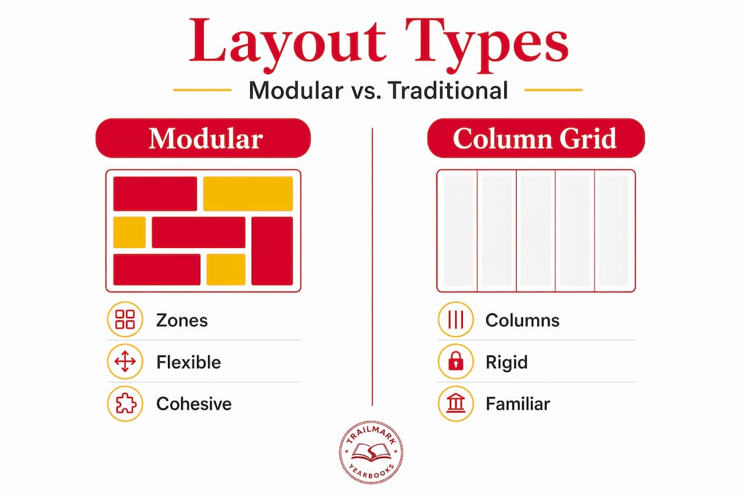
The structural backbone of this approach is the modular grid. Think of a grid as an invisible framework of rows and columns that divides your spread into rectangular zones. Modular grids are foundational in yearbook design because they create organized rectangular zones for diverse content types, fitting photos, captions, and sidebars neatly side by side. Once the grid is set, your team places content modules into those zones.
Here is what a standard set of content modules typically looks like:
- Photo packages: One dominant image plus two to four supporting photos arranged within a defined zone
- Caption blocks: Short descriptive text placed directly below or beside each photo
- Copy blocks: The main written story for the spread, usually 150 to 300 words
- Sidebars: Secondary content like fun facts, quick stats, or student poll results
- Headlines and deck copy: The title unit that anchors the top of the module set
You may also hear modular design called "mods" or "coverage zones." Mods are defined as separate coverage zones that systematically organize spreads, and this terminology is widely used across the yearbook industry.
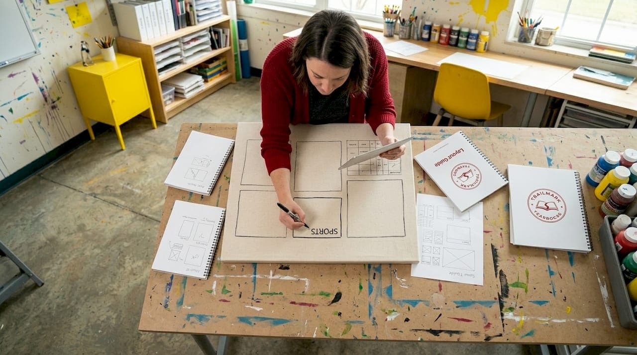
Pro Tip: Before your team places a single photo, sketch out your module zones on paper first. Locking in the grid before adding content prevents the most common layout errors.
The critical difference between modular design and a traditional column grid is flexibility. Column grids lock content into vertical lanes. Modular grids create a matrix of both horizontal and vertical zones, giving your team far more options for how content sits on the page.
Why modular design benefits your yearbook team
The practical advantages of modular design go beyond visual appeal. For school-based production teams, especially those working with rotating groups of students who may have no prior design experience, modular layouts solve real workflow problems.
- Clear ownership of assignments. When a spread is divided into five distinct modules, you can assign one module to each student. No one is stepping on anyone else's work, and accountability is obvious.
- Consistent visual balance. Balancing systematic layouts with creative flexibility is key to successful yearbook production. Modular grids enforce that balance by default because each zone has a defined size and position.
- Broader student and topic coverage. Varied module sizes within a single spread let you feature a large group photo alongside individual portraits and a short written story. You cover more ground without the page feeling crowded.
- Easier revisions during production. Need to swap a photo or rewrite a caption two weeks before the deadline? In a modular layout, you change one unit without rebuilding the entire spread. This alone saves significant time in the final stretch of production.
- Thematic cohesion across the book. When every spread uses a shared modular structure, the overall yearbook reads as one cohesive publication rather than a collection of individual pages with no visual relationship to each other.
Maintaining consistent color schemes and typography across modules strengthens the thematic cohesion of the entire yearbook. This is not just about looks. It signals to readers, parents, and students that care was taken on every page.
One common pitfall is over-packing modules. More content per module does not produce better results. It produces clutter.
Pro Tip: Limit each module to one primary visual and one primary message. If a module feels crowded, split it into two smaller zones rather than shrinking the text or photos.
Proper modular layouts also respect gutters and avoid placing important elements across page bindings. That gutter issue destroys spreads more often than any other single mistake, and modular grids make it far easier to catch during the layout phase.
Modular vs. other yearbook layout approaches
Understanding what makes modular design distinct becomes clearer when you hold it up against the alternatives.
| Feature | Modular design | Full-spread layout | Linear column grid |
|---|---|---|---|
| Layout structure | Grid of independent zones | Single unified composition | Vertical columns only |
| Team assignment flexibility | High | Low | Medium |
| Revision difficulty | Low | High | Medium |
| Best for | Most spreads, all grade levels | Feature covers and openers | Text-heavy academic sections |
| Visual consistency | Built in | Requires strong art direction | Moderate |
| Recommended for beginners | Yes | No | With guidance |
Full-spread layouts work beautifully for opening spreads, theme reveals, or senior feature pages where one large visual concept dominates. But they require strong design instincts and are difficult to assign to a student team without extensive supervision.
Linear column grids suit text-heavy content like academic department pages or faculty directories. They feel familiar because they mimic newspaper or magazine formats. The limitation is that they offer less room for creative photo placement and varied visual hierarchy.
Modular design sits in the middle as the most practical choice for the bulk of your yearbook. It is structured enough to keep student teams on track and flexible enough to accommodate everything from sports action shots to club group photos. The two approaches are not mutually exclusive. Many experienced yearbook advisors use modular layouts for 80 percent of the book and reserve full-spread compositions for key feature sections.
How to implement modular design effectively
Getting your team up and running with modular layouts does not require starting from zero. These steps will take you from concept to first finished spread faster than you might expect.
- Choose a base grid template. Most online yearbook design platforms provide pre-built modular templates. Pick one that matches your page dimensions and adjust the module sizes to fit your content needs. Many platforms offer drag-and-drop module customization aligned to school themes and colors.
- Assign module roles to team members. Break each spread into clearly labeled zones before your students touch the software. Label each zone with the content type it holds and assign a specific student to each zone.
- Write copy to fit the module, not the other way around. Copy that runs longer than the module allows is one of the most common production delays. For writing copy that fits cleanly within modules, set a character count target for each copy block before writing begins.
- Build a master style sheet. Document your font choices, sizes, color codes, and spacing rules before production starts. Share this with every team member and refer to it at every review session. Color palette and font consistency transform a modular page into a unified visual story.
- Use a deadline tracker. Modular design helps speed up production, but only if deadlines are tied to individual modules. A yearbook deadline checklist keeps each module accountable and prevents the bottlenecks that typically pile up in the final weeks.
Pro Tip: Set a "lock" date for each module two days before the spread deadline. That buffer gives you time to catch alignment errors, missing captions, or gutter violations before the page ships to print.
Regarding software, tools that support modular layouts include online yearbook creators, Canva with custom grid setups, and Adobe InDesign with defined frame grids. Each has different learning curves. For most school teams, a dedicated online creator tool designed specifically for yearbooks offers the best combination of structure and ease of use.
Real examples of modular design in action
Seeing modular design in real yearbook spreads makes the concept click faster than any definition. Consider these two contrasting scenarios that illustrate the range of what modular layouts can accomplish.
Scenario one: A middle school sports spread. The adviser divided a two-page spread into six modules. The dominant module held a full-action basketball photo spanning roughly one third of the left page. Two smaller portrait modules flanked it, each featuring a different player with a short caption. The right page contained a copy block module with game highlights, a sidebar module with season statistics, and a small pull quote module from the coach. Every element had its own space. The result was a spread that felt rich without feeling chaotic.
Key outcomes from this approach:
- Six students each owned one module, reducing revision conflicts
- The spread covered more athletes than a single full-spread photo could
- Editing the stats sidebar two days before deadline required changing one module only
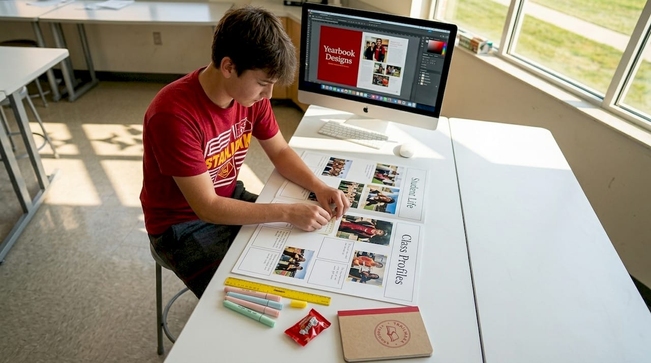
Scenario two: A high school club section. The team used a repeating modular template across twelve consecutive club pages. Each page used the same four-module structure: group photo, club description copy, officer spotlight portrait, and a fun facts sidebar. Readers flipping through the section recognized the format immediately, which made navigation intuitive.
Student involvement in yearbook creation with modular design boosts school pride and gives students hands-on experience in digital design and teamwork. The club section example shows exactly how that plays out. Students who designed the chess club page could hand their template to the student covering the robotics club with zero re-briefing required.
My take on modular design after years of working with school yearbooks
I'll be direct: the biggest resistance I hear from advisors is that modular design sounds rigid. The fear is that a grid will kill creativity and every spread will look the same. I've found the opposite to be true in practice.
What modular design actually kills is chaos. When students have no structural framework, they fill space randomly, text overlaps photos, captions drift to unexpected corners, and the adviser spends half of production fixing layout issues instead of improving content. Modular grids eliminate that entirely.
What surprises most advisors is that creative decisions happen within the modules, not despite them. Students still choose the photos, write the stories, select the colors, and set the mood. The grid simply tells them where things live. That constraint actually frees students to focus on the quality of their content rather than spending three class periods trying to figure out where to put things.
I've also watched modular design transform struggling yearbook programs. When a new adviser takes over a chaotic yearbook class, introducing a consistent modular system in the first semester produces measurable improvements in finished page quality and team morale. Students feel like they know what they're doing. That confidence carries the entire production forward.
My honest advice: start with one section of the book, maybe the clubs or sports section, and apply a modular template there first. Let the team experience the workflow before rolling it out across every chapter.
— Jace
See how Trailmarkyearbooks makes modular design easy for schools

Trailmarkyearbooks is built around making this process manageable for every school, whether you are an experienced adviser or brand new to yearbook production. The platform supports flexible design options including Canva, InDesign, and a dedicated online creator, all of which accommodate modular layouts without requiring advanced design skills. Free design assistance is available to every school, and the team brings 50-plus years of combined experience to every project.
If you want to see what a finished modular yearbook looks like before committing, you can request a sample directly from Trailmarkyearbooks with no signup required. Pricing is transparent and all-inclusive with shipping included. When you're ready to talk through your school's specific layout needs, connect with a rep for personalized guidance at no cost.
FAQ
What is a module in yearbook design?
A module is a self-contained layout zone on a yearbook spread that holds one type of content, such as a photo package, caption block, copy story, or sidebar. Modules sit within a modular grid and can be edited independently without affecting other elements on the page.
How do modular grids differ from column grids?
Column grids divide a page into vertical lanes only, while modular grids create a matrix of both rows and columns. This gives yearbook teams more flexibility in placing photos, text, and visual elements in a wider variety of arrangements.
What software supports modular yearbook design?
Many dedicated yearbook platforms include pre-built modular templates with drag-and-drop customization. Canva and Adobe InDesign also support modular layouts through custom frame grids and template structures.
How many modules should a typical yearbook spread have?
Most spreads work well with four to seven modules depending on the content mix. Fewer modules suit feature pages with large dominant photos, while more modules work for coverage-heavy sections like clubs or sports.
Can beginners use modular design without prior layout experience?
Yes. Modular design is particularly well-suited for student teams and new advisors because the grid provides a clear structural framework. Best practices for yearbook design consistently recommend starting with modular templates to reduce layout errors and build team confidence quickly.