

Assemble a small team, pick a theme and a template, and lock your final proof date first. Do that before you touch a single page layout. Get yearbook design help right at the start and the rest of the project runs on rails instead of adrenaline. Everything below fills in the how.
TL;DR:
- Lock the yearbook format, theme, and final proof dates early to avoid delays and ensure smooth progress throughout the project timeline.
- Use a consistent layout grid, limited font families, and a restrained color palette to create visually balanced and professional spreads.
- Require 300 DPI images, standardized file naming, and uniform lighting and cropping standards to improve overall photo quality and print reliability.
- Choose a suitable design tool based on your team's skills, whether it’s InDesign for control, publisher platforms for collaboration, or Canva for speed.
- Implement a multi-phase review process with outside proofing to catch common layout issues, low-resolution images, and coverage gaps before printing.
Table of Contents
- What Is the Fastest Way to Get Yearbook Design Help?
- Design Fundamentals: Layout, Hierarchy, and Color That Actually Work
- What Are the Image Quality Standards for Print?
- Which Design Tool Fits Your Team?
- How Do You Prepare a Yearbook File for Print?
- How Do You Manage a Yearbook Project Without a Last-Minute Crunch?
- Common Layout Mistakes You'll Catch During Proofing
- Why Publisher-Assisted Support Reduces Production Risk
- How Should Yearbooks Reflect School Branding?
- How Do You Get Students and Staff Involved in Content Creation?
- Ideas for Senior Quotes, Events, and Special Sections
- Should You Offer a Digital Yearbook Alongside Print?
- What Accessibility Considerations Matter in Yearbook Design?
- Adviser Perspective: Practical Expectations and Sanity-Saving Rules
- How Trailmarkyearbooks Makes This Easier
- Practical Links and Templates to Explore Next
- Sources
- FAQ
What Is the Fastest Way to Get Yearbook Design Help?
The fastest path to a finished, print-ready yearbook is a short starter checklist you can run through in the first two weeks, before anyone opens a template.
- Name a point of contact. One adviser or lead volunteer owns final decisions, even if a committee helps with content.
- Lock the format. Decide book size, cover type (soft or hard), and page count early, since this affects pricing and binding choices.
- Pick one unifying theme. A theme gives volunteers a shared visual language so pages do not look like they came from five different people.
- Set folder and filename rules. Something as simple as "Grade_LastName_First.jpg" and a shared drive folder per event saves hours later.
- Choose your template path. Decide now between an InDesign master file, a publisher studio template, or a drag-and-drop builder like Canva or Mixbook.
- Set your final proof and submission dates, then work backward to schedule at least two proof rounds before that deadline.
If your timeline allows it, build in time for one printed proof, not just a screen review. Colors and photo crops always look different on paper.
Design Fundamentals: Layout, Hierarchy, and Color That Actually Work
Most rough-looking yearbook spreads share one problem: no dominant element. Every photo is the same size, every caption fights for attention, and the eye has nowhere to land. Fix that first and everything else gets easier.
- Give each spread one dominant photo or headline, then let two or three secondary items support it.
- Pick a single grid system, modular or column-based, and reuse it across the whole section instead of reinventing structure page by page.
- Limit yourself to two font families total: one for headlines and one for body and captions, with consistent sizing rules for each.
- Choose a restrained color palette, ideally three to four colors, and check that text contrast stays readable against photo backgrounds.
- Leave white space on purpose. A crowded page reads as rushed even when the content is strong.
Advisers who approach the book as storytelling rather than a documentation dump, with a real theme and balanced coverage, tend to produce yearbooks that stay memorable years later instead of getting shelved.
Pro Tip: Set your crop guides and frame styles once at the start of the project and save them as a reusable style, whether that's an InDesign object style or a Canva template element. Volunteers copying an existing frame make far fewer inconsistent choices than volunteers building from scratch.
For cover-specific inspiration, browse cover design ideas by grade level and style before your theme meeting, since a strong cover concept often shapes the rest of your palette decisions.
What Are the Image Quality Standards for Print?
Photos are where most yearbook problems start, and where they're easiest to prevent with a few rules set on day one.
- Require 300 DPI at final print size; a photo that looks sharp on a phone screen at 72 DPI can print blurry at full page width.
- Standardize a naming convention (event, date, grade, subject) so anyone uploading photos files them the same way.
- Assign one person per grade or event as the upload owner, so there's no confusion about who's responsible for a missing folder.
- Standardize portrait lighting and crop ratio for class pages so student photos don't look like they came from five different cameras.
- Send a permissions and photo release reminder home before the first candid photo session, not after images are already in layout.
- Batch-edit exposure and color in sets, using one consistent filter or preset per event, so the whole book doesn't look patchworked.
A consistent portrait crop and lighting standard on class pages is one of the cheapest fixes available. It costs nothing but a shared instruction sheet for photographers, and it's the difference between a page that looks professional and one that looks like a scrapbook.
Which Design Tool Fits Your Team?
Your team's skill level and timeline should decide your tool, not the other way around. Three paths cover almost every school situation.
- Adobe InDesign fits experienced volunteers who need precise typography and full creative control. Set up master pages, paragraph styles, and a photo grid before placing any content. This single setup step is what saves hours of repetitive formatting later.
- Publisher studio platforms suit schools that want built-in workflows, easier collaboration among multiple volunteers, and direct print integration without a separate export step.
- Drag-and-drop builders like Canva fit fast-moving volunteer teams with limited design experience. They're excellent for speed and collaboration, but budget extra time for final print packing, since color conversion and bleed checks often need manual attention before submission.
Whichever path you choose, every export needs to produce the same things: bleed included, crop marks where required, fonts embedded, and colors converted to the format your printer needs.
How Do You Prepare a Yearbook File for Print?
Print prep is where a beautiful layout either survives or falls apart at the trim line. Run this checklist before you submit anything.
- Confirm bleed, typically 0.125 inches, along with safe zones and final trim size so nothing important gets cut off.
- Export using the color space and PDF preset your printer requests; ask them directly if you're not sure which one applies.
- Embed or outline every font, and double check that linked images are still full resolution, not placeholder thumbnails.
- Run one final pass focused only on names, captions, and grade or club listings, since these are the errors readers notice first.
- Order a printed proof if your timeline allows it, and leave real time in the schedule to fix whatever the proof reveals.
Standard settings like 0.125-inch bleed and full-resolution image placement are the most common export requirements across most school print jobs, but always confirm against your specific printer's specs. For a fuller technical walkthrough, see this bleed and trim checklist built for advisers.
How Do You Manage a Yearbook Project Without a Last-Minute Crunch?
A yearbook project runs in five phases: planning, collection, layout, proofing, and print. Treat each phase as its own mini-deadline instead of one giant deadline at the end.
- Planning (weeks 1 to 2): finalize theme, format, and roles.
- Collection (ongoing through most of the year): gather photos, quotes, and copy on a rolling basis.
- Layout (weeks vary by section): build spreads once each section's content is roughly complete.
- Proofing (at least two rounds): review for accuracy, then design consistency.
- Print (final submission through delivery): submit files and track your turnaround window.
A simple role matrix keeps volunteers from stepping on each other: an editor who owns the theme and final calls, a photo lead who manages uploads, a layout lead who builds spreads, a copy editor who checks writing, and a proofreader who checks everything else. Recruit parent volunteers specifically for photo collection and proofreading. Those tasks scale well with extra hands and don't require design skill. Set weekly checkpoints tied to your school calendar (report cards, breaks, sports seasons) so milestones don't sneak up on you, and budget early for print costs so fundraising isn't a last-minute scramble.
Common Layout Mistakes You'll Catch During Proofing
Most proofing rounds turn up the same handful of problems, and each one has a fast fix.
- Overcrowded spreads: cut the photo count or split the content across two spreads instead of cramming one.
- Inconsistent design elements: run a visual audit against your style sheet and standardize fonts, colors, and frames.
- Poor photo quality: flag low-resolution images before final export and replace or recrop them rather than shrinking around the problem.
- Missing or unbalanced coverage: check an inclusion list by grade, club, and activity to catch groups that got skipped.
- Proofing misses: assign at least one fresh set of eyes, someone who hasn't stared at the page for weeks, to catch names and captions everyone else has stopped seeing.
These pitfalls, overcrowding, inconsistency, and neglected candid moments among them, show up in nearly every volunteer-run yearbook at some stage. Catching them during proofing instead of after printing is what separates a smooth project from a costly reprint.
Why Publisher-Assisted Support Reduces Production Risk
Volunteer teams face the same risks every year: missed deadlines, coverage gaps, and last-minute file errors that only surface once it's too late to fix cheaply. A dedicated rep or publisher studio catches problems earlier, because someone outside your building is watching the file with fresh eyes and print experience.
A multi-phase plan with assigned roles and scheduled checkpoints, backed by an outside proofreader for the final pass, is what prevents the single most common failure mode in yearbook production: missing or misspelled names.
Some yearbook publishers pair that kind of structure with free design assistance for schools that want a second set of hands, whether that means a full review of a self-built file or hands-on help building spreads from scratch.
How Should Yearbooks Reflect School Branding?
A yearbook that ignores school colors and identity looks like it belongs to a different building. Branding consistency doesn't mean plastering the mascot on every page. It means the book feels like it came from your school specifically, not a generic template anyone could have used.
Start with your school's actual color values, not a close guess. If your mascot is navy and gold, use the exact navy your athletic uniforms use, not a random blue from your software's default palette. Apply those colors sparingly but consistently: section dividers, folio numbers, header bars, and maybe one accent per spread. Overusing school colors on every element flattens the design and makes photos harder to read against busy backgrounds.
Your school logo or mascot belongs on the cover and maybe a divider page or two, not stamped across every spread. Restraint reads as more professional than repetition.
If your school has a style guide for print materials, even a basic one built for letterhead or athletics programs, pull the exact color codes and fonts from it rather than eyeballing a match. That single step prevents the awkward situation where your yearbook's "school blue" doesn't quite match the blue on the gym banner.
Consider tying your theme concept to school identity in a way that feels organic rather than forced. A school with a strong outdoors or trail mascot might build a wayfinding-style theme around it. A school with a strong arts program might lean into typography as a design element itself. The goal is a theme that could only belong to your school, built from your actual colors and identity rather than a trend borrowed from somewhere else.
How Do You Get Students and Staff Involved in Content Creation?
The yearbooks readers remember longest are usually the ones with the widest range of contributors, not just the yearbook committee's inner circle.
Start by making contribution easy, not just available. A shared photo upload folder or a QR code posted in the school office that links straight to a submission form removes the friction that keeps busy teachers and students from bothering. If submitting a photo requires five steps and an email, most people won't do it. If it takes fifteen seconds, participation jumps.
Assign a "content scout" for each grade or department. This doesn't need to be a design volunteer. It can be a teacher who agrees to snap a few photos during their own classroom activities and drop them into the shared folder weekly. Distributing that responsibility across many small contributors beats asking one photographer to cover an entire school.
Senior quotes and staff shoutouts work best with a real deadline and a real reminder system, not an open-ended request that gets forgotten. Send the request with a specific due date, a short example to model the tone you want, and one follow-up reminder about a week before the cutoff.
Consider a simple incentive for participation: a shoutout board, a small prize drawing for students who submit a photo, or public recognition of the classes with the highest submission rates. Staff engagement often responds well to a direct ask from the principal rather than a generic email from the yearbook committee. It signals the project has real institutional weight behind it.
Building a storytelling-driven theme that gives students a specific creative prompt, rather than an open-ended "share your favorite memory," also tends to generate stronger submissions with less back-and-forth editing.
Ideas for Senior Quotes, Events, and Special Sections
Special sections are where a yearbook earns its emotional weight, and they're also where lazy defaults show up most often.
For senior quotes, skip the plain text block on a white background. Pair each quote with a small senior photo, a consistent frame style, and enough white space that the page doesn't feel like a wall of text. Set a character limit up front (roughly 150 to 200 characters works well) so pages stay visually balanced and one wordy quote doesn't blow up your grid.
Event spreads benefit from a clear visual hierarchy: one hero photo that captures the energy of the event, several supporting candids, and a short caption block rather than a paragraph of recap text nobody reads. Homecoming, prom, and graduation each deserve their own visual treatment within your overall theme rather than an identical template repeated three times.
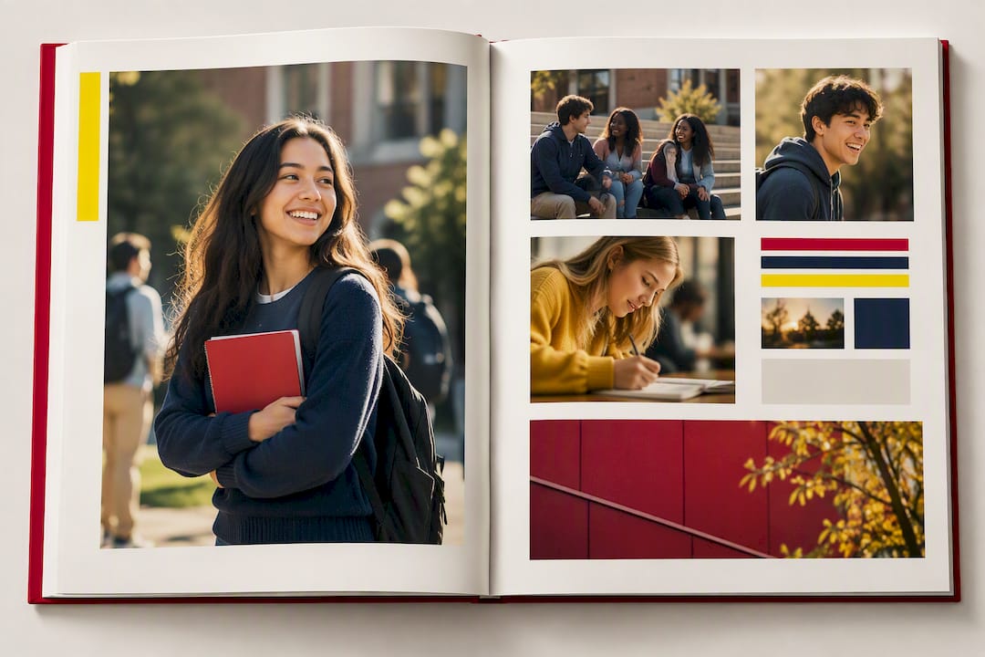
For clubs and activities, resist the urge to use a single formal group photo for every organization. Mix in a candid action shot alongside the group photo where possible. This is exactly the kind of image candid photography brings to a yearbook that a posed photo never captures, and it's usually the page students actually stop to look at years later.
Consider a "in their own words" feature for staff retiring or students graduating with an unusual story. A short quote block with a personal photo adds texture that a straight academic recap section can't.
Should You Offer a Digital Yearbook Alongside Print?
Digital yearbooks are increasingly common as a companion to the print edition, not a replacement for it. Most schools that offer both use the digital version for accessibility, archiving, and reach: alumni who moved away, grandparents who can't easily receive a shipped book, or students who want video content that print physically can't hold.
A digital companion can include content the print book can't, like short video clips from events, audio messages, or an expanded photo gallery beyond what page count allows in print. Some digital platforms let you embed the same layout files you built for print, so you're not building two separate designs from scratch.
Keep expectations realistic about integration. A digital yearbook is rarely a live-updating product that syncs automatically with your print files. Most schools treat it as a separate deliverable built from the same source content, finished after the print file is locked. Plan for that as a distinct phase in your timeline rather than assuming it happens automatically once print is done.
If budget or volunteer time is tight, print should stay the priority. It's the artifact families actually keep. A digital add-on is a strong bonus once your core book is on track, not a substitute for finishing the print edition well.
What Accessibility Considerations Matter in Yearbook Design?
Accessibility in yearbook design usually comes down to a handful of concrete, fixable choices rather than a specialized skill set.
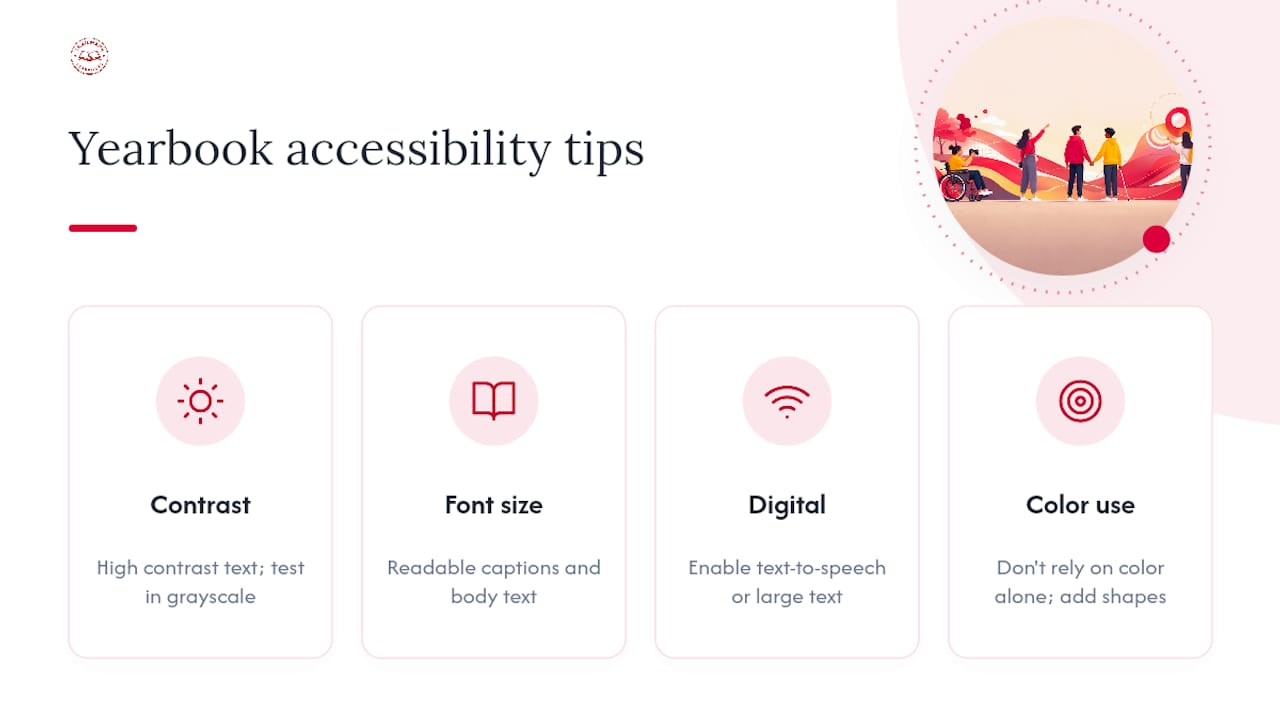
Contrast is the biggest one. Light gray text on a white background or a busy photo behind a caption might look stylish, but it's genuinely hard to read for a large share of readers, not just those with diagnosed vision impairments. Keep body text and captions at strong contrast against their background, and test it by squinting at the page or converting it to grayscale to check readability.
Font size matters more than most volunteer teams assume. Captions set at 6 or 7 points might fit more text per page, but they become unreadable for many readers, including plenty of parents and grandparents flipping through the book. Keep body and caption text at a size that holds up without a magnifying glass.
If your school has students using assistive technology or a digital yearbook companion, consider whether that digital version can support text-to-speech or larger-text viewing modes. Not every publisher platform offers this, but it's worth asking about if your school has students who would benefit.
Avoid relying on color alone to convey information, like using red text as the only indicator of a "must-read" callout. Pair color coding with a shape, icon, or bold label so the information comes through even for readers with color vision differences.
Adviser Perspective: Practical Expectations and Sanity-Saving Rules
Keep your book's scope realistic for the volunteers you actually have, not the team you wish you had. Write down your style rules early and share them before layout starts, not after rework begins. Start proofing early and protect at least one full week for someone outside the project to read it cold.
— Jace
How Trailmarkyearbooks Makes This Easier
Some yearbook publishers provide free design assistance, whether you're working in InDesign, Canva, or a fully custom setup, and offer a dedicated point of contact instead of a support ticket queue. Printing turnaround times may run 2 to 3 weeks once your file is submitted, with no order minimums and flexible deadlines.
If you want full production support rather than a DIY build, Design Your Own Yearbook or let a rep create it for you covers both paths under one roof. Schools working with a photography partner can also check the photography studio partnership options to streamline portrait day and image handoff. When you're ready to see print quality before committing, request a sample and get an instant, all-inclusive quote with no sales call required.
Practical Links and Templates to Explore Next
- InDesign yearbook template setup for master pages and export settings.
- Canva's yearbook maker for drag-and-drop templates and collaboration.
- Mixbook's page design basics for layout fundamentals and cover ideas.
Sources
- Free Yearbook Maker - Create Yearbook Designs Online | Canva
- How to Design a Yearbook: A Step-by-Step Guide for Students and Advisors | Touch Archive
- How to design a yearbook layout in InDesign | Envato Tuts+
- Creating a Yearbook? Get Started with Yearbook Page Design Basics | Mixbook
FAQ
What Is the Best Software for Designing a Yearbook?
The right software depends on your team's skill level and timeline. Experienced volunteers get the most creative control from Adobe InDesign, while fast-moving teams with limited design experience often do better with a drag-and-drop builder like Canva or a publisher studio platform. There's no single best option, only the one that matches your available time and skill.
Can AI Help Design a Yearbook?
AI tools can speed up specific tasks like generating theme ideas, drafting captions, or cleaning up photo color, but they can't replace a human editor making judgment calls about coverage and tone. Most schools still rely on volunteer teams and publisher templates for the actual layout and proofing work, with AI as a supporting tool rather than the core workflow.
What Are the Most Common Yearbook Design Mistakes?
Overcrowded spreads, inconsistent fonts and colors across sections, and low-resolution photos top the list of common layout mistakes. Missing or unbalanced coverage across grades and clubs, plus proofing errors in names and captions, round out the most frequent issues volunteer teams catch too late.
How Can I Design a Yearbook Without Design Experience?
Start with a template, whether that's an InDesign master file, a publisher studio design, or a Canva layout, rather than building pages from a blank canvas. Set a simple style sheet for fonts and colors before anyone starts building spreads, and lean on free design assistance from a publisher like Trailmarkyearbooks if you want a second set of eyes on your layout.
How Much Does Yearbook Printing Cost?
Costs vary based on binding, cover type, and add-ons like foil stamping or personalized covers. Trailmarkyearbooks lists instant, itemized pricing for options like perfect bound soft covers, hardcover board, and Smyth sewn binding, so schools can see exact per-book costs before committing to an order.