

Open InDesign, set your document to the printer's exact trim size plus a 0.125 inch bleed, and build one parent page before you place a single photo. From there, create paragraph and character styles for names, captions, and headlines, then decide whether portrait pages get built by hand or automated with Data Merge or a script. Package the finished file with fonts and linked images before you send anything to print.
That's the whole InDesign yearbook template setup in one breath. Everything past this point is the detail that keeps it from falling apart at 2 a.m. the night before your deadline.
Three things to do right now, before reading further:
- Confirm your printer's trim size and bleed requirement (call or check the spec sheet).
- Create a new document with facing pages enabled and at least one parent page.
- Set up a "Body Text" and "Caption" paragraph style before you place your first image.
The single most common print failure isn't a design mistake. It's a missing bleed or a broken image link. A yearbook that looks perfect on screen can still get bounced back by the printer if a photo box bleeds past the trim edge without margin, or if a linked image goes missing after files get moved between computers.
Key Takeaways
A print-ready InDesign yearbook depends on setting bleed and margins correctly from the start, building parent pages and styles before layout, and packaging fonts and links before handoff.
| Point | Details |
|---|---|
| Set bleed first | Use a 0.125 inch bleed and confirm trim size with your printer before building any spread. |
| Build parent pages early | Create a base parent for folios plus section-specific parents for portraits, features, and openers. |
| Lock in styles before layout | Set up paragraph and character styles for body, caption, headline, and folio text before placing copy. |
| Automate portraits carefully | Use Data Merge or a Yearbook Creator-style script, but test your CSV on a small batch first. |
| Package before you submit | Run File > Package and preflight checks to confirm fonts, links, and page count before handoff. |
| Consider a production partner | TrailMark Yearbooks supports InDesign-built files with free design assistance and 2 to 3 week turnaround for schools needing backup. |
Table of Contents
- What You Need Before You Start the InDesign Yearbook Design
- How Do You Set Up the Document for Print?
- How Do Parent Pages Keep Your Yearbook Consistent?
- Setting Up Styles for Consistent Yearbook Typography
- Building Portrait Grids and Photo Pages Without Losing Your Mind
- What Image and Export Settings Prevent Print Problems?
- How Should You Package and Hand Off Your Yearbook Files?
- What Advisers Get Wrong About InDesign Yearbook Production
- Why Skip the Shortcuts Everyone Recommends?
- Where TrailMark Fits If You'd Rather Not Finish Alone
- Where to Learn More and Get Adviser Support
- Frequently Asked Questions
- Sources
What You Need Before You Start the InDesign Yearbook Design
A clean InDesign yearbook design depends on what's sitting in your folders before you open the software, not on how good you are with the Pen tool. Gathering assets after layout has started is how projects slip their deadlines.
Here's what to have in hand before you set up your file:
- Portrait images, named consistently (student ID or last name + first initial works well), pulled straight from the photographer's delivery.
- A portrait CSV with columns for first name, last name, grade or homeroom, and exact filename. This file is the backbone of any automated portrait grid, so accuracy here saves hours later.
- Candid and event photos, sorted by section (sports, clubs, classes) so staff aren't hunting through one giant folder.
- Approved logos and sponsor art, at final resolution, not screenshots pulled off a website.
- Licensed fonts installed or activated through Adobe Fonts, matched to what your style guide calls for.
- A locked final page count, ideally a multiple of 4 (some printers require multiples of 8), confirmed with your printer before layout begins.
Ask your printer for a spec sheet before you touch the document setup dialog. That sheet tells you the trim size, required bleed, preferred color profile, and binding method, and skipping this step is how schools end up with a beautifully designed book that gets rejected at the print stage over a margin that's a sixteenth of an inch too tight.
Once assets are gathered, build a ladder: a simple spreadsheet listing every spread by page number, section, and the staff member responsible for it. Pair the ladder with a folder structure like 01_Assets/Portraits, 02_Assets/Candids, 03_InDesign, and 04_Exports, and agree on a file naming convention (Yearbook_v3_2026-03-01.indd) so nobody overwrites someone else's afternoon of work. Planning the ladder and section assignments before layout starts is a habit backed by classroom-tested InDesign yearbook lesson materials built specifically for school teams.
How Do You Set Up the Document for Print?
Go to File > New > Document and enter the trim size your printer gave you, most commonly 8.5 x 11 inches for a standard yearbook, though some schools print at 9 x 12 for a more premium feel. Set Facing Pages to on. This matters because it lets InDesign treat your file as spreads (left and right pages that mirror each other), which is how a physical book actually gets bound and printed.
Set your bleed to 0.125 inches on all four sides. Bleed is the extra image or color that extends past the trim line, and without it, any photo or color block meant to reach the edge of the page will print with a thin white sliver where the trimming blade wasn't perfectly precise. If your printer wants job notes, a slug area (extra space outside the bleed for printer instructions) can hold page numbers, color bars, or proofing notes that get trimmed away and never appear in the final book.
Margins deserve more thought than most first-timers give them:
- Keep captions and folios at least 0.25 to 0.375 inches from the trim edge, since text that sits too close reads as cramped or risks getting clipped.
- Add extra inside margin (0.5 inches or more) near the spine for binding creep, the slight shift in image position that happens as pages get sewn or glued together in a thick book.
- Never place a student's face or a headline directly on the spine fold.
Page count matters more than most advisers realize going in. Printers work in signatures, groups of pages (often 4, 8, or 16) printed on a single large sheet and folded down. A page count that doesn't match a signature multiple usually means blank pages get inserted, or the printer bills you for pages you didn't plan for. Confirm the required multiple with your printer before you lock your ladder.
Pro Tip: Build a one-page "dummy spread" first, a mockup with placeholder gray boxes and lorem ipsum text. Send it to your printer as a test file before committing to 120 real spreads. It's a five-minute step that catches trim and bleed problems while they're still cheap to fix.
How Do Parent Pages Keep Your Yearbook Consistent?
Parent pages (what many designers still call "master pages") are the template layer sitting behind your actual spreads. Anything you put on a parent page, a folio number, a section header, a background color band, automatically appears on every spread linked to it, and editing the parent page updates every one of those spreads at once.

InDesign's Parent Book workflow lets you manage multiple parent page files inside a single document or across linked files, which is exactly how yearbook teams keep folios, backgrounds, and recurring layout elements synced across a 150 page book without editing each spread by hand. That consistency, according to the Using InDesign manual's guide to the Parent Book, is precisely why professional layout teams build parent pages before they build a single real spread.
Set up your parent pages in this order:
- Build a base parent page first, holding only the folio (page number) field and any consistent background element like a color bar or watermark.
- Create section-specific parents on top of it, a portrait grid parent for the student photo pages, a feature-page parent with a large image well and headline frame, and a section-opener parent with more open white space.
- Use primary text frames on parent pages so that page numbers and running headers auto-populate instead of getting typed manually on every spread, which is where transposed digits and skipped folios usually creep in.
A small team of two or three editors can manage everything from three or four parent pages. Larger staffs with a dozen student contributors tend to do better with more specific parents, since a student assigned to "Sports" only ever touches the sports parent template and can't accidentally break the yearbook's front matter.
Pro Tip: Lock any element on a parent page you never want touched, like the folio frame, using the Layers panel. Locked elements simply refuse to move, sparing you the "why did page 47's number disappear" conversation two weeks before deadline.
One habit worth building early: when a parent page updates, spreads that override an element locally won't inherit the change automatically. That's by design, InDesign assumes a local override is intentional, but it means staff need to know the difference between clicking to select an inherited element (which updates automatically) and detaching it (which freezes it in place).
Setting Up Styles for Consistent Yearbook Typography
Paragraph and character styles are the single highest-leverage setup step in the entire InDesign yearbook design process, and it's the one novices skip most often because it feels like busywork before the "real" design starts. It isn't. Applying styles early means uniform text formatting across the whole book and dramatically less cleanup during final edits, a workflow confirmed across professional yearbook design tutorials.
Build these paragraph styles before you place any body copy:
- Body Text for standard captions and story copy.
- Caption Name for bolded student names under portraits.
- Headline for section and spread titles.
- Folio for the page number text.
- Byline for staff credit lines on feature spreads.
Name them in plain English, not "Style 1" or "Untitled," since a student staff member six months from now needs to understand what each style does without asking you. Character styles handle smaller overrides within a paragraph, italicizing a quote inside a caption, or bolding a nickname, without breaking the paragraph style underneath it. For guidance on choosing fonts that actually pair well across headlines and body copy, a staff font-pairing guide is worth reviewing before you finalize your style set.
Object styles do the same job for image frames: a consistent 2 point white stroke around portraits, a fixed corner radius on candid photo boxes, a standard drop shadow on pull quotes. Set the object style once and apply it to every frame of that type, instead of manually formatting 300 individual photo boxes.
Swatches tie it together. Build your school's colors as named swatches (not just picked from the color picker each time), and if a color needs to shift later, a school rebrand, a printer's color correction, you update the swatch once and every element using it updates across all 150 pages instantly.
Building Portrait Grids and Photo Pages Without Losing Your Mind
Portrait pages are where InDesign yearbook template setup either saves your staff weeks of work or eats them alive, depending on which method you pick.
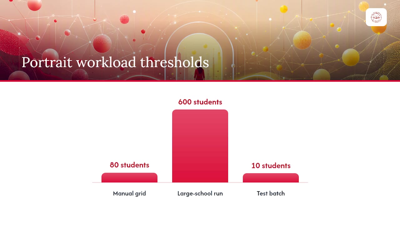
Method one: the manual grid. Build a clean grid of image frames on a parent page, sized and spaced evenly (a small grid is standard for most trim sizes), with a primary text frame beneath each photo for the name and caption. Staff then manually places each portrait and types each name. This works fine for a middle school of 80 students. It becomes brutal at a large school with many students across many spreads.
- Prepare your CSV in the PSPA format (last name, first name, grade, filename) that most automation tools expect, since a malformed CSV is the number one reason automated grids fail on the first attempt.
- Run InDesign's Data Merge panel, pointing it at your CSV and your portrait grid template, so InDesign auto-places each photo and populates each caption field from the spreadsheet.
- Or use a Yearbook Creator-style script or add-on built specifically for school yearbooks, which reads that same PSPA-style CSV and can auto-build entire portrait sections, including sorting by last name and flagging missing photos, a workflow detailed in Id-Extras' yearbook production guide.
Both automated paths depend entirely on clean data. If a filename in your folder doesn't exactly match the filename listed in your CSV, the merge either skips that student or throws an error, and testing on a batch of 10 students before running all 600 will save you from discovering that problem at midnight.
Pro Tip: Normalize every portrait filename to lowercase with no spaces before you build your CSV. "Smith_John.jpg" and "smith_john.JPG" look identical to a human and completely different to a script.
Batch relinking solves a related headache: when a folder of images gets moved, renamed, or handed off between computers, InDesign loses track of every linked file at once. Practitioner-built relink scripts can repoint dozens or hundreds of broken links in one pass instead of manually reselecting each one through the Links panel, a fix well documented on GraphicDesign StackExchange's thread on bulk relinking. Manual layout is doable for a small book, but most experienced yearbook designers lean on scripts specifically because repetitive placement tasks are where hours disappear fastest.
Common portrait-page problems and their fixes: a low-resolution warning usually means the source photo was under 300 ppi at its placed size, so swap in a higher-res original rather than scaling up. A "missing gap" in an alphabetical grid usually traces back to a student photo that was never delivered, not a script bug. And duplicate names in a grid almost always mean two rows in the CSV weren't deduplicated before the merge ran.
What Image and Export Settings Prevent Print Problems?
Print quality problems almost always trace back to two things: low resolution images and the wrong export preset. Both are fixable in minutes if you catch them before the file goes out.
Target 300 ppi (pixels per inch) for every portrait and candid photo at its final placed size in the layout. A photo that looks sharp on a laptop screen at 72 ppi will print visibly soft or pixelated, because screens and printing presses render image detail at very different densities. If InDesign flags a placed image with a yellow warning triangle in the Links panel, that's usually a resolution problem worth fixing before you go further.
Convert images to CMYK color if your printer requires it, since most consumer cameras and phones capture in RGB, a color space built for screens, not ink. Ask your printer which color profile they want; many commercial print shops still prefer a specific CMYK profile like U.S. Web Coated SWOP.
For your final export, use whichever PDF/X preset your printer specifies:
- PDF/X-1a is the older, more conservative standard many printers still default to, requiring all colors converted to CMYK before export.
- PDF/X-4 supports live transparency and RGB with embedded profiles, giving more flexibility if your printer's workflow supports it.
- Skip printer's marks and page information unless your printer specifically asks for them; extra marks outside the trim area can confuse automated print equipment.
Before you export anything final, run InDesign's Preflight panel (Window > Output > Preflight). It catches missing fonts, overset text (copy that's been typed but doesn't fit its frame and is invisibly cut off), and images linked in the wrong color space, the exact category of error that causes the most last-minute print delays according to professional layout guides. A red dot in the bottom left corner of your document window means preflight found a problem. A green dot means you're clear to export.
How Should You Package and Hand Off Your Yearbook Files?
Organize your production folder before you're staring down a deadline, not after. A workable structure looks like:
Yearbook_2026/
  01_Assets/ (Portraits, Candids, Logos)
  02_InDesign/ (working .indd files)
  03_Proofs/ (exported proof PDFs)
  04_Final_Export/ (packaged files for printer)
Name files with a version number and date (Spread_Sports_v4_0312.indd) so nobody's working off a stale copy by accident.
- Once your file is finished and preflight is clean, go to File > Package. InDesign gathers every font, every linked image, and the .indd file itself into one folder, ready to hand off.
- Open the packaged folder and confirm the fonts and links subfolders actually contain files, not empty placeholders, a mistake that happens when links were broken before packaging.
- Export a proof PDF at low resolution for a final read-through by an adviser or second staff member before the high-res version goes to the printer.
- Include a short handoff note with your cover specification, your portrait CSV, and any special instructions (foil color, embossing, binding type) alongside the packaged files.
A short pre-submission checklist, page count confirmed, all fonts embedded, no red preflight warnings, cover file matched to spec, catches most last-minute disasters before they become expensive ones. TrailMark's own adviser checklist for print risk management walks through this exact verification step in more depth, and the proofing process guide for advisers covers what to actually look for on that final proof read.
What Advisers Get Wrong About InDesign Yearbook Production
Most advisers who struggle with InDesign aren't struggling with the software. They're struggling with a data problem dressed up as a design problem: a portrait CSV with three different naming conventions, filenames that don't match, or a page count that shifted twice after the ladder was already built. Fix the data discipline first, and the InDesign part gets dramatically easier.
TrailMark Yearbooks works with school teams who build in InDesign and still want backup: fast 2 to 3 week turnaround, free design assistance if a spread needs a second set of eyes, and adviser resources built around exactly the kind of ladder and CSV planning this guide covers.
Most of the yearbook production headaches we hear about from advisers trace back to file prep, not design skill. A missing bleed, a mismatched CSV, a font that wasn't packaged. None of that is a talent problem. It's a checklist problem, and it's fixable before it ever reaches a printer.
Choosing between finishing the job yourself and handing production to a partner usually comes down to staff bandwidth, not skill. A confident designer with a clean CSV and a tested parent page setup can absolutely finish the book solo. A stretched adviser juggling a dozen other responsibilities often does better leaning on a flexible design partner who already knows the InDesign workflow and can catch the mistakes this guide just walked through.
Why Skip the Shortcuts Everyone Recommends?
The advice you'll find scattered across forums tends to push two extremes: either "just wing it in InDesign, you'll figure it out," or "buy the expensive plugin and let it do everything." Both miss the actual lesson buried in how professional yearbook teams work: the software matters less than the discipline around it.
A clean CSV and a locked ladder will save a novice designer more time than any script or add-on ever will, because automation amplifies whatever data you feed it, good or bad. What the conventional advice underrates is how much of yearbook production is really project management wearing a design hat. Parent pages and paragraph styles aren't advanced techniques, they're the guardrails that keep a student staff of twelve from quietly breaking the book one spread at a time.
If you take one thing from this guide, prioritize your CSV and file naming before you touch a single template. Everything downstream, portrait grids, Data Merge, packaging, gets dramatically easier once that foundation is solid, and dramatically harder if it isn't.
Where TrailMark Fits If You'd Rather Not Finish Alone
If you've built your parent pages, locked your styles, and are still staring down a stack of portrait pages with a deadline closing in, TrailMark Yearbooks is built for exactly that moment. Unlike hiring a freelance designer or negotiating a print quote through back-and-forth emails, TrailMark gives schools instant all-inclusive pricing online, no sales calls, no hidden line items, and shipping already built into the number you see.

You keep full control of your InDesign file if that's what your team prefers, or you lean on TrailMark's free design assistance to finish spreads your staff hasn't gotten to yet. Design options stay flexible: InDesign, Canva, or TrailMark's own online creator, whichever fits your team's actual skill level rather than forcing everyone into one tool. Turnaround runs 2 to 3 weeks with no order deadlines hanging over your ladder, and adviser support comes from a team built on more than 50 years of combined yearbook production experience. If you want to see the print quality before committing a whole book to it, request a physical sample or check current production pricing and options to see what a stress-free handoff actually looks like.
Where to Learn More and Get Adviser Support
A handful of resources cover the gaps this guide can't go deeper on:
- Envato Tuts+'s yearbook layout tutorial walks through styles and packaging in more visual detail than text alone can offer.
- Adobe Education Exchange's InDesign for Yearbook program offers classroom-ready lesson plans for teachers introducing students to layout work.
- Id-Extras' guide to yearbook automation goes deeper into script-based portrait grid tools for larger schools.
- Alhora is worth a look for teams assembling final book exports and double-checking layout before a print run.
- TrailMark's adviser resource library rounds out planning templates and guides built specifically for school production teams.
Frequently Asked Questions
What is the standard bleed size for a yearbook in InDesign? Most commercial printers require 0.125 inches of bleed on every edge. Always confirm the exact figure with your specific printer's spec sheet before finalizing your document setup, since some binding methods call for more.
Do I need Data Merge, or can I place portraits manually? Manual placement works fine for smaller books with fewer students. Past that, Data Merge or a script-based tool saves substantial time, provided your portrait CSV and filenames are clean and consistent.
What's the difference between a parent page and a template? A parent page is a layer inside InDesign that spreads inherit from automatically. A template usually refers to the finished .indd file itself, reused as a starting point for a new year's book, parent pages included.
Why do my images look fine on screen but blurry when printed? Screens display at roughly 72 to 96 ppi, while print needs about 300 ppi at the image's final placed size. A photo that looks sharp on a laptop can print soft if it wasn't sized for print resolution.
Should I convert my whole file to CMYK before sending it to print? Ask your printer first. Some accept RGB files with embedded profiles under PDF/X-4, while others require a full CMYK conversion under the older PDF/X-1a standard. Following their spec avoids unexpected color shifts.
Sources
- How to design a yearbook layout in InDesign | Envato Tuts+
- Using InDesign Manual - Mastering the Parent Book
- Id-extras