

Yearbook typography is built on four primary font categories: Serif, Sans Serif, Script/Handwritten, and Decorative/Display. Each type serves a specific design role, from body text to bold section titles, and choosing the right combination determines whether your yearbook looks polished or amateur. The industry standard for 2026 limits any single yearbook to a maximum of three font families. That constraint forces intentional choices and produces a cohesive, professional result. This guide walks yearbook staff members, designers, and educators through every font category, sizing standards, and pairing rules you need.
1. Types of yearbook fonts: the four core categories
The four recognized categories of yearbook fonts are Serif, Sans Serif, Script/Handwritten, and Decorative/Display. Each category carries a distinct visual personality and serves a specific function in page layout. Mixing categories without a plan produces visual noise. Understanding what each type does is the first step toward a design that feels intentional.
These categories are not arbitrary. They reflect how readers process type on a page. Serif fonts signal authority and tradition. Sans Serif fonts signal clarity and modernity. Script fonts signal warmth and personality. Decorative fonts signal energy and theme. A well-built yearbook uses at least two of these categories in deliberate contrast.
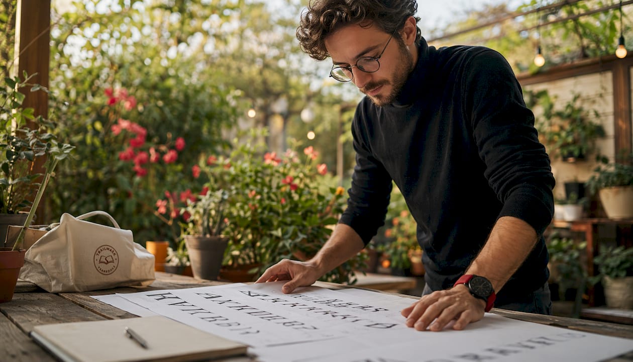
2. Serif fonts: the backbone of body text
Serif fonts are typefaces with small strokes, called serifs, attached to the ends of each letterform. Classic examples include Times New Roman, Garamond, Georgia, and Palatino. These fonts have anchored body text in print publishing for centuries because the serifs guide the eye across a line of text.
In yearbook design, Serif fonts work best for:
- Body copy: captions, student bios, and feature article text
- Pull quotes: short, impactful quotes set in a slightly larger size
- Formal headings: class pages and faculty sections where tradition fits the tone
The industry-standard font size hierarchy places body copy at 9–10pt and captions at 7–8pt. Those sizes demand a font with strong letterform structure, which is exactly what Serif fonts provide. A caption set in Garamond at 8pt reads cleanly. The same caption in a thin Sans Serif at 8pt can disappear on the page.
Serif fonts carry a classic, formal mood. They tell readers this content is worth reading carefully. That tone fits class photos, senior tributes written as formal copy, and faculty pages.
Pro Tip: Pair a Serif body font like Georgia with a clean Sans Serif headline font like Montserrat. The contrast creates visual hierarchy without requiring a third font family.
3. Sans Serif fonts: clean lines for headlines and modern layouts
Sans Serif fonts lack the small strokes of their Serif counterparts, which gives them a clean, open appearance. Popular examples for school yearbooks include Helvetica, Futura, Montserrat, Open Sans, and Proxima Nova. Their simplicity makes them highly readable at both large and small sizes.
Sans Serif fonts are the right choice for:
- Main headlines: section openers and spread titles
- Subheadings: 14–18pt labels that organize content within a spread
- Navigation elements: page numbers, section tabs, and divider labels
- Captions in modern layouts: when the design calls for a lighter, more contemporary feel
The standard size range for subheadings is 14–18pt, and main headlines typically run 24–48pt. Sans Serif fonts hold up at those sizes without looking heavy or dated. They also scale down well, which makes them flexible across a full yearbook.
Sans Serif fonts communicate approachability. They feel current without trying too hard, which suits middle school and high school audiences. A yearbook built around a Sans Serif headline system looks like it was designed with intention rather than assembled from defaults.
Pro Tip: Use one Sans Serif font in two weights, such as regular and bold, instead of choosing two different Sans Serif families. You get visual contrast while keeping your font count low.
4. Script and handwritten fonts: warmth in the right places
Script and handwritten fonts mimic the flow of cursive or hand-lettered writing. Examples include Pacifico, Playlist, Allura, and Brush Script. They carry an emotional warmth that no other font category matches. That warmth is also their biggest design risk.
These fonts work well in specific, limited contexts:
- Senior tribute headlines: a student's name set in a flowing script adds personal feeling
- Quote callouts: a short inspirational quote in a handwritten font feels authentic
- Theme wordmarks: the yearbook's title or theme phrase on the cover or divider pages
- Accent labels: small decorative text that supports a photo spread without competing with it
Overusing Script fonts in senior tributes makes layouts look unprofessional. The rule is simple: if every other spread uses a script font, none of them feel special. Reserve script typography for moments that genuinely call for a personal touch.
Legibility is the other concern. Script fonts become hard to read below 18pt, especially in print. Test any script font at its intended size before committing to it across a section. A font that looks beautiful on screen can blur or break apart in print at small sizes.
Pro Tip: Limit script or handwritten fonts to one per yearbook and use it only for accent text, never for body copy or subheadings. One well-placed script font creates impact. Three create confusion.
5. Decorative and display fonts: bold statements and visual energy
Decorative and Display fonts are built for impact. They include slab serifs, grunge styles, geometric display faces, retro letterforms, and illustrated typefaces. Examples include Bebas Neue, Rockwell Extra Bold, and custom display faces available through design platforms. These fonts are not meant for reading at length. They are meant to be seen.
The best uses for Decorative fonts in yearbooks include:
- Section divider titles: large, bold type that announces a new chapter
- Theme wordmarks: the yearbook's name or year set as a graphic element
- Spread openers: a single oversized word that sets the mood for a photo spread
- Accent graphics: type used as a shape or texture rather than a reading element
| Use Case | Recommended Size | Role |
|---|---|---|
| Section divider title | 72pt+ | Primary visual anchor |
| Spread opener word | 48–72pt | Mood setter |
| Theme wordmark | 60pt+ | Brand identity |
| Accent graphic | 36–60pt | Supporting visual element |
Bold decorative typography can replace photography as a primary visual element when high-quality images are limited. That is a significant design insight. A spread with one strong photo and an oversized display word can outperform a spread crowded with mediocre images. Type becomes the graphic.
Pro Tip: Use a Decorative font only for one role throughout the entire yearbook, such as section dividers only. Consistency turns a bold font choice into a recognizable design system.
6. Font pairing and hierarchy: the rules that hold everything together
Font pairing is the practice of combining two or three font families so they contrast without clashing. The most reliable pairing structure for yearbooks is a Serif body font, a Sans Serif headline font, and one optional accent font from the Script or Decorative category. That structure covers every typographic need a yearbook has.
Limiting any yearbook to a maximum of three font families is the single most important rule in yearbook typography. Three families is not a creative restriction. It is a professional standard. Using too many fonts creates a messy, disjointed design that signals inexperience to every reader who picks up the book.
Font size hierarchy gives each font family a clear job. The industry-standard hierarchy runs as follows: 7–8pt for captions, 9–10pt for body copy, 14–18pt for subheadings, 24–48pt for main headlines, and 72pt or larger for section dividers. Applying these sizes consistently across every spread creates a visual rhythm that readers feel even when they cannot name it.
Line spacing, called leading, is the often-overlooked factor that separates professional layouts from amateur ones. Setting leading to approximately 120% of the font size is the standard. For 10pt body text, that means 12pt leading. That small gap between lines makes copy breathe and dramatically improves readability in print.
Free font sites frequently cause licensing and print fidelity issues. Using fonts from a vetted printing platform library prevents technical errors and legal complications. Trailmarkyearbooks supports design through Canva, InDesign, and its own online creator, all of which provide access to print-ready font libraries. That matters when your yearbook goes to press.
Pro Tip: Build a one-page font style guide before your staff starts designing. List each font family, its role, and its approved sizes. Share it with every designer on the team. A shared style guide prevents the single most common yearbook design error: inconsistent typography across spreads.
Key Takeaways
The most effective yearbook typography system uses three font families maximum, assigns each a specific role, and applies consistent size hierarchy across every spread.
| Point | Details |
|---|---|
| Four font categories | Serif, Sans Serif, Script, and Decorative each serve a distinct design role. |
| Limit font families | Use no more than three typeface families to maintain professional cohesion. |
| Apply size hierarchy | Follow the 7–8pt caption, 9–10pt body, 14–48pt headline standard for every spread. |
| Use Script fonts sparingly | Reserve handwritten fonts for accents only; overuse makes layouts look unprofessional. |
| Set leading at 120% | Line spacing at 120% of font size separates polished layouts from amateur ones. |
Why font choices shape the story your yearbook tells
Font selection is one of those decisions that yearbook staff members tend to underestimate until they see the printed result. I have watched talented student designers spend weeks on photography and layout, then lose the professional feel of the entire book by using six different fonts across thirty spreads. The fonts were all attractive on their own. Together, they made the book feel like it was designed by six different people.
The fix is not complicated, but it requires discipline. Documenting font choices in a style guide before a single spread is built changes everything. When every designer on the staff works from the same one-page reference, the book reads as a unified piece of work. That consistency is what makes a yearbook feel like a publication rather than a class project.
The other thing I have seen staff members get wrong is treating Script fonts as a default for anything emotional. Senior sections, memorial pages, and quote spreads all get the same flowing cursive, and the effect flattens. Script fonts only carry emotional weight when they appear rarely. Use them once or twice in the entire book, and they land. Use them on every other page, and they become wallpaper.
Font choice is also a storytelling tool. A bold Decorative font on a sports section opener communicates energy before a single photo loads. A clean Sans Serif on an academics spread signals clarity and achievement. Your yearbook's visual design tools should make those choices easy to execute, not harder. When the typography works, readers feel the theme of the book without being able to explain why.
— Jace
Trailmarkyearbooks: professional font and design support for your staff
Choosing the right fonts is only half the work. Getting them to print correctly, at the right sizes, with the right spacing, is where many yearbook projects run into trouble.
Trailmarkyearbooks gives yearbook staff and advisers access to print-ready design tools through Canva, InDesign, and its own online creator, all backed by 50+ years of combined experience. Every font in those platforms is vetted for print quality, so what you see on screen matches what arrives in your hands. With a 2–3 week turnaround, no hidden fees, and free design assistance included, your staff can focus on creative decisions rather than technical ones. Request a sample to see how your font choices render in print before your final order. You can also browse the full range of yearbook production services to find the right fit for your school.
FAQ
What are the four main types of yearbook fonts?
The four main types are Serif, Sans Serif, Script/Handwritten, and Decorative/Display. Each category serves a specific role, from body text to bold section titles, in professional yearbook design.
How many font families should a yearbook use?
A yearbook should use no more than three font families. Exceeding that number creates visual inconsistency and makes the design look unprofessional.
What font sizes work best for yearbook body copy and headlines?
Body copy reads best at 9–10pt, captions at 7–8pt, subheadings at 14–18pt, and main headlines at 24–48pt. Section dividers typically use 72pt or larger for maximum visual impact.
When should you use Script fonts in a yearbook?
Script fonts work best as accents for senior tributes, quote callouts, or theme wordmarks. They should appear sparingly because overuse makes layouts look unprofessional and reduces their emotional impact.
What is leading and why does it matter for yearbook typography?
Leading is the vertical space between lines of text. Setting it to approximately 120% of the font size, such as 12pt leading for 10pt text, significantly improves readability and gives layouts a polished, professional appearance.