
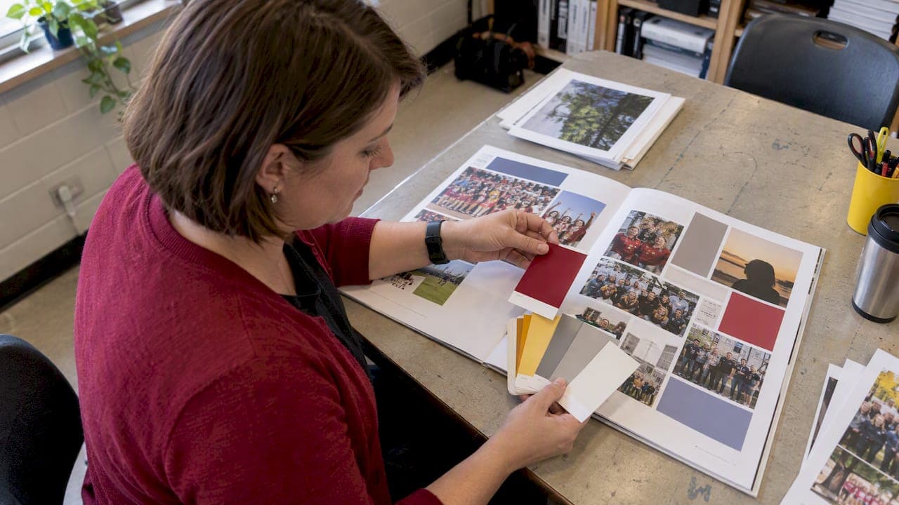
Choose a 3 to 5 color palette tied to your theme and school brand, then run contrast and color-blind checks on every text and background pairing before you send files to print. That single discipline prevents most of the legibility problems that show up in finished books. Below you will find ready-to-use palette ideas, a step-by-step approval checklist, basic color theory, and the specific contrast tests and tools that keep a palette both on-trend and printable.
TL;DR:
- Keep captions and small labels at 4.5:1 contrast and large text at 3:1 under WCAG 2.2; test every text and background pairing.
- Convert palette swatches to CMYK before export and request a physical proof when possible, since vivid blues and greens can print duller.
- Test the palette against real candid photos and simulate color blindness; add tinted panels behind text when busy images undermine contrast.
- Preserve school identity by making one official color dominant, using neutrals for broad backgrounds, and reserving saturated accents for headers or dividers.
- Use roughly 60% neutral space, 30% dominant color, and 10% bold accents, while letting actual photo spreads reveal clashes hidden by blank mockups.
Table of Contents
- Palette Ideas by Theme and Mood
- How to Choose and Approve a Yearbook Palette
- Color Theory Basics for Student Designers
- Accessibility and Contrast Checks Before Final Approval
- Print vs. Screen: What Changes When Colors Go to Press
- Tools That Make Palette Building and Testing Easier
- Who Wrote This and How TrailMark Supports Advisers
- Making School Colors Work Inside a Palette
- Using Color to Tell Your Yearbook's Story
- Balancing Vibrant Colors With Neutrals for Readability
- Trendy Accents Fade, Legibility and Cohesion Last
- Get Design Help Building Your Yearbook's Palette
- FAQ
- Sources
Palette Ideas by Theme and Mood
A good starting palette has one dominant color, one neutral, and one or two accents, never more than five total. Here are collections organized by mood, each ready to test in a layout or paste into a design tool.
- Classic school: navy #1B2A4A, cream #F5F0E6, crimson #9E2B25, gold accent #C9A227, works well on covers and formal portrait pages.
- Modern muted: slate #3C4A52, warm gray #B8B0A6, dusty rose #C98A8A, works best on section dividers and candid photo spreads.
- Bold and energetic: electric blue #0074D9, hot coral #FF4F58, sunshine yellow #FFD93D, charcoal #2B2B2B, suits sports pages and spirit-themed spreads.
- Pastel soft: blush #F7C9C0, mint #BFE3D0, lavender #D9CDEA, soft cream #FDF9F2, fits elementary books and gentle candid layouts.
- Earthy seasonal (fall): rust #B5502B, olive #6E7845, mustard #D9A441, cream #F3EADF, pairs well with outdoor and harvest-themed covers.
- Cool seasonal (winter): ice blue #A9CCE3, deep navy #1F3A5F, silver gray #C7C9CC, works for winter formal and holiday spreads.
- Retro throwback: burnt orange #C65D27, teal #2F6E6B, mustard #D9A441, cream #F0E6D2, strong on nostalgia-themed section openers.
- Minimal monochrome: three tonal shades of one hue plus a near-black, for example navy family #1B2A4A, #3A4D73, #7C8FB0, #16213A, clean for a text-heavy index page.
- Nature-inspired: forest green #3F5E4A, sand #E8DCC3, sky blue #9CC6DB, bark brown #5C4631, suits outdoor clubs and nature club features.
Warmer neutrals tend to flatter a wider range of skin tones in candid photography, while very saturated accents work best in small doses like headers or borders rather than across full backgrounds. Whatever palette you pick, test caption text and small labels separately since what reads fine at headline size can fail at nine or ten points.
How to Choose and Approve a Yearbook Palette
Start with your school's official colors, then layer in one or two accents for contrast and personality rather than reinventing the whole scheme. From there, work through a short approval checklist before any palette gets locked for production.
- Confirm the mood matches your theme: festive, formal, retro, or minimal.
- Check photo compatibility by dropping real candid and portrait images behind each color block.
- Establish hierarchy: one background color, one primary text color, one or two accents for emphasis.
- Run contrast checks on every text and background pairing, not just the boldest one.
- Confirm print-readiness by converting swatches to CMYK and reviewing them against a proof when possible.
When reviewing swatches with a designer or printer, ask what the CMYK build looks like next to the RGB version, whether captions were tested at actual print size, and whether the cover treatment needs a spot color or foil for the darkest or lightest tone. Our grid system guide is a useful companion here since palette accents often live inside grid blocks and dividers.
Pro Tip: Build a one-page style sheet with hex, CMYK, and Pantone values so every student working on the book pulls from the same source.
Color Theory Basics for Student Designers
Three terms do most of the work in palette decisions: hue is the color family itself, saturation is how intense or muted it looks, and value is how light or dark it sits. Value matters most for legibility, since text and background need enough value difference to read clearly even before you measure exact contrast.
Harmony types give you a shortcut to combinations that already look intentional:
- Analogous colors sit next to each other on the wheel and create a calm, cohesive feel.
- Complementary colors sit opposite each other and create strong, energetic contrast.
- Split-complementary pairs one color with two neighbors of its opposite for contrast with less tension.
- Triadic schemes use three evenly spaced hues for balanced variety.
- Monochrome palettes use one hue in several values, ideal for a clean, text-heavy page.
The 3 to 5 color rule exists because more than that tends to fight itself on a printed page. When a book needs more range, such as across many section dividers, a tonal system, several values of one or two hues, often reads more cohesive than adding brand-new colors.
Accessibility and Contrast Checks Before Final Approval
Run every text and background pairing through a contrast checker before you call a palette final, not just the ones that look risky. The Web Content Accessibility Guidelines (WCAG) 2.2 set the numeric standard for this.
A ratio of at least 4.5:1 is required for normal text and 3:1 for large text under WCAG 2.2. That standard applies to captions and small labels just as much as headlines, where failures are most common.
- Run a color-blindness simulation on your full palette, not just on individual swatches.
- Add outlines, tinted bars, or shadow boxes behind text sitting on busy photo backgrounds.
- Reorder text and background placement when a pairing sits below the threshold.
- Swap a saturated accent for a darker or lighter value rather than dropping it entirely.
If a pairing fails, the fastest fix is usually a value shift, darkening text or lightening the background, rather than picking an entirely new color.
Print vs. Screen: What Changes When Colors Go to Press
Monitors display color in RGB, but commercial printing reproduces it in CMYK, and that difference is why some vivid RGB colors never look quite right as a hard copy. Printing industry guidance on color reproduction confirms that converting artwork to CMYK and requesting a physical proof are the two steps that prevent most print surprises.
- Convert all art and palette swatches to CMYK before final file export, not just at proof stage.
- Build CMYK or Pantone values into your style sheet alongside the hex codes so printers and students apply the same colors.
- Order a physical color proof whenever the budget and timeline allow it.
- Embed fonts, confirm bleed and safe text areas, and double-check swatches are included in the export.
Saturated blues and greens are the most common colors to shift duller in CMYK, so plan extra scrutiny there if those shades carry your school colors. Our Illustrator prepress guide walks through bleed and CMYK setup in more detail for staff building covers.
Tools That Make Palette Building and Testing Easier
A short toolkit covers nearly every step from picking colors to shipping print-ready files. Adobe Color's palette generator lets you start from a base hue, such as your school color, and generate analogous, complementary, or triadic options in a few clicks. Adobe Express's accessibility tools simulate color blindness and check contrast directly on your chosen swatches.
- Free color-blindness simulators let any student preview a palette before it reaches layout.
- Hex-to-CMYK converters help you build the print-ready style sheet before file export.
- Save finished swatches as a shared library for InDesign, Illustrator, or Canva so the whole team works from the same values.
A simple workflow ties it together: extract a palette from your school colors, test contrast and color-blind simulation, convert to CMYK, then request a proof before full production.
Who Wrote This and How TrailMark Supports Advisers
Jace writes yearbook design guidance for advisers on color, layout, and prepress topics. On the production side, we provide design assistance and flexible design options so advisers are not stuck choosing and proofing a palette alone. Case studies and adviser testimonials on color-driven redesigns will be added here as they become available.
Making School Colors Work Inside a Palette
School colors are usually the fixed starting point, and the trick is building the rest of the palette around them rather than treating them as the whole scheme. If your official colors are a strong pair like navy and gold, use one as the dominant background or text color and the other as an accent rather than giving both equal weight across every page, which tends to look busy rather than branded.
A neutral, cream, warm gray, or soft white, gives both colors room to breathe and keeps candid photos from competing with the background. If your school colors are both highly saturated, like a bright red and bright blue, pull one down in value or saturation for backgrounds and reserve the brighter version for small accents such as headers or dividers. This keeps the identity intact without overwhelming photo-heavy pages.
For schools with three or more official colors, picking a primary and one supporting shade, then treating the rest as occasional accent use, usually reads cleaner across a full book than forcing all of them onto every spread. Our cover ideas guide shows several examples of school-color pairings applied to cover treatments specifically.

Using Color to Tell Your Yearbook's Story
A palette is not just decoration, it is one of the fastest ways to signal what your book's theme is about before a reader even reads a headline. A retro-themed book leans into warm oranges and teals, a nature or outdoors theme leans into greens and earth tones, and a minimalist or modern theme leans into a tighter monochrome or two-tone system.
Consistency across sections matters more than variety. If your opening spread introduces a navy, gold, and cream palette, carrying that same trio through sports, clubs, and class pages reinforces the theme rather than diluting it with new colors every few pages. Save bigger shifts, a seasonal accent change or a slightly brighter version of an accent color, for section dividers rather than the whole book, so the shift reads as intentional pacing rather than inconsistency.
Pairing your palette decisions with your theme concept early, before layout begins, also saves rework. Our theme ideas guide recommends testing a theme and its palette together across three sample spreads before committing, since a color that looks good on a mood board does not always hold up once it sits behind real photos.
Balancing Vibrant Colors With Neutrals for Readability
The most common palette mistake in student-designed yearbooks is using too many saturated colors at once, which fights for attention and tires the eye across a 100-plus page book. A reliable ratio is roughly 60% neutral, 30% dominant color, and 10% bold accent, though exact math matters less than making sure neutrals carry the bulk of backgrounds and body text areas.

Vibrant colors work best in small, deliberate doses: a headline, a border, a small icon or divider, rather than as a full-page background behind body text. Reserve your brightest accent for moments that need attention, like a section title or a pull quote, and let neutrals do the heavy lifting everywhere captions and body copy appear.
Testing this balance on an actual candid photo page, not just a blank mockup, reveals problems quickly, since busy photography combined with a saturated background often pushes small text below a safe contrast threshold. Our background design guide covers practical fixes for text sitting over photos, including tinted bars and solid-color panels that keep vibrant choices from undermining readability.
Trendy Accents Fade, Legibility and Cohesion Last
Chase one trendy accent color if it fits, but keep a stable core palette underneath it. A book that reads clearly and matches its photos years from now beats one that only looked current the day it shipped.
— Jace
Get Design Help Building Your Yearbook's Palette
Picking and testing a palette is easier with a second set of eyes, and that is exactly what our free design assistance is for. We pair fast 2 to 3 week turnaround with flexible design options across our own online creator, Canva, and InDesign, so your staff can build a palette and still hit production deadlines without scrambling.
If you want to see how a palette looks on an actual printed page before committing, request a sample and review the proof in hand rather than guessing from a screen. For schools weighing design-it-yourself against full support, our production services overview outlines both paths.
FAQ
What is the ideal number of colors for a yearbook palette?
Most cohesive yearbook palettes use 3 to 5 colors: one dominant, one neutral, and one or two accents. Going beyond that tends to compete for attention across a full-length book and makes consistent application harder.
What contrast ratio should yearbook text meet?
Text should meet at least a 4.5:1 contrast ratio for normal body copy and 3:1 for large text, per WCAG 2.2. Captions and small labels need the stricter 4.5:1 ratio since they are easy to overlook during review.
How do I check if my palette works for color-blind readers?
Run your full palette through a color-blindness simulator, such as the one built into Adobe Express, before finalizing pages. For code-level or site-wide accessibility remediation beyond print palettes, AccessWiser's guidance on color-blind fixes covers practical remediation strategies in more depth.
Why do my colors look different once the yearbook is printed?
Screens display color in RGB while commercial printing uses CMYK, so some bright RGB colors shift duller once converted, as noted in printing industry guidance on color reproduction. Converting your palette to CMYK early and requesting a physical proof is the most reliable way to catch these shifts before full production.
What's a simple way to pick a palette that still matches our school brand?
Start from your official school colors, then add one or two accent colors using a harmony type like analogous or complementary from a generator such as Adobe Color. Test the result against real candid photos and run a contrast check before treating it as final.
Sources
- Web Content Accessibility Guidelines (WCAG) 2.2
- Color palette generator – Color wheel tool | Adobe Express
- Commercial Printing: Thoughts on Color Reproduction