
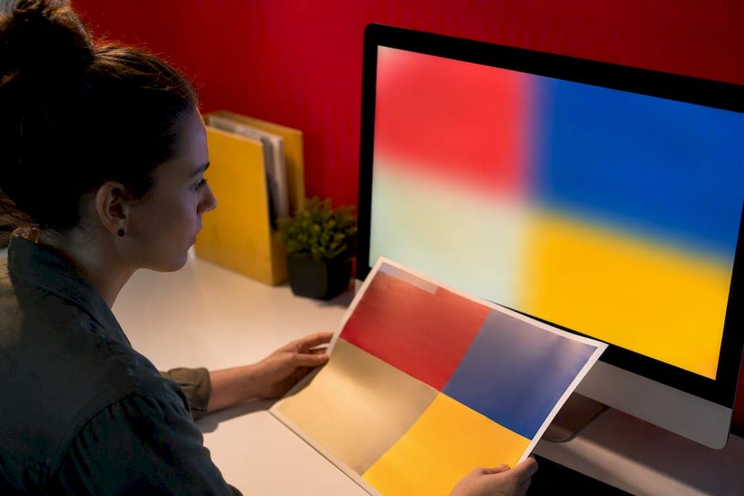
Use CMYK for anything headed to a commercial press and RGB for anything staying on a screen. RGB covers a wider range of color than any ink set can reproduce, so converting to CMYK can mute vivid blues, greens, and neons. Soft-proof before you convert, and send final files tagged with your printer's specific ICC profile.
TL;DR:
- Converting RGB to CMYK involves a lossy process that often causes vibrancy loss, especially in neon greens, saturated blues, and bright oranges.
- Choosing the correct rendering intent and conducting soft-proofing with device-specific ICC profiles greatly reduces color shifts before printing.
- Calibrating your monitor with hardware tools ensures soft-proof accuracy, particularly when matching paper stock and ink absorption.
- Using spot inks or Pantone colors is recommended for brand consistency and large color areas because CMYK cannot reproduce certain hues precisely.
- Always request a physical proof before large print runs to confirm color fidelity and avoid costly mismatches in high-volume projects.
Table of Contents
- CMYK vs RGB Printing: The Physics Behind the Colors
- Why Colors Shift When You Convert to CMYK
- How to Convert RGB to CMYK Without Losing Your Colors
- Soft-Proofing With ICC Profiles: Seeing Print Colors Before You Print
- Calibrate Your Monitor Before You Trust What You See
- Pure Black vs Rich Black: Getting Dark Colors Right
- Your Print-Ready File Checklist
- Fixing the Most Common Print Color Problems
- What Yearbook Printing Taught Us About Trusting a Screen
- Get Color Right Before You Commit to a Full Print Run
- Sources
CMYK vs RGB Printing: The Physics Behind the Colors
RGB and CMYK aren't just two settings in a dropdown menu. They're two completely different physical processes for producing color, and that difference explains almost every color problem a designer runs into.
RGB is an additive color model. A screen starts black and adds red, green, and blue light in varying intensities until it builds the color you see. Stack all three at full strength and you get white, because you're adding more light. This is how phones, laptops, and monitors work.
CMYK is a subtractive model. Paper starts white, and cyan, magenta, yellow, and black (the "K") ink get layered on top, absorbing certain wavelengths and reflecting the rest back to your eye. Add more ink and you move toward black, not white, because you're subtracting light rather than adding it. This is the core reason RGB and CMYK behave so differently even when you're looking at "the same" file.
The practical consequence is gamut, which just means the total range of colors a system can produce. RGB's gamut is dramatically larger than CMYK's. A few categories that routinely fall outside what ink can reproduce:
- Saturated, glowing blues (think sports team royal blue or a bright sky)
- Neon greens and lime shades used in logos or highlight graphics
- Fluorescent oranges, pinks, and other "screen bright" accent colors
- Deep, vibrant purples that shift toward muddy or gray in print
None of this means CMYK is broken. It means ink and light are different physical media, and no amount of software cleverness erases that gap entirely.
Why Colors Shift When You Convert to CMYK
Every color outside the CMYK gamut has to get mapped to the nearest color ink can actually produce. That remapping is where vibrancy disappears, and it's the single most common complaint designers have after a print job comes back looking "flat" compared to the screen.
The industry measures how noticeable a color shift is using a metric called Delta E. As a rough guide, a Delta E under 1 is invisible to the human eye, a shift between 2 and 3 is noticeable only to a trained eye under good lighting, and anything above 5 is obvious to almost anyone. Out-of-gamut blues and neons frequently shift by 8 to 15 Delta E units or more once forced into CMYK, which is why that bright royal blue on your monitor prints as a duller, grayer navy.
Common shift patterns worth knowing before you design:
- Bright blues often shift purple or gray once converted
- Neon greens lose saturation and drift toward a duller olive or teal
- Vivid oranges can flatten and lean slightly brown
- Rich purples frequently lose depth and read as muddy
This isn't a flaw in your printer. Converting RGB to CMYK is inherently a lossy process, because you're mapping a larger set of possible colors onto a smaller one. A controlled color-managed workflow narrows the gap. It doesn't erase it.
How to Convert RGB to CMYK Without Losing Your Colors
The order of operations matters more than most designers realize. Convert too early and you lose the ability to see what's happening; convert too late and you send an unconverted file straight to press.
Start by choosing a rendering intent, the rule your software uses to handle out-of-gamut colors. Relative colorimetric shifts only the colors that fall outside the target gamut and leaves everything else alone, which is the better default for most print work. Perceptual intent compresses the entire range proportionally, which can look smoother for photography but shifts more colors overall.
A safer, repeatable conversion sequence looks like this:
- Assign or soft-proof the target CMYK profile onto your RGB file first, without converting yet
- Turn on gamut warning to see exactly which areas will shift
- Manually adjust the flagged colors while you're still in a flexible RGB or Lab space
- Convert to CMYK using relative colorimetric intent
- Save with the destination ICC profile embedded in the file
For file format, PDF/X-1a or PDF/X-4 are the formats most commercial printers expect, since both lock in fonts, flatten transparency issues, and enforce CMYK or spot color output. High-resolution TIFF works well for individual images headed into a layout. Whatever format you choose, build in at least a 0.125 inch bleed beyond the trim line, keep critical text and logos inside a safe margin, and run a PDF preflight check before export. A properly built print-ready PDF catches most of these issues before a file ever reaches a press operator.
Soft-Proofing With ICC Profiles: Seeing Print Colors Before You Print
An ICC profile is a small data file that describes exactly how a specific device, whether a monitor, printer, or paper stock, renders color. Load the right one, and your software can simulate what a file will look like once it's actually printed, all without wasting a sheet of paper.
Generic CMYK profiles get you in the ballpark. A profile built for your printer's exact press and paper stock gets you much closer to the final result, because ink absorption and paper brightness change the outcome more than most designers expect. The ICC profile library at color.org hosts standard industry profiles like FOGRA39 and SWOP, and most professional print vendors will supply their own custom profile on request.
To soft-proof in Photoshop, InDesign, or Illustrator:
- Open View > Proof Setup > Custom, and load the printer's specific ICC profile
- Enable "Simulate Paper Color" to preview how the actual stock affects contrast and white point
- Turn on gamut warning to flag any colors that will shift once converted
- Compare the proofed view against your original RGB version side by side
Pro Tip: Always ask your print vendor directly whether they have a custom ICC profile for the paper and press combination you're using. A lot of designers assume a generic CMYK profile is "close enough," but a vendor-supplied profile often changes the soft-proof preview more than any manual color correction will.
Soft-proofing has one real limitation: it's only as accurate as the monitor displaying it, which is exactly why calibration matters so much.
Calibrate Your Monitor Before You Trust What You See
A soft proof is only useful if your monitor is telling the truth. An uncalibrated display can shift color temperature, contrast, and brightness enough to make a perfectly good conversion look wrong, or worse, make a bad one look fine.
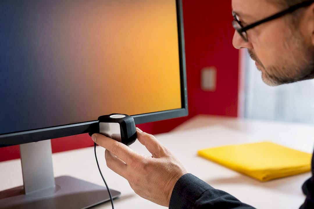
For professional or color-critical work, a hardware colorimeter is worth the investment over relying on your operating system's built-in display calibration, which adjusts based on your eye's judgment rather than an actual light-measuring sensor. Hardware calibration produces meaningfully more accurate soft-proofing results than software-only adjustments, particularly for anyone making repeated color decisions across a project.
A few numeric targets to calibrate toward:
- White point around 6500K for most general work, or 5000K if your print lab specifically requests it
- Gamma set to 2.2, the standard for most displays and print workflows
- Brightness dialed down to match a dim, controlled room rather than a bright office
- Ambient light kept consistent and low, since a sunny window behind your monitor will trick your eyes into misjudging contrast
Print labs calibrate their own proofing stations to these same benchmarks, which is the whole point: matching your setup to theirs is what makes a soft proof trustworthy instead of decorative.
Pure Black vs Rich Black: Getting Dark Colors Right
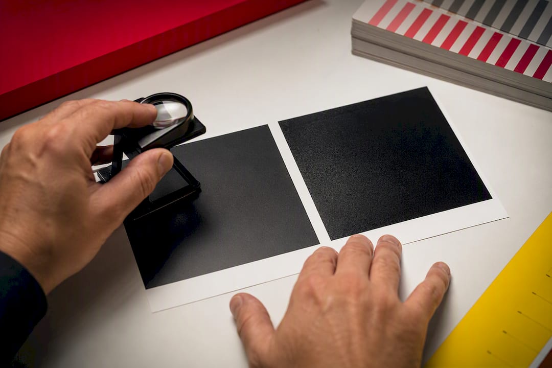
Not all "black" in a print file is actually black, and using the wrong one causes two very different problems. Body text set in 100% K (pure black, no other ink) prints crisp and sharp, because a single ink layer registers precisely even at small sizes.
Rich black, a mix of black plus other inks, is meant for large solid areas like backgrounds or big graphic blocks, where 100% K alone can look slightly gray or flat. A common, safe formula is roughly 60% cyan, 40% magenta, 40% yellow, and 100% K, though exact recipes vary by printer and paper.
- Never use rich black on small text or thin lines, since slight misregistration between four ink layers creates a visible colored halo or blur
- Reserve rich black for large solid shapes, not fine detail
- For exact brand colors that must match precisely across every print run, ask about Pantone or spot ink instead of relying on CMYK process color
Pro Tip: If a client's logo has to match an exact brand color every single time, don't fight the CMYK gamut. Specify the Pantone number and let the printer mix a spot ink instead.
Your Print-Ready File Checklist
Turning everything above into a repeatable process is what actually prevents color disasters. Here's the order that works:
- Start your design in RGB working space so you retain full editing flexibility and access to filters and effects
- Soft-proof early using the target ICC profile, even before your design is finished
- Convert to CMYK using relative colorimetric intent once the design is locked
- Embed the destination ICC profile in your final file
- Set bleed to at least 0.125 inch and keep critical elements inside the safe margin
- Outline or embed all fonts so nothing reflows on the printer's end
- Confirm images are at least 300 ppi at final print size, not screen resolution
- Run a full PDF preflight check for missing fonts, low-resolution images, and incorrect color spaces
- Request a hard proof, a real printed sample, for any color-critical or high-volume project
| Stage | What to check | Why it matters |
|---|---|---|
| Design | Working in RGB, soft-proofing early | Keeps editing flexible before locking colors |
| Conversion | Relative colorimetric intent, embedded profile | Minimizes shift on out-of-gamut colors |
| Export | PDF/X-1a or PDF/X-4, 300 ppi images, 0.125 inch bleed | Matches standard press requirements |
| Proofing | Soft proof plus one hard proof for critical jobs | Catches what a screen alone can't show |
If a project involves an exact brand color or a large production run, that's the point to move from process CMYK to a specified Pantone ink and to order a physical sample before committing to the full quantity. Reviewing how hard and soft proofs work together before a big run catches problems a monitor simply can't reveal.
Fixing the Most Common Print Color Problems
Most color complaints trace back to one of a handful of repeat offenders, and each has a quick fix.
- RGB file sent without conversion or profile: convert to CMYK, embed the destination ICC profile, and re-export before resending
- Images pulled from a website or screenshot: check resolution; anything under 300 ppi at final size will look soft or pixelated in print
- Pure black used on a large background, or rich black used on small text: swap to the correct black formula for the element's size
- Colors look right on screen but wrong in the proof: confirm your monitor is calibrated and that you're soft-proofing with the actual printer's profile, not a generic one
A soft proof previews color on a calibrated screen; a hard proof is an actual printed sample, and it's the only way to catch paper-stock effects a monitor can't simulate. For anything color-critical, request both, and ask your vendor directly which ICC profile they used and whether a hard proof is available before the full run.
What Yearbook Printing Taught Us About Trusting a Screen
Color surprises in yearbook production usually show up in the same place: a school's carefully chosen team blue or a neon spirit-wear yellow that looked perfect on a laptop and came back from press looking dull. It's rarely a printing error. It's an uncalibrated monitor and a file that skipped soft-proofing.
Three rules hold up on every project: always soft-proof against the actual print profile, never trust an uncalibrated display for final color decisions, and order a physical sample before a full print run when a color has to be exact. Full-color cover art and spirit pages are where this matters most, and choosing print methods that hold color well makes the difference between a book that looks like the proof and one that doesn't.
— Jace
Get Color Right Before You Commit to a Full Print Run
Getting CMYK and RGB right on your own files is one thing. Getting hundreds of pages of student photos, spirit colors, and cover art to print consistently across an entire yearbook run is another challenge entirely, and it's exactly what Trailmarkyearbooks handles for schools every season. Every order includes proofing support and free design assistance, so a school's adviser isn't left guessing whether a color will hold once it hits press.

Turnaround runs 2 to 3 weeks with instant, all-inclusive online pricing and no sales calls required. If color accuracy on a cover, spirit page, or team photo spread is a concern, the safest next step is to request a physical sample before committing to a full run, or check current yearbook production options and pricing directly.