
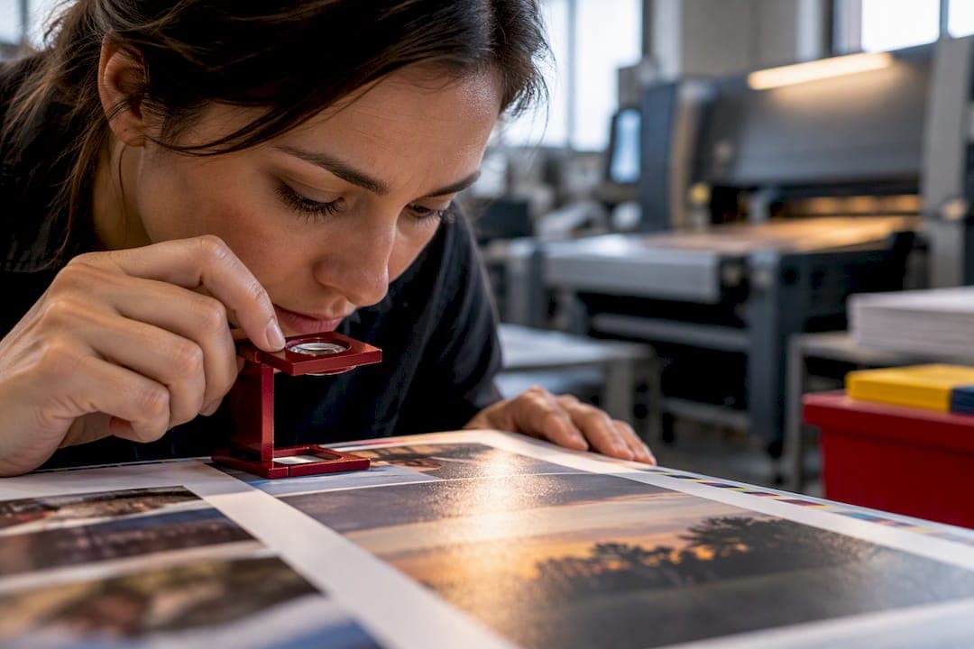
Aim for 300 effective ppi at the final print size, export a PDF/X file with embedded fonts and your printer's ICC profile, and run a short preflight check before you hit submit. Every recurring print complaint traces back to one of those three steps getting skipped. Fix the workflow, not just the individual photo.
TL;DR:
- Achieving sharp print quality requires images to be placed at 300 effective ppi at final size, with resolution dropping below 150 ppi resulting in visible pixelation.
- The effective ppi must be checked in layout software after cropping and resizing, not just the original file resolution, to prevent image quality issues.
- Export file formats like PDF/X-1a or TIFF with lossless compression, and maximum quality JPEG are essential to preserve image data during printing.
- Color accuracy depends on proper color space management, including soft proofing with printer ICC profiles, to avoid dull or flat output.
- Running a preflight checklist—checking effective ppi, bleed, safe zones, embedded fonts, and ink coverage—significantly reduces print errors and last-minute reprints.
Table of Contents
- What Resolution Actually Delivers Sharp Yearbook Print Quality?
- How Do You Calculate Effective PPI for a Layout Slot?
- Which File Types and Export Settings Work Best for Print?
- Why Do Printed Colors Look Dull Compared to the Screen?
- What Bleed and Margin Settings Prevent Cropped Images?
- How Do You Fix Blurry or Pixelated Yearbook Photos?
- What Should Be on Your Preflight Checklist Before Submission?
- TrailMark's Recommended Workflow for Fewer Print Surprises
- How Do Paper Types and Finishes Change the Way Photos Print?
- Does Offset or Digital Printing Change Yearbook Quality?
- How Should You Handle Spot Colors and Special Inks?
- What Quality Control Steps Happen During and After Printing?
- Small Checks, Big Difference
- Get Design Help That Matches Your File Workflow
- Sources
- FAQ
What Resolution Actually Delivers Sharp Yearbook Print Quality?
Photo-quality print output depends on resolution at final size, not on the megapixel count of the camera that took the shot. Most yearbook production guides converge on 300 ppi as the standard for crisp portraits, candids, and full-bleed spreads. That number isn't arbitrary. It matches the halftone screening most commercial printers use to reproduce continuous tone images without visible dot patterns.
You have some room to work with. Small slots, like a headshot in a grid, can hold up reasonably well at 225 ppi because viewing distance and print size are both small. Full-page spreads and cover images deserve the full 300 ppi treatment since flaws show up at arm's length. The floor matters more than the ceiling: images under roughly 150 ppi show visible pixelation and blur, no matter how good the original photo was.
Statistic Callout: Images placed below ~150 ppi cross a visible quality threshold. At that point, individual pixels become perceptible to the naked eye at normal reading distance, and no amount of sharpening fixes it after the fact.
How Do You Calculate Effective PPI for a Layout Slot?
Effective ppi is the number that actually matters once a photo gets cropped and resized inside a page layout. Original file resolution is meaningless if the image gets stretched to fill a bigger space than it was shot for.
The formula: effective ppi = image pixel dimension ÷ print size in inches.
A photo that's 1200 pixels wide, placed into a 3 inch wide slot, renders at 400 effective ppi. Sharp. That same photo stretched to fill a 6 inch wide half spread drops to 200 effective ppi. Borderline. Push it to 8 inches and you're at 150, right at the failure line.
Quick checks worth building into your routine:
- In InDesign, select the image and check the Effective PPI field in the Info panel or Links panel. It reflects any cropping or scaling you've applied, unlike the raw file resolution.
- In Photoshop, use Image > Image Size to confirm pixel dimensions before you export anything.
- If a photo tests low, don't fight it. Swap it into a smaller slot, request a larger original from whoever shot it, or reassign a higher resolution image to that spot instead.
This single check catches more print quality problems than anything else in the resolution planning process.
Which File Types and Export Settings Work Best for Print?
File format choice affects how much image data survives the trip from your layout to the press. JPEG is fine for photos when exported carefully; TIFF makes sense when you need lossless quality for a cover image or a detail-heavy spread that's going to get scrutinized. Native, flattened files matter more than people assume, since re-flattening layered files at export time can introduce artifacts you won't catch until proofs arrive.
For your final output:
- PDF export: Use a PDF/X preset. PDF/X-1a is the safer, more universally accepted option; PDF/X-4 supports live transparency if your printer's workflow handles it. Embed all fonts and images, and include bleed plus crop marks.
- JPEG settings: Export at maximum quality (10-12 in Photoshop's scale) and disable chroma subsampling if the option is available. That setting throws away color detail to save file size, which shows up as color fringing on printed edges.
- TIFF settings: Use LZW compression or none at all. Avoid JPEG compression inside a TIFF wrapper. It defeats the purpose of choosing a lossless format.
- Ask your printer which preset they actually want. Presses vary, and many printers publish their own export presets specifically to avoid this guesswork.
Why Do Printed Colors Look Dull Compared to the Screen?
Color shifts between screen and press almost always come down to color space mismatches. Adobe RGB has a wider gamut than sRGB and holds onto more saturated greens and cyans during editing, which makes it appealing for outdoor team photos and stage productions with vivid lighting. But that wider gamut only helps if the file gets correctly mapped to your printer's output profile before it ships. Skip that step and Adobe RGB files often print flatter than sRGB ones, because unmapped color data gets clipped or misinterpreted.
The fix is a soft proof. In Photoshop or Bridge, load your printer's ICC profile and preview how the image will actually render under those specific ink and paper conditions. Manufacturer support documentation walks through applying profiles at the driver level too, which is worth checking if you're proofing on a local printer before final submission.
Pro Tip: Email your printer before you start final color correction and ask two questions: which ICC profile should you use, and do they want you to convert to it or let their system manage the conversion on their end. That single email prevents most of the dull-color complaints editors run into after delivery.
What Bleed and Margin Settings Prevent Cropped Images?
Yearbook trim tolerances are tighter than most first-time editors expect, and a missing bleed is the single most common reason a page comes back with a white sliver along one edge. Standard yearbook bleed is 0.125 inches beyond the trim line on every side that touches the edge of the page. Safe margins, where you keep text and important faces, should sit at least 0.25 inches inside the trim line.
Practical rules for setting this up correctly:
- Set bleed guides in InDesign under File > Document Setup, or use your online creator's built-in bleed template if you're not working in professional design software.
- Export crop marks and bleed marks together when you generate your PDF, so the printer can see exactly where the trim falls.
- On spreads that cross the gutter, account for creep. Pages toward the center of a saddle-stitched book shift slightly during binding, so keep faces and critical content away from the inner margin.
- Never place a face, name, or headline right at the trim edge. Give it breathing room even when the layout looks tight.
Getting bleed settings right the first time saves a reprint cycle you don't have time for on a fixed school calendar.
How Do You Fix Blurry or Pixelated Yearbook Photos?
Most image problems fall into a handful of predictable categories, and each one has a different fix. Diagnosing correctly saves you from wasting time on a repair that was never going to work.
- Compression artifacts and banding. Blocky patches around faces or smooth gradient bands in a sky usually mean the image was saved at a low JPEG quality setting, sometimes more than once. If you spot this, request the original file rather than trying to smooth it out. Repeated resaving compounds the damage.
- Low effective ppi from oversizing. This isn't a quality problem with the source file. It's a layout problem. Resize the slot or swap the photo instead of trying to "fix" pixels that were never there.
- Changed DPI metadata with no new pixels. Bumping a file's DPI setting in software only changes the label, not the actual pixel count. It will not improve print output, and relying on it is one of the most common false fixes editors attempt.
- Legitimate upscaling candidates. Tools like Photoshop's Super Resolution or other AI-based upscalers can add convincing detail in some cases, but results vary significantly by image type. Test on a duplicate first, and treat upscaling as a last resort behind requesting the original file.
More diagnostic examples live in Trailmarkyearbooks's guide to common photo quality issues if you want a visual reference for what each artifact actually looks like on the page.
What Should Be on Your Preflight Checklist Before Submission?
A short, ordered check before you submit catches the overwhelming majority of print problems while they're still free to fix. Run through these in sequence, not randomly:
- Effective PPI. Re-check every placed image against its final slot size, especially anything resized late in production.
- Bleed and safe zones. Confirm 0.125 inch bleed on all edge-touching elements and that nothing critical sits inside the safe margin.
- Embedded fonts. Missing fonts get substituted silently by some workflows, which changes your layout without warning.
- PDF/X preset confirmation. Verify you exported with the preset your printer actually requested, not a generic PDF.
- Color and profile tagging. Confirm images are tagged with the correct color profile rather than left untagged.
- Total Ink Coverage. Check TIC before submission. Exceeding typical limits around 300 to 320 percent can cause drying problems or ink offsetting on press, and heavy blacks often need converting to a straight 100% K to stay under that ceiling.
Statistic Callout: A short prepress checklist covering PPI, bleed, embedded fonts, and TIC reliably catches the errors that otherwise turn into rejection fees or a delayed print run. Request a printed proof whenever your schedule allows it, and confirm expected paper stock before you approve anything final.
TrailMark's Recommended Workflow for Fewer Print Surprises
A reliable sequence looks like this: collect original files first, verify effective PPI for every slot, run a color and profile check, export as PDF/X, preflight the whole document, then request a proof before the full run commits. Skipping steps out of order is where most last-minute fire drills come from.

Trailmarkyearbooks builds design assistance and flexible file compatibility around exactly this sequence, whether your staff works in InDesign, Canva, or an online creator..
.
How Do Paper Types and Finishes Change the Way Photos Print?
Paper choice changes how ink sits on the page, and that affects perceived sharpness and color as much as resolution does. Glossy stock reflects more light and produces the most saturated, punchy color reproduction, which is why most photo-heavy yearbook spreads default to it. Fine detail in faces and busy backgrounds also reads more clearly on gloss because the surface doesn't scatter light the way uncoated paper does.

Matte stock trades some of that punch for a softer, less reflective look. Colors read slightly more muted, but matte handles text-heavy pages and fine type better since there's no glare under classroom or gymnasium lighting when students actually flip through the finished book. It also hides fingerprints and handling wear better over a school year of passing the book around for signatures.
Uncoated stock sits furthest from glossy on the spectrum. Ink absorbs directly into the paper fiber rather than sitting on a coated surface, which softens both color saturation and fine detail. Photos can look noticeably duller on uncoated stock, so it tends to work best for text pages, quote collections, or sections without dense photo grids rather than a cover or a full photo spread.
None of these choices are purely aesthetic. A photo that tested fine on your screen in RGB can look different depending on which stock absorbs the ink differently, which is another reason a physical proof matters more than a screen preview when you're choosing paper for the first time.
Does Offset or Digital Printing Change Yearbook Quality?
The printing method your book runs on affects color consistency, cost per unit, and how forgiving the process is of small file errors, and the two methods work differently enough that it's worth understanding before you commit to a print quantity.
Offset printing uses plates and runs ink through rollers onto paper, which is the traditional method for larger press runs. It delivers excellent color consistency across every copy in a run because the plates and ink mixture stay fixed for the entire job. Offset also handles spot colors and large solid areas of ink more predictably than digital processes, and it tends to be more cost-effective at higher volumes since the largest costs are in plate setup rather than per-copy printing.
Digital printing skips the plate step entirely and prints directly from a digital file, copy by copy. That makes it far more practical for shorter runs, on-demand reprints, and situations where a school needs a handful of extra copies after the main order shipped. Digital presses have improved substantially in color accuracy, but subtle shifts between print batches can occur more than they would on an offset run, since there's no fixed plate holding the color formula steady across the whole job.
Neither method is universally better. The choice usually comes down to print quantity and turnaround needs rather than pure image quality, and it's worth asking your printer which process they'll use for your order size so you know what to expect from the proof.
How Should You Handle Spot Colors and Special Inks?
Spot colors, like a Pantone match for your school's exact team color, and special finishes like foil stamping or spot UV coating add a level of print precision that standard four-color process printing can't always replicate exactly.
Standard yearbook printing runs on CMYK process color, which builds every color from four ink layers. That works well for photos and most design elements, but a specific brand or school color, especially a bright orange, a deep navy, or a metallic tone, can shift slightly from what you see on screen because CMYK simply can't reproduce every color in the visible spectrum with full accuracy. If your school color is critical to get exactly right on the cover, ask your printer whether a spot color match is available for that element rather than relying on process color to get close.
Foil stamping and spot UV coating for cover treatments require their own file setup, typically a separate spot color channel or a dedicated layer in your file that tells the printer exactly where the foil or coating applies. These elements sit outside your regular photo and text layers, so they need to be flagged clearly before export, not discovered by the printer during production.
The practical move is simple: if your yearbook cover uses a specific school color, a foil accent, or any coating beyond standard gloss lamination, say so explicitly when you send files. Printers can't guess which parts of a design need special ink handling from a flattened PDF alone.
What Quality Control Steps Happen During and After Printing?
Quality control doesn't end when you hit submit. It continues through proofing and into the final printed check, and skipping either stage is how errors that were catchable slip into thousands of finished copies.
A printed proof, not just a PDF preview on screen, is the single most valuable quality check available before a full run commits. Screens and printed paper render color differently no matter how well calibrated your monitor is, so a physical proof shows you exactly how colors, cropping, and paper stock will actually look. Requesting one costs time up front but catches problems a screen simply can't reveal, including how a specific photo reads on the paper stock you actually chose.
Color calibration on the printer's end matters just as much. Reputable print shops calibrate their presses regularly against known color standards to keep output consistent from the first book in a run to the last. That consistency is what prevents copy 50 looking noticeably different from copy 500, something that becomes a real problem when every student in a grade is comparing the same team photo across their own copies.
After the full run finishes, a spot check across several copies pulled from different points in the run confirms that consistency held. Minor variation is normal in any print process, but it shouldn't be visible to a student flipping between two copies side by side. If you're working with a printer who offers this kind of run-to-run check as part of standard production, that's worth confirming ahead of time rather than assuming it's included.
Small Checks, Big Difference
Prioritize getting your hands on original source files over trying to repair damaged ones. Don't panic over every borderline photo. Reassigning it to a smaller slot often solves the problem instantly.
Pro Tip: Schedule your proof request earlier than feels necessary. That buffer is what buys you room to rescue a problem photo instead of discovering it during the final week.
Small production checks, run consistently, are what separate a yearbook that looks professional from one that doesn't.
— Jace
Get Design Help That Matches Your File Workflow
Trailmarkyearbooks is the alternative to guessing your way through file prep alone. You get instant, transparent pricing with no sales calls, and a 2 to 3 week turnaround that gives you room to fix a flagged photo instead of scrambling against a hard deadline. Free design assistance comes standard, and your staff can work in InDesign, Canva, or the built-in online creator without reformatting anything to fit a rigid template.

If color accuracy or paper choice is worrying you before a full run, request a printed sample first and see exactly how your photos render on the actual stock. For schools weighing binding and cover options, the production options page lays out perfect bound, hard cover, and finishing choices with pricing shown up front, no quote request required.
Sources
- File preparation for printing | University of Wisconsin-Madison Printing
- A guide to choosing between sRGB and Adobe RGB | The Photography Institute
- Adjusting ink limits | Printing Industries of America
FAQ
Is 300 DPI Better Than 600 DPI for Yearbook Photos?
For photo pages, 300 ppi is the industry standard and going higher rarely improves visible print quality. Higher resolutions matter more for fine-line text or line art than continuous tone photography, so doubling resolution on a portrait photo mostly just doubles your file size without a visible benefit.
Is 200 DPI Good Enough for Print Quality?
200 ppi sits in a gray zone. It's above the roughly 150 ppi threshold where pixelation becomes visible, but below the 300 ppi standard most printers recommend for sharp results. It can work for smaller photo slots but isn't safe for a full spread or cover image.
Is PNG or JPEG Better for Yearbook Printing?
High-quality JPEG is generally the more practical choice for photographs going to print, since it balances file size with image fidelity when exported at maximum quality settings. PNG works well for graphics with sharp edges or transparency, like logos, but it's not the standard format for photo pages in most yearbook workflows.
What Does TrailMark Charge for Different Cover Options?
Pricing is fully itemized and published upfront on the production options page, including options like a perfect bound soft cover at $1.60 per book and 150 point hardcover board at $1.50 per book. There's no quote request required to see exact costs before you commit.
Why Does My Printed Yearbook Look Different Than It Did on Screen?
Screen and print use different color methods, RGB versus CMYK, so some shift is normal even with correct color management. The larger cause of unexpected shifts is usually a missing or mismatched ICC profile between your working file and the printer's actual output conditions.