
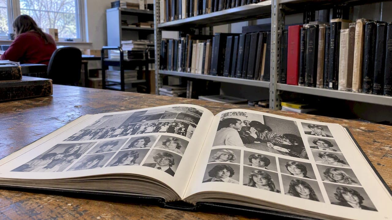
A black and white yearbook gives you a cohesive, timeless look that can cost less to produce while putting the focus on composition, contrast, and emotion instead of color. The trade-off is less visual pop in candid shots and sports action, so many schools blend approaches. The themes, print specs, photo prep steps, sourcing tips, and pricing details below will help you decide and build the book well.
TL;DR:
- For books longer than 80 pages, use a modular grid and page ladder, with one focal image per spread and consistent heading and body fonts.
- Export photos at 300 DPI at print size, keep originals archived, and use curves to preserve midtones and facial detail during grayscale conversion.
- Schools can reserve color for sports or arts features and use grayscale for portraits and class pages, balancing visual impact against printing costs.
- Request a printed proof and check halftones, skin tones, and dark backgrounds; screen previews may not match paper, and optional finishes raise each book’s cost.
Table of Contents
- Black and white yearbook inspiration and theme ideas
- Yearbook formats and print specs that matter for black and white books
- Design and layout tips for strong black and white pages
- Photography and photo prep for black and white printing
- Where to find black and white images and examples
- Pricing options and practical choices for black and white printing
- Publisher perspective: why TrailMark recommends black and white options
- How TrailMark Yearbooks can handle your black and white yearbook
- FAQ
- Sources
Black and white yearbook inspiration and theme ideas
A strong monochrome theme gives student designers a clear visual language before they open a single template. The best concepts repeat a motif (a border, a typeface, a texture) across every spread so the book reads as one object instead of scattered pages.
- Vintage film noir: heavy shadows, dramatic angles, and a serif masthead on the cover.
- Newsprint archive: columns and halftone dots that mimic old newspaper layouts.
- Fine art portrait: large single portraits with generous white space, like a gallery catalog.
- Industrial minimalist: thin grid lines, sans-serif type, and lots of negative space.
- Polaroid scrapbook: white-bordered photo frames arranged in loose, overlapping grids.
- Architectural blueprint: technical line work and measurements as decorative elements.
- Film strip motif: sprocket-hole graphics framing candid sequences.
- Typewriter memo: monospace captions styled like old typed notes.
- High-contrast street photography: bold blacks, blown highlights, and tight crops.
- Chalkboard and ink: textured backgrounds that suggest classroom materials.
- Botanical silhouette: plant and nature silhouettes as recurring page accents.
- Letterpress classic: deep black type on cream or off-white stock.
For covers, pick one motif and let it anchor the design: a single oversized portrait, a repeated pattern, or a bold title treatment. Keep portraits lit consistently (even, front-facing light works best) so the theme does not fight the photography. See cover ideas by grade and style for more starting points.
Yearbook formats and print specs that matter for black and white books
Format choices affect both appearance and price, and they matter more in black and white because there is no color to mask inconsistencies in paper or binding quality.
- Standard sizes run from smaller 8x8 workbook formats up to full 9x12 trim, with typical page counts starting in the mid-twenties and scaling up from there.
- A perfect bound soft cover keeps costs down, while a 150 point board hard cover or Smyth sewn binding holds up better for archival keeping.
- Matte cover finishes pair well with monochrome art because they avoid glare on dark photo areas; a flat foil stamp adds a single metallic accent without disrupting the grayscale palette.
- Designing in CMYK from the start, rather than converting late, keeps tonal values predictable when the printer renders the file, according to Touch Archive's design guide.
- Request a printed proof before final approval so you can check halftone smoothness, especially in skin tones, which can look blotchy if the screen pattern is too coarse.
Design and layout tips for strong black and white pages
Without color to guide the eye, layout structure carries more weight. A modular grid and a page ladder keep portraits and candids aligned from the first spread to the last, which matters most once a book runs past 80 pages.
Visual hierarchy comes from scale, whitespace, and tonal contrast rather than color blocking. Make one image per spread the clear focal point by sizing it larger and surrounding it with breathing room, then let smaller supporting images and captions recede. An InDesign yearbook layout tutorial walks through building parent pages and paragraph styles that keep these patterns consistent across dozens of spreads without manual rework.
- Build a repeatable photo grid template and reuse it across class and club pages.
- Set one heading font and one body font for the entire book to avoid visual noise.
- Add texture through halftone patterns, paper stock choice, or a restrained foil or emboss accent rather than multiple decorative effects.
- Check that captions and folios stay legible against darker photo backgrounds.
Pro Tip: Test your grayscale contrast by squinting at a printed page: if text disappears into the background, increase the tonal gap before sending final files.
A shared grid system and page ladder prevent the last-minute layout scramble that tends to hit staffs working against a deadline.

Photography and photo prep for black and white printing
Shoot for contrast and texture, not just a good smile. High-key lighting (bright, low-shadow) suits portrait pages, while low-key, shadow-heavy lighting works well for mood shots in theater, music, or night events.
- Export final images at 300 DPI at the size they will print, not the size they were captured.
- Crop tight enough to keep faces out of the gutter and spine area.
- Keep original high-resolution files archived even after converting to grayscale for layout.
- Use curves rather than a flat grayscale conversion to protect midtones and avoid crushed shadows that erase facial detail.
Soft-proofing against the printer's ICC profile, plus a calibrated monitor, is the standard workflow professional labs use to match screen tonal values to the final print, according to Canon's monochrome printing guide. That guide also recommends making a small pattern-print test sheet with slight brightness and contrast variations before committing to final settings, since what looks right on a screen can print darker or flatter on paper. For class pages specifically, the adviser playbook on class photo sizing covers how to avoid shrinking portraits into illegible thumbnails.
Where to find black and white images and examples
University and public library digital archives are a reliable free source for both inspiration and historical content. The UNT Digital Library's yearbook holdings give access to thousands of digitized yearbook pages that show how earlier decades handled monochrome layout and typography.
- Check usage rights before publishing any archival page; many collections require attribution or written permission for reproduction.
- When student photography falls short for a themed spread, commercial stock libraries offer black and white images as a supplement.
- Build a "heritage" spread using archival images with clear captions and source credit, which adds depth without extra photography. A guide to yearbook historical archive value explains how to use this material well.
Pricing options and practical choices for black and white printing
Grayscale economy printing costs less than full four-color process runs, mainly because it uses fewer ink passes, but the trade-off is less tonal richness in photos that were shot or lit for color. Many schools split the difference: black and white for portrait and class pages, color for a handful of feature spreads like sports or arts events, which balances budget against visual impact.
- Request a printed sample before committing, since screen previews rarely match paper output exactly.
- Printed endsheets, a flat foil stamp, and higher-grade paper stock are common add-ons that raise per-book cost.
- A split binding or personalized covers also add to the base price, so confirm final specs before locking the order.
- Ask for instant, itemized pricing rather than a quote that bundles options together, so you can see what each choice costs.
Publisher perspective: why TrailMark recommends black and white options
Black and white is recommended when a school wants a cohesive, archival feel on a tighter budget, with design assistance and a printed proof available before final approval. Our adviser design resources and fast sample turnaround make testing a monochrome concept low-risk.
— Jace
How TrailMark Yearbooks can handle your black and white yearbook
We build instant, transparent pricing with no sales calls and no hidden fees, so you can see exactly what a black and white run costs before committing a budget line. If you want help beyond production, our Design Your Own Yearbook and full-service design options cover schools that need a hands-on partner as much as schools that just need printing.
Typical turnaround runs 2 to 3 weeks with no order deadlines, which helps when a theme or cover concept needs a late revision. Schools that want to see tonal reproduction before committing can request a printed sample first.
| What you need | Where to start |
|---|---|
| Instant pricing, no sales call | Main site |
| Binding, cover, and finish options | Printing options |
| Full-service design help | Design Your Own Yearbook |
| Proof before final approval | Request a sample |
Requesting a sample provides a printed proof well before submission deadlines.
FAQ
Can you see yearbook pictures online?
Many historical yearbooks are digitized and viewable through university and public library archives, such as the UNT Digital Library. Current yearbooks are sometimes posted by individual schools, though availability varies by district and year.
Can I print a color photo in black and white?
Yes, a color photo can be converted to grayscale for printing, but the result looks better when you preserve midtones during conversion rather than using a flat, automatic grayscale filter. Soft-proofing against the printer's color profile before final output helps the printed version match what you see on screen, a step Canon's monochrome printing guide recommends.
Can you still get a yearbook years later?
Reprints and on-demand copies are often possible well after the original print run, depending on the publisher's reorder policies and whether the files were archived. Checking with the school or the original printing service is the fastest way to confirm availability for a specific year.
What does a yearbook look like?
A typical yearbook includes a cover, student portraits organized by class or grade, candid photo spreads, club and sports sections, and often a signature or memory-book section at the back. Format varies by format and size, but most follow a page ladder that groups similar content together for easy navigation.
What should schools check before choosing between classroom display tools and a printed yearbook?
A printed yearbook offers a lasting physical keepsake, while tools like digital signage work well for showcasing achievements in real time around campus; some schools use both for different purposes. Reviewing options such as K-12 digital signage alongside a printed book helps clarify which format fits a specific goal.
Sources
- UNT Digital Library — yearbook holdings
- How to design a yearbook step-by-step guide — Touch Archive
- Making the perfect monochrome print — Canon
- How to design a yearbook layout in InDesign — Envato Tuts+