

A consistent yearbook style guide is the single most effective way to keep your book cohesive, protect editorial accuracy, and save your staff real production time. When every section follows the same fonts, caption rules, and photo specs, the book reads as one unified piece rather than a collection of disconnected spreads. The three outcomes that matter most: visual unity across every page, editorial accuracy in names and quotes, and faster approvals because design debates stop before they start.
A complete style guide covers three layers:
- Visual rules: fonts, color palette, grid/margins, image treatment
- Verbal rules: tone, caption format, name/grade conventions, punctuation standards
- Technical rules: photo resolution, file naming, export specs, submission deadlines
Table of Contents
- What a yearbook style guide actually is
- Key elements every style guide must include
- Why consistency matters for your book, staff, and school record
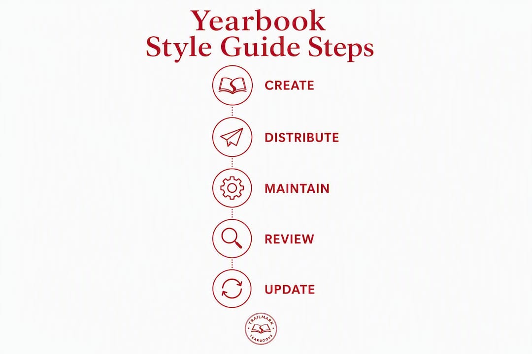
- How to create, distribute, and maintain your style guide
- Common pitfalls and how to fix them
- Your printable one-page style checklist
- How Trailmarkyearbooks supports style guide implementation
- Key Takeaways
- The part most advisers skip
- Trailmarkyearbooks makes the first step easy
- Useful sources and resources
What a yearbook style guide actually is
A yearbook style guide is a living document that sets every visual, verbal, and technical rule your staff follows from first spread to final proof. Think of it less like a rulebook and more like a creative compass: by narrowing the choices upfront, you free student editors to focus on photography and storytelling instead of debating whether a caption ends with a period.
The guide typically covers:
- Fonts: family names, sizes, weights, and roles (heading, body, caption)
- Color palette: primary and accent hex codes, approved tints for print backgrounds
- Layout rules: column grid, margin widths, gutter sizes, white space minimums
- Caption and name formats: exact punctuation, grade notation (e.g., "Sofia Reyes, 10" vs. "Sofia Reyes, Grade 10"), and photo credit style
- Photo specs: minimum resolution (300 dpi for print), acceptable file types, file naming convention
- Deadlines and file handoffs: section due dates, export format, folder structure
The guide also plays a critical role at production handoffs. When a copy editor, layout designer, and print vendor all reference the same document, errors from miscommunication drop sharply. For yearbook theme alignment, the guide ensures the theme shows up consistently in dividers, typography, and photography treatment without overwhelming the content.
Key elements every style guide must include
Break your guide into three groups. Here is what belongs in each, with concrete examples your staff can use immediately.
Visual elements
- Heading font: one display or serif typeface, 24–36 pt for spread headlines
- Body font: a family with regular, bold, italic, and bold-italic cuts (e.g., Freight Text, Minion Pro, or Source Serif 4) at 9–11 pt
- Caption font: a clean sans-serif at 7–8 pt (e.g., Proxima Nova, Myriad Pro)
- Primary color: one brand hex (e.g., #8B1A1A for a deep red school color)
- Accent color: one supporting hex plus a 20% tint for print-safe backgrounds
- Grid: a 6-column grid with 1p6 gutters and 3p0 outer margins for standard spreads
- Visual hierarchy: clear entry points per spread, consistent use of white space, and no more than three type sizes per page (see layout guidance for advisers)
Verbal elements
- Caption format: First name Last name, grade. Action description. (e.g., "Marcus Webb, 11. Sprints toward the end zone during Friday's home game.")
- Name/grade notation: decide once — "Grade 10" or "10th grade" or just "10" — and never mix them
- Tone: warm, specific, present tense for captions; feature-length copy can use past tense
- Punctuation: Oxford comma, no serial comma exceptions; AP style for dates and titles unless your house style differs
- Permissions and ethics: explicit rules for photo consent, quote attribution, and privacy (see yearbook policy best practices)
Technical elements
- Photo resolution: 300 dpi minimum at final print size; 72 dpi web exports for online previews
- File types: TIFF or high-res JPEG for photos; PDF/X-1a for final page exports
- File naming:
SECTION_SPREAD_LASTNAME_v1.indd(e.g.,SPORTS_P42_WEBB_v1.indd) - Accessibility: minimum 4.5:1 contrast ratio for text over backgrounds; inclusive caption conventions that describe rather than assume (accessibility planning guide)
Recommended font roles for print:
| Role | Example Font | Size | Weight |
|---|---|---|---|
| Spread headline | Playfair Display | 24–36 pt | Bold |
| Section subhead | Playfair Display | 9–11 pt | Regular |
| Body copy | Source Serif 4 | 9–11 pt | Regular / Bold |
| Caption | Proxima Nova | 7–8 pt | Regular / Italic |
| Pull quote | Proxima Nova | 7–8 pt | Bold Italic |
Pro Tip: Pick a body font family that ships with at least four cuts — regular, bold, italic, bold-italic. Fonts with those four styles let you handle emphasis, captions, and pull quotes without ever importing a second family, which keeps your file sizes down and your layouts consistent.
Why consistency matters for your book, staff, and school record
Consistent design elements keep a yearbook engaging and readable; inconsistent design makes a book feel disorganized and less likely to be revisited. That is the reader experience argument in one sentence. But the production argument is just as strong.

When your staff agrees on a caption format on day one, a single typographic rule prevents dozens of inconsistent captions scattered across sports, clubs, and academics sections. Without that rule, a copy editor spends hours hunting down variations — "Sofia Reyes, 10th grade" on page 14, "Sofia Reyes (10)" on page 38, "Reyes, Sofia — Grade 10" on page 61. Each one is a potential error in the permanent school record.
The production benefits stack up quickly:
- Fewer design debates during layout because font and color choices are already locked
- Faster adviser approvals because spreads arrive matching the agreed template
- Fewer reprints or costly corrections because photo specs and export formats are defined before anyone submits a file
- Reduced rework when student editors turn over year to year, since the incoming class inherits a working system
Editorial accuracy matters beyond aesthetics. A misspelled name or wrong grade in a printed yearbook cannot be corrected after binding. Consistent name and caption rules are the first line of defense. Systematic approaches to layout, coverage, and production are what separate books students and alumni value over time from ones that feel thrown together.
How to create, distribute, and maintain your style guide
Building the guide is a one-time investment that pays back every production cycle. Here is a practical sequence:
- Assign an owner. One person — usually the adviser or a senior editor — holds the master document and approves all exceptions. See adviser responsibilities for a clear breakdown of who owns what.
- Audit last year's book. Flip through it and note every inconsistency: font variations, caption format drift, photo quality gaps. These become your first rules.
- Pick theme-appropriate rules. Choose fonts and colors that support the year's theme without overpowering content. A theme should enhance storytelling, not dominate it.
- Build templates first. Lock fonts, colors, and grid into InDesign, Canva, or your online creator before any student touches a spread. Templates are enforcement by design.
- Write the guide. One shared document, version-controlled, stored in a password-protected resource hub or shared drive. Date every revision.
- Distribute and train. Run a 20-minute kickoff session. Hand every editor a one-page cheat sheet. Short micro-training beats a 40-slide deck nobody reads.
- Set checkpoints. Build style reviews into your deadline management schedule — at least one mid-production check before final proof.
- Run peer reviews. Pair editors to cross-check each other's spreads against the cheat sheet before submission. Catches errors faster than a single adviser review.
Rollout checklist:
- Guide published to shared drive with version date
- Templates distributed and tested in all design tools
- Kickoff training completed; cheat sheets handed out
- First checkpoint date on the production calendar
- Sign-off process defined (who approves exceptions)
Pro Tip: Store the live guide in one place only — a shared Google Drive folder or your production platform's resource hub — and link to it from your team's main communication channel. If editors have to hunt for the guide, they will skip it.

Common pitfalls and how to fix them
Common early errors include inconsistent typography, crammed layouts, and missing copy-proofing steps that lead to permanent printed mistakes. Here is where most teams fall short, and the fix for each:
- Too many fonts. A book with six typefaces looks like a ransom note. Fix: limit the guide to two font families maximum — one serif for display/body, one sans-serif for captions and labels.
- Inconsistent caption formats. When each section editor writes captions differently, the book reads as five separate publications. Fix: create a mandatory caption template with a fill-in-the-blank structure and include it in the cheat sheet.
- Photo quality variance. A 72 dpi phone screenshot next to a 300 dpi DSLR shot is jarring in print. Fix: state the minimum resolution in the guide and reject non-compliant files at submission, not at proof.
- Missing tech specs. Editors who do not know the export format submit RGB PDFs for a CMYK print job. Fix: include a one-line export checklist at the bottom of every template file.
- Guide not enforced. A style guide nobody checks is decoration. Fix: build style compliance into the checkpoint review, not as an afterthought at final proof.
- Accessibility gaps. Low-contrast text over busy photo backgrounds fails readers with visual impairments and looks poor in print. Fix: add a contrast check to the spread review checklist and follow the accessibility planning guidance.
Your printable one-page style checklist
Copy this into your staff workflow or paste it into your template files.
Typography
- Heading font: [Family name], [size] pt, Bold
- Body font: [Family name], [size] pt, Regular
- Caption font: [Family name], [size] pt, Regular/Italic
- No more than two font families per spread
Color
- Primary color: #[HEX CODE]
- Accent color: #[HEX CODE]
- Background tint: 20% of primary (confirm print-safe with vendor)
Captions
- Format: First name Last name, grade. Action description.
- Ends with a period
- Present tense, third person
- Photo credit on file (if required)
Names and grades
- Grade notation: [choose one format and lock it]
- Full legal name or preferred name per school policy
Photos
- Minimum 300 dpi at final print size
- File type: TIFF or high-res JPEG
- File naming:
SECTION_SPREAD_LASTNAME_v1
Files and deadlines
- Export format: PDF/X-1a (CMYK)
- Section due date: [date]
- Final proof deadline: [date]
For the full guide and exception requests, contact: [Guide Owner Name, email].
Pro Tip: Print this checklist and tape it to every workstation in your yearbook room. Physical reminders outperform digital ones for students who are deep in layout mode.
How Trailmarkyearbooks supports style guide implementation
Trailmarkyearbooks is built to make style guide enforcement practical, not theoretical. Here is what the platform and team bring to the process:
- Free design assistance: Trailmarkyearbooks's design team helps advisers build or refine templates that lock in approved fonts, colors, and grid settings from the start.
- Flexible design tools: work in Canva, Adobe InDesign, or Trailmarkyearbooks's online creator — all support template-based workflows that prevent style drift.
- Dedicated adviser support: a real person, not a ticket queue, answers questions about production specs, export formats, and proof corrections.
- Fast 2–3 week turnaround: tight production windows mean proof reviews happen quickly, so style errors caught at proof do not blow your deadline.
- Production spec compliance: Trailmarkyearbooks's print specs (resolution, color profiles, bleed settings) are documented and available to advisers, so the technical section of your style guide has a clear source of truth.
A practical workflow: share your style guide with your Trailmarkyearbooks adviser at project kickoff. They will confirm your export specs match the print requirements and flag any template settings that could cause color or font substitution at output. That one conversation prevents the most common production-day surprises.
Pro Tip: Use Trailmarkyearbooks's flexible design tools to embed your approved hex codes and font files directly into the master template. When editors open the file, the right settings are already there — no manual entry, no drift.
Key Takeaways
A consistent yearbook style guide is the foundation of a cohesive, professional book — and the single best tool for reducing rework, protecting accuracy, and keeping your student staff aligned from kickoff to final proof.
| Point | Details |
|---|---|
| Build a living document | Create one version-controlled guide covering visual, verbal, and technical rules and update it each production cycle. |
| Lock fonts and colors early | Limit to two font families and define hex codes before any student opens a template to prevent style drift. |
| Use templates as enforcement | Embed approved settings into InDesign, Canva, or your online creator so compliance is the default, not the exception. |
| Train with a cheat sheet | A one-page checklist distributed at kickoff does more for consistency than a long training session alone. |
| Trailmarkyearbooks supports the process | Free design assistance, template support, and a dedicated adviser help teams implement and enforce their guide through production. |
The part most advisers skip
Most yearbook programs spend weeks debating the theme and almost no time writing down the rules that make the theme work across 120 pages. That is the gap a style guide fills — and it is the gap that shows up in the final book whether you addressed it or not.
The conventional wisdom is that style guides constrain student creativity. The opposite is true. When a student editor does not have to decide whether a caption ends with a period, they spend that mental energy on the photograph they are captioning. Narrowing the low-stakes decisions is what frees people for the high-stakes ones.
The other thing worth saying plainly: a style guide is not a one-time document. The teams that get the most out of it treat it as a working file they update at the end of every production cycle, noting what broke down and what held. A guide that reflects last year's actual problems is worth ten generic templates downloaded from the internet.
If you are starting from scratch, the fastest path is to audit last year's book for inconsistencies, write a rule for each one, and build those rules into your templates before the first editor sits down. That is the whole system. Everything else is refinement.
Trailmarkyearbooks makes the first step easy
Getting a style guide off the ground is the hardest part. Trailmarkyearbooks removes the production friction that usually derails it: free design assistance means you are not building templates alone, and a dedicated adviser walks you through print specs so your technical rules are accurate from day one. With a 2–3 week turnaround and no order deadlines, you have room to proof carefully and catch style errors before they are permanent.
Request a printed sample to see exactly how your fonts, colors, and photo specs translate to the finished page. When you are ready to move forward, explore production services and get instant all-inclusive pricing with no signup required. Your style guide deserves a production partner that actually follows it.
Useful sources and resources
These references are worth bookmarking as you build or refine your guide.
| Resource | What it covers | Templates included |
|---|---|---|
| Creating a Yearbook Style Guide, Friesens Yearbooks | Comprehensive guide covering content, design, photography, and ethics rules | No, but includes detailed rule examples |
| Font Fundamentals for Yearbooks, Friesens Yearbooks | Font selection, readability, and body font best practices for print | No |
| How to Design a Yearbook, Touch Archive | End-to-end design workflow including roles, coverage, and theme application | No |
| Yearbook Page Design Basics, Mixbook | Layout fundamentals, design consistency, and reader experience | No |
| Common Yearbook Design Errors, Trailmarkyearbooks | Frequent mistakes and practical fixes for typography, layout, and proofing | No |
| School Yearbook Policy Best Practices, Trailmarkyearbooks | Caption rules, permissions workflow, and ethics guidance | No |
| Yearbook Visual Hierarchy, Trailmarkyearbooks | Grid, margins, white space, and entry point guidance | No |
To request templates or a sample book directly, visit Trailmarkyearbooks and connect with an adviser.