
A yearbook folio is defined as the page number on a yearbook spread combined with identifying words, labels, or graphics that help readers locate and orient themselves within the book. Most educators treat folios as a minor detail, but they are one of the most structurally significant elements in any yearbook. In a book with 100 or more pages, a folio is the difference between a reader who finds the Seniors section in seconds and one who flips through half the book. Publishers like Walsworth and Friesens have long recognized folios as a core design element, not an afterthought. Getting them right shapes how professional, cohesive, and readable your yearbook feels from cover to cover.
What is a yearbook folio and what does it include?
A yearbook folio is the combination of a page number and contextual identifiers placed on each page of a yearbook spread to guide the reader. The industry term for the full unit, including the page number, section label, and any accompanying graphic, is the "folio tab." Understanding the distinction matters because a folio tab does more than mark a page. It identifies the section and topic alongside the page number, giving readers immediate context about where they are in the book.
The folio tab typically sits at the outside bottom corner of a page spread. That placement is deliberate. It stays out of the way of photos and copy while remaining easy to find when a reader is thumbing through pages. The outside corner is the most visible edge when flipping, which is why folio placement at the corner has become the standard across school yearbook publishing.

Beyond location, the folio tab can contain several distinct elements working together. The page number is always present. A section title, such as "Sports," "Clubs," or "Faculty," appears alongside it. Some yearbooks add a short topic label for even more precision, like "Varsity Basketball" within the Sports section. Graphic accents, including school mascots, small icons, or thematic shapes, round out the design. Each of these elements can be styled independently, giving your design team real creative latitude.
Pro Tip: Keep the page number itself in a clean, highly readable font even when the surrounding folio tab uses a decorative or thematic typeface. Readers scan for the number first, and legible page numbers are non-negotiable for usability.
Why a well-designed folio improves the reader experience
The primary purpose of a folio is navigation, and that function becomes critical the moment a yearbook exceeds 80 pages. Without folios, a reader searching for the sophomore class photos in a 200-page book has no reliable way to jump to the right section. With a well-labeled folio tab, the same reader can flip to the approximate area and confirm their location instantly.
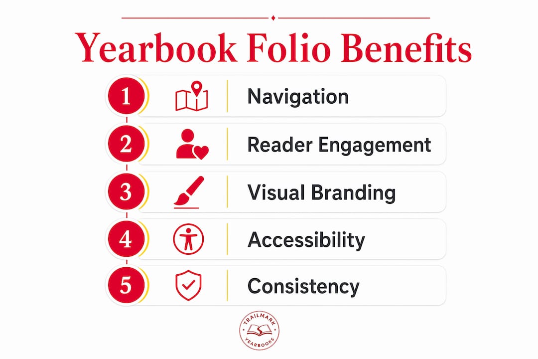
Navigation is only half the story. A consistent folio design creates a unified identity across the yearbook, making it feel like a single, intentional book rather than a collection of disconnected pages. This is the distinction between a yearbook that reads like a professional publication and one that feels assembled from separate projects. When every spread shares the same folio style, color, and placement, the book develops a visual rhythm that readers feel even if they cannot name it.
Folios also carry storytelling weight that most advisers underestimate. When a folio tab uses the school's colors, incorporates the mascot, or mirrors the year's design theme, it quietly reinforces school identity on every single page. That repetition is powerful. A reader who flips through 150 pages sees the folio design 150 times. That is 150 opportunities to reinforce the school's brand and the book's theme without adding a single word of copy.
"Advisers view folios as more than navigation tools. They are storytelling elements that tie each page to the book's overall identity, creating a reading experience that feels intentional and complete." Touch Archives
The contrast with plain page numbers is stark. A bare page number tells the reader where they are. A folio tab tells them where they are, what section they are in, and what the book is about. That is three functions delivered in a space smaller than a business card.
Design tips for creating effective yearbook folios
Effective folio design follows a short set of principles that balance readability with visual appeal. The goal is a folio that readers notice when they need it and ignore when they do not.
- Choose font size and weight for legibility first. The page number should be no smaller than 8 points and ideally set in a medium or bold weight. Thin or script fonts for page numbers create readability problems, especially in print where ink spread can close up fine letterforms.
- Lock placement to the outside bottom corner. Consistency in placement is more important than any single design choice. Readers learn where to look after the first few pages, and moving the folio mid-book breaks that expectation.
- Match the color palette to your yearbook theme. If the book uses navy and gold throughout, the folio should draw from those same colors. Balanced color use in folios maintains thematic cohesion across every spread.
- Limit graphic elements to one or two per folio tab. A mascot icon or a simple geometric shape works well. Multiple competing graphics create visual noise that distracts from the page content.
- Test your folio design at actual print size before committing. A folio that looks sharp on screen at 150% zoom can become muddy or illegible at the printed size of roughly 1 by 0.5 inches.
Pro Tip: Simpler folio designs improve accessibility for readers with visual processing differences and prevent the folio from competing with photos and headlines for attention. One strong graphic element beats three weak ones every time.
Here is a quick comparison of folio design approaches to help you choose the right fit for your school:
| Folio style | Best for | Potential drawback |
|---|---|---|
| Minimalist (number only) | Small yearbooks under 80 pages | Provides no section context |
| Number plus section title | Most school yearbooks | Requires consistent labeling plan |
| Number, title, and icon | Larger books with strong branding | Can feel cluttered if not carefully sized |
| Full thematic tab with color block | Award-entry or showcase yearbooks | Demands high design consistency throughout |
Effective folio design also benefits from a six-column master grid underlying the entire book layout. That grid gives the folio a fixed anchor point on every spread, so alignment stays consistent even when the content above it changes dramatically from page to page.
Yearbook folio style examples and when to use each
Folio styles fall into four practical categories, each suited to a different yearbook context. Knowing which style fits your book prevents the most common design mistake: choosing a folio that looks great on the cover spread but fights with content on interior pages.
Classic minimalist folios use only the page number, set in a clean serif or sans-serif font. These work well for smaller elementary school yearbooks where sections are short and readers do not need detailed orientation. The trade-off is that they offer no section context, so a reader jumping to a specific part of the book gets no confirmation from the folio alone.
Section-labeled folios add a section title next to the page number, such as "Clubs | 47" or "Seniors | 112." This is the most widely used format in middle and high school yearbooks because it solves the navigation problem without adding significant design complexity. Section titles in folio tabs help readers orient themselves quickly and improve the overall aesthetic quality of the spread.
Thematic branded folios incorporate school colors, custom typography, and graphic elements like mascots or icons. Award-winning yearbooks frequently use small thematic icons repeated consistently across pages to reinforce school spirit without overwhelming the spread. This approach requires more upfront design work but pays off in a book that feels polished and intentional. For advisers working with Canva or Adobe InDesign, creating a master folio template and applying it across all spreads keeps this style manageable.
Creative integrated folios treat the folio tab as a design feature rather than a utility element. These might use a color block that bleeds to the page edge, a pattern that echoes the year's theme, or a folio that changes color by section. This style suits larger high school yearbooks with dedicated design teams and a strong visual concept. The risk is inconsistency. If the folio design is too complex, maintaining it across 150 or more pages becomes a production challenge.
The right choice depends on three factors: the size of your yearbook, the strength of your design team, and how much thematic consistency you can realistically maintain through production. A yearbook module design approach, where each section uses a pre-built template, makes even complex folio styles achievable for advisers working with limited time.
Key takeaways
A yearbook folio is the page number plus section labels and graphics that guide readers and reinforce the book's visual identity on every spread.
| Point | Details |
|---|---|
| Folio definition | A folio combines a page number with section titles and graphics to aid navigation. |
| Standard placement | Folios belong at the outside bottom corner of each spread for maximum visibility. |
| Design principle | Keep page numbers in legible fonts; limit decorative elements to one or two per tab. |
| Storytelling function | Consistent folio design ties every page to the yearbook's theme and school identity. |
| Style selection | Choose folio complexity based on yearbook size, design team capacity, and thematic goals. |
Why folios deserve more attention than most advisers give them
I have reviewed hundreds of school yearbooks over the years, and the folio is almost always the element that separates a book that feels professionally produced from one that feels like a class project. The irony is that most advisers spend weeks agonizing over cover design and almost no time on folios, even though the folio appears on every single interior page.
The most common mistake I see is treating the folio as a last-minute addition. A design team builds out 60 spreads, then realizes they never established a folio template. At that point, they either rush a design that does not match the rest of the book or they skip folios entirely and end up with bare page numbers. Neither outcome serves the reader or the school.
My honest advice: design your folio template before you design a single interior spread. Lock in the font, the color, the placement, and the graphic element. Then apply it as a master element in whatever software you use, whether that is Canva, InDesign, or an online creator. Changing a folio template that is embedded in a master page takes minutes. Retrofitting 80 spreads manually takes days.
The other thing I would push back on is the idea that simple folios are "boring." A clean, well-executed folio with the school's colors and a single mascot icon is more memorable than a cluttered folio tab that tries to do too much. Restraint is a design skill. The best folios I have seen are the ones you barely notice while reading but immediately miss when they are gone. That is exactly the effect you should be aiming for. For advisers who want to build stronger yearbook policy foundations before tackling design decisions, starting with structure always produces better results.
— Jace
How Trailmarkyearbooks makes folio design easier for school advisers
Designing a folio that works across an entire yearbook is straightforward when you have the right support. Trailmarkyearbooks provides free design assistance to every school, which means you are not figuring out folio templates alone. Whether your team uses Canva, InDesign, or the Trailmarkyearbooks online creator, the platform supports the flexible layouts that make consistent folio design achievable without a professional design background.

Advisers can request a printed sample to see exactly how folio designs translate from screen to print, which eliminates the guesswork around font legibility and color accuracy. Trailmarkyearbooks also offers downloadable adviser resources that include layout guides covering folio placement and design standards. With a 2 to 3 week turnaround, no order deadlines, and all-inclusive pricing with no hidden fees, Trailmarkyearbooks gives school staff the tools to produce a yearbook that looks intentional from the first page to the last.
FAQ
What is a folio in a yearbook?
A folio is the page number on a yearbook spread combined with a section title, topic label, or graphic element that helps readers identify their location within the book. It is typically placed at the outside bottom corner of each page.
What does a yearbook folio tab contain?
A folio tab contains the page number plus a section or topic title and optional graphics such as mascot icons or thematic accents. The combination aids navigation and reinforces the yearbook's visual theme.
Where should a yearbook folio be placed?
Folios are traditionally placed at the outside bottom corner of a page spread. This position keeps the folio visible when flipping pages while preventing it from interfering with photos, headlines, or body copy.
How is a yearbook folio different from a scrapbook page number?
A yearbook folio functions as a navigation and branding system repeated consistently across every spread, while a scrapbook page number is purely sequential with no design or contextual function. Folios carry section labels and thematic graphics that scrapbooks do not use.
What font should I use for a yearbook folio?
Use a clean, medium-weight serif or sans-serif font for the page number itself, set at a minimum of 8 points. Decorative or script fonts can appear in surrounding folio elements, but the number must remain legible at print size.