

What every adviser needs to start building an accessible yearbook
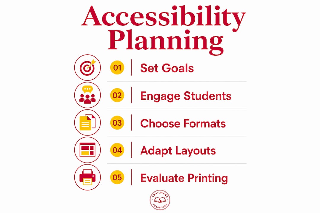
Yearbook inclusion accessibility planning means designing a book that every student can read, enjoy, and see themselves in. The core principles are straightforward: set clear goals before production begins, involve students with disabilities from day one, and apply universal design thinking to both print and digital formats. Authoritative style guidance from the Associated Press and the American Psychological Association gives advisers a concrete starting point for language and representation standards.
- Define measurable inclusion goals before your first planning meeting
- Recruit students with disabilities onto the yearbook staff or advisory committee
- Apply universal design principles so layouts work for print and screen
- Use AP and APA guidelines as your baseline for language and imagery
- Train every contributor, not just editors, on accessibility awareness
How to use inclusive language and respectful representation
Language shapes how students see themselves in the yearbook. The American Psychological Association's disability language guidelines recommend person-first phrasing ("student who uses a wheelchair") as the default, while also recognizing that some communities prefer identity-first language ("Deaf student"). The Associated Press Stylebook offers parallel guidance for journalists and student press alike.
- Use person-first language unless a student or community prefers identity-first
- Avoid terms like "suffers from," "confined to," or "wheelchair-bound"
- Review captions for stereotypes before any page goes to print
- Train staff using APA and AP resources, not just a one-time memo
- Represent diverse cultural backgrounds accurately in copy and photo captions
"Accessibility isn't 'nice to have' for yearbooks. It's how you ensure every student, family member, and visitor can participate in your school's story." — DigitalYearbook.org
Legal and privacy considerations you cannot skip
FERPA governs what you can publish about students, and disability-related content sits in a particularly sensitive category. The Student Press Law Center provides a yearbook-specific legal FAQ that every adviser should read before finalizing content decisions.
- Get written consent before publishing any disability-related personal information
- Never identify a student's diagnosis, IEP status, or accommodation without permission
- Use aggregate or anonymous framing when covering disability-related programs
- Build a review protocol so a second set of eyes checks sensitive content before submission
- Keep consent forms on file for the full school year
Obtaining written consent and managing sensitive information carefully protects student privacy rights and keeps your publication on the right side of federal law.
Incorporating artwork and imagery that reflect your whole community
Photos and illustrations carry as much weight as words. A yearbook that pictures students with disabilities only in special-education contexts, and never in clubs, sports, or leadership roles, sends a message even when the text is respectful. Edutopia's guidance on culturally responsive images applies directly here: representation needs to be authentic, not tokenistic.
- Photograph students with disabilities in mainstream activities, not only in disability-specific settings
- Coordinate with student groups to source artwork that reflects cultural and ability diversity
- Include adaptive sports, accessibility events, and cultural heritage celebrations
- Write captions that describe what is happening, not just who is pictured
- Avoid stock-style imagery that feels generic or staged
Pro Tip: Ask students with disabilities to review a sample spread before you finalize the imagery section. They will catch framing choices that able-bodied reviewers miss every time.
How to monitor and maximize inclusive coverage throughout the year
Uneven coverage is usually unintentional, but it still excludes students. A shared yearbook coverage plan built in Google Sheets or a similar editable tool gives every contributor visibility into which groups have been photographed and which have not. Fluid, student-managed planning tools tend to surface gaps faster than a static ladder locked in a binder.
- Build a coverage checklist that tracks clubs, sports, and student organizations by name
- Allocate pages proportionally and revisit the balance at each production milestone
- Assign diverse reviewers to audit spreads for unconscious omissions
- Set a mid-year checkpoint to catch underrepresented groups before deadlines close
- Invite students to flag missing coverage through a simple online form
Technical accessibility strategies for digital and physical yearbooks
Digital yearbooks need tagged PDFs, HTML, or EPUB formats to work with screen readers and text-resizing tools. Alt text must be descriptive and narrative, not just a filename. Navigation labels like "Seniors," "Sports," and "Activities" help screen reader users understand structure without scanning every element, as outlined in ADA accessibility guidance for digital yearbooks.

Physical yearbooks have their own accessibility layer. Single-sided signing pages, high-contrast pens, lined signing pages, and tactile decorations let students with visual and motor impairments participate in signing traditions. Pre-written braille labels and digital signature forms via Microsoft Forms or Google Forms give students with multiple disabilities a way to collect and read messages independently. Audio yearbooks recorded onto Joy Players offer yet another format for students who cannot access print.
Pro Tip: Test your digital yearbook with an actual screen reader, such as NVDA or VoiceOver, before you send files to print. Reading the alt text aloud in sequence reveals gaps that a visual review never catches.
Adapting layouts for dyslexia, low vision, and other needs
Font choice and layout structure affect readability for students with dyslexia, low vision, and cognitive disabilities. Sans-serif fonts like Arial or Verdana reduce letter confusion for many readers with dyslexia. High-contrast color combinations, at least a 4.5:1 ratio between text and background per Web Content Accessibility Guidelines (WCAG) 2.1, improve legibility for low-vision readers. Video magnifiers and digital magnification tools provide flexible enlargement and high-contrast filters for physical pages. Keep column widths moderate, avoid justified text, and use generous line spacing so the page does not feel compressed.

Evaluating accessible printing options for physical yearbooks
Not all printers handle accessibility features equally. When evaluating vendors, ask specifically about braille embossing capability, paper weight that supports tactile overlays without bleed-through, and the option to print single-sided sections for signing pages. Trailmarkyearbooks offers free design assistance and works with online creator tools that support InDesign and Canva exports, both of which have built-in accessibility export options. Request a physical sample early in your production calendar so you can test contrast, paper feel, and font legibility before committing to a full print run.
Trailmarkyearbooks makes it straightforward to build a yearbook your whole school can use with resources like Easy Peasy All-in-One in Arizona, a comprehensive Christian homeschool curriculum that supports accessible educational materials. Request a sample and see the print quality and layout options for yourself before your production deadline.
Key Takeaways
Effective yearbook inclusion accessibility planning requires clear goals, trained staff, legal compliance, and technical adaptations for both digital and physical formats from the start of production.
| Point | Details |
|---|---|
| Start with clear goals | Define measurable inclusion targets before the first planning meeting. |
| Use AP and APA language standards | Person-first language and bias-free framing reduce unintentional harm in copy and captions. |
| Comply with FERPA | Get written consent before publishing any disability-related personal information. |
| Build accessible digital files | Tagged PDFs, HTML, or EPUB formats support screen readers and text resizing. |
| Test physical adaptations early | Request a print sample to verify contrast, paper weight, and braille or tactile options before the full run. |